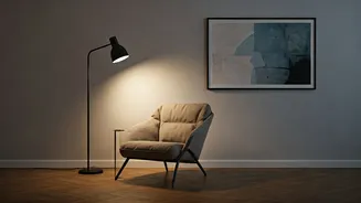

We often assume that transforming a space requires renovation, walls to be broken, layouts to be reimagined, budgets to stretch. But in reality, the emotional tone of a home is shaped far more subtly.
It lives in colour choices, material finishes, surface textures, and the way light moves across them. These decisions may appear decorative, but they quietly dictate how a room feels, how it is used, and how people respond to it.
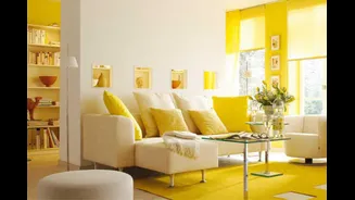
For Suparna Handa, Managing Director, Sarita Handa, colour and material have always been foundational tools rather than afterthoughts. She points out that dark corners, for instance, rarely need structural fixes. Instead, they respond intuitively to lighter palettes and tactile surfaces. Cotton-linen blends, chalky whites, pale greens, and washed neutrals gently reflect light without glare. Layered textiles, quilting, embroidery, and surface detailing introduce movement, allowing light to travel and animate spaces that might otherwise feel static.
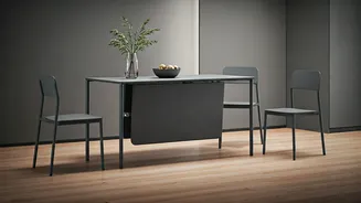
Warmth, she explains, is not just a matter of colour temperature but of fibre and finish. Natural materials like linen, wool, silk, and handwoven cotton bring a lived-in softness that grounds a room emotionally. Earthy tones, sand, clay, muted rusts, and softened browns, introduced through cushions, bedspreads, upholstery, or handcrafted furniture, create spaces that invite touch and age gracefully. These are rooms that feel welcoming, not styled.
A similar philosophy guides the work of Neha Kataria, Creative Director, The Right Address, which represents Jay Strongwater in India. Kataria believes that the mood of a room is often shaped by decisions operating quietly in the background, material integrity, surface finish, and light interaction. When addressing dark or underlit spaces, she avoids simple brightness in favour of depth. Polished verde green Italian marble, for instance, has an inherent luminosity. Its veining and reflective surface allow light to move rather than disappear, creating visual energy even in shaded corners. Paired with cast bronze detailing or mirror-backed surfaces, such materials form focal moments that feel intentional rather than corrective.
When it comes to warmth, Kataria shifts the conversation away from colour entirely. Two materials within the same tonal family can evoke entirely different emotions depending on finish. Antiqued brass, hand-patinated bronze, brushed metals, and honed stone introduce warmth through texture and imperfection. Softly backlit stone or onyx further diffuses light, creating depth without harshness. Calm, she adds, emerges through continuity, neutral-toned fabric panels, upholstered walls, and soft panelling that absorb both visual and acoustic noise. Furniture placement matters as much as material choice, encouraging ease of movement rather than rigid symmetry.
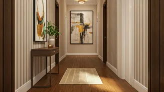
Interior designer Mita Mehta echoes this belief from lived experience. She notes that a room’s mood is often sensed instantly before one registers square footage or furnishings. Dark corners, she explains, are frequently a result of surfaces that absorb light: matte finishes, heavy drapes, or poorly balanced materials. Simple changes, lime-washed walls, warm off-whites, light-toned wood, brushed metals, or textured fabrics can radically alter how light behaves without altering structure.
Across these perspectives, a common truth emerges: homes do not need to be rebuilt to feel renewed. They need to be re-layered. Colour and material, when chosen with restraint and intention, shape warmth, calm, and light in ways that are both enduring and deeply personal. In an era of constant visual noise, it is these quiet, thoughtful decisions that give a space its lasting sense of ease.