


Neutrals have long been labelled the ‘safe’ choice in interiors, but there’s nothing passive about them. In reality, these quiet shades do the heavy lifting by setting the tone, shaping light, and determining
whether a room feels airy or oppressive, timeless or dated. The right neutral can make a compact apartment feel expansive or bring warmth to an otherwise stark home. The wrong one can flatten everything.
Today’s design conversations have moved beyond plain beige. Instead, shades like greige, sand, and the increasingly popular Cloud Dancer are redefining what a modern base palette looks like – especially in Indian homes where natural light, artificial lighting, and material finishes behave differently across seasons.
“Neutrals are often considered the safest choice in interiors, but in reality, they carry the responsibility of defining the entire mood of a space,” says Kavya Sethi, Founder at Walnut Studio and Principal Designer at Woodcraft International. Tusshar Joshi, Founder of Utkarsh Vastukaran, echoes the shift: “Neutrals are no longer just safe choices. They’re design statements.” And for Nikita Mohan, Founder of Vilasa Luxury Living, the decision is deeply personal: “The secret lies in choosing a shade that aligns with both your architecture and your lifestyle.”
So how do you pick the one that works for you?
Greige: The Contemporary All-Rounder
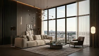
A blend of grey and beige, greige has become the darling of modern homes. It offers the cool sophistication of grey with the softness of beige, creating a look that feels polished without being clinical.
Joshi says, “This is a balanced blend that works beautifully in modern homes where you want warmth without losing that clean, contemporary edge.” It pairs seamlessly with wood, metal finishes, and muted décor, making it ideal for living rooms, home offices, and transitional spaces.
But Sethi offers a word of caution. In certain lighting conditions, especially warm artificial light common in Indian homes, greige can quickly feel dull and lifeless, losing the crispness it promises on a swatch.
Sand: Warm, Earthy, Inviting
If your home leans into natural textures such as thick linen, cane, terracotta, or raw wood, sand tones bring an organic warmth that feels grounded and comforting.
Mohan says, “Sand is earthy and welcoming, perfect for sunlit rooms that celebrate natural materials.” These hues lend themselves beautifully to relaxed, lived-in interiors and timeless design schemes that resist fleeting trends.
Yet, like greige, sand can surprise you. Sethi notes that it often reads darker than expected, sometimes becoming visually heavy and dominating the room rather than quietly supporting it.
Cloud Dancer: Light, Airy, Effortless
Then there’s Cloud Dancer – a soft off-white that designers increasingly trust as a fail-safe neutral.
“It is calm, light, and quietly confident. It doesn’t demand attention, yet it has the ability to hold a space together,” says Sethi. Its strength lies in versatility. From deep greens and rich woods to bold blacks, warm metals, and pastels, it allows other elements to shine without competing.
Joshi recommends it for smaller spaces or minimalist interiors, where brightness and openness matter most. Mohan adds that it reflects light beautifully, making compact rooms feel more expansive while maintaining a serene ambience.
The result? A shade that feels fresh today but won’t date tomorrow.
How To Choose What Works
Ultimately, the perfect neutral isn’t about trends. It’s about context. Observe your light. Consider your materials. Think about how you want to feel when you walk into the room.
Greige suits sleek, contemporary homes. Sand enhances warm, textural spaces. Cloud Dancer offers a timeless, breathable canvas.
Because the best neutrals don’t just decorate a home, they quietly shape the way you live in it.