


Mixing colours and patterns is one of the quickest ways to add personality to a home, but it’s also one of the easiest design elements to get wrong. While thoughtfully layered interiors feel rich, dynamic
and inviting, an overload of prints and competing colours can leave a room feeling chaotic rather than cohesive.
The good news? Designers say achieving balance is less about following strict rules and more about understanding how colours, patterns and textures interact within a space.
Start With a Strong Colour Story
Before introducing patterns, establishing a clear colour palette is essential. According to Sanjeev Bhandari, Founder and CEO, AirBrick Infra, every successful layered interior begins with a cohesive colour story.
“When going all-out with prints, a cohesive colour palette is the non-negotiable foundation,” he says. Choosing two or three core shades and allowing the rest of the room to build around them creates visual consistency, even when multiple patterns are involved.
Similarly, Nupur Jain of Nandika Interiors recommends selecting two to three dominant shades supported by a few accent colours. This approach ensures that patterns complement rather than compete with one another.
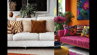
Master the Art of Pattern Mixing
One of the biggest challenges homeowners face is combining multiple prints within the same room.
Bhandari advises starting with one large-scale pattern that acts as the focal point of the space. This could be a statement wallpaper, a patterned sofa or a striking rug. Smaller patterns can then be layered through cushions, throws and accessories.
For Akanksha Gupta, founder, Studio A, contrast in scale is key. A large statement print paired with smaller, more understated motifs creates visual depth without overwhelming the room.
Jain also advocates for the designer-favourite “rule of three”, combining one large-scale print, one medium-sized pattern and one smaller motif. This creates rhythm and hierarchy, allowing each pattern to stand out while contributing to the overall design.
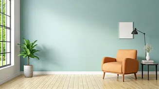
Let Neutrals Do the Heavy Lifting
While bold colours and patterns bring character, neutral elements play an equally important role. Gupta recommends using muted tones as a foundation. “Muted colours help ground a space and allow brighter patterns to stand out,” she explains.
Bhandari agrees, noting that solid-coloured upholstery, neutral walls or understated rugs provide visual breathing room between more expressive design elements. These quieter moments help create balance and prevent the space from feeling visually cluttered.
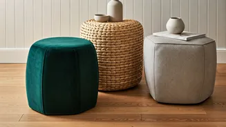
Texture Is Just As Important As Colour
A well-designed room isn’t built on colour alone. According to Jain, texture adds another layer of sophistication without introducing additional visual noise. Materials such as wood, linen, stone, metal and boucle create depth while maintaining harmony.
Gupta also highlights the role of natural materials such as carved wood and woven textiles, which add warmth and help unify different colours and patterns throughout the space.
Create Cohesion Through Repetition
One of the simplest ways to make multiple design elements feel intentional is through repetition. Repeating colours across artwork, cushions, rugs and decorative accents creates a sense of continuity that ties the room together. Even contrasting patterns feel more cohesive when connected through recurring shades and textures.
For homeowners drawn to bolder aesthetics, Bhandari recommends pairing timeless motifs such as florals and stripes while keeping them within the same colour family. This allows for visual interest without sacrificing harmony.
Design for Living, Not Perfection
Ultimately, great interiors are not about showcasing design expertise, they are about creating spaces people genuinely enjoy spending time in.
“The final goal of interior design should always be creating space for people to live and relax,” says Gupta. “Home should not be a museum to your design skills.”
Bhandari encourages homeowners to identify one hero piece, whether it’s a statement rug, bold wallpaper or favourite sofa and allow it to guide the rest of the room’s design direction.
When colours, patterns and textures are layered thoughtfully, interiors feel collected rather than cluttered, expressive rather than overwhelming. The result is a home that feels personal, inviting and effortlessly balanced.