
Mumbai runs on routine. The metro is part of it now. Same platforms, same exits and the same corner near the door every morning. Lakhs of commuters move through the city daily without really looking around
inside the coaches anymore, for which small design details often slip past unnoticed until someone stops and looks closely. That happened this week when an X user flagged an unusual pattern inside Mumbai Metro Aqua Line coaches.
What seemed like a simple decorative cut on a seat panel ended up kicking off a wider conversation about design, identity and borrowed aesthetics in public infrastructure.
The Detail That Started It All
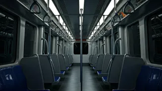
The post featured a photograph taken inside an Aqua Line (Line 3) train. At first glance, the metal cutwork on the side panel of a seat looked purely ornamental. Look again, though, and the shapes began to resemble fan-like ginkgo leaves.
Ginkgo leaves are strongly associated with East Asia, particularly China, Japan and Korea. They are not native to India. That was the user’s central question. Why would Mumbai’s newest metro line feature a motif that has no obvious local connection?
In his caption, the user questioned the design choice directly, arguing that public infrastructure should reflect local culture. He pointed out that using symbols without context reduces design to decoration. For him, the issue wasn’t aesthetics alone. It was about meaning.
The post read, “Why does Mumbai’s Aqua Line metro have ginkgo leaves as a design motif? That’s East Asian; Mumbai isn’t Japan/China. The plant doesn’t even grow here. If you’re going to borrow symbols, at least make them mean something. Design without context is just decoration. This is exactly how public design loses its local identity.”
Check it out here:
Why does Mumbai’s Aqua Line metro have ginkgo leaves as a design motif?
That’s East Asian, Mumbai isn’t Japan/China 🇯🇵🇨🇳
The plant doesn’t even grow here😭If you’re going to borrow symbols, at least make them mean something.
Design without context is just decoration. This is… pic.twitter.com/bJO21P93U5— Aditya (@UghDitya) January 15, 2026
How Did The Internet React
As expected, the post travelled fast. Some users weren’t convinced the pattern was ginkgo at all. One comment read, “Thinking out loud, could be fish scales maybe?”
Others brushed off the concern entirely. “Yahan dhang se roads nahi bante, aur functional metro mein aesthetic chahiye?” one user wrote. Another added, “It’s amusing how people always find something to cry about.”
But many tried to explain rather than dismiss the observation. Several users pointed out that the Aqua Line was built with the help of Japanese Official Development Assistance. That, they argued, could explain the design language.
One comment noted, “Bangalore Metro coaches are made in China but branded as BEML.” Another wrote, “These trains might be designed or built abroad, which explains the design language.” Some even joked that the pattern was part of a “Ghost of Yōtei” advertisement campaign running on the line.
More Than Just A Motif
Beyond the jokes and pushback, a section of users appreciated the original observation. One comment summed it up neatly: “Very good point. I hope more designers read this.”
What began as a quiet detail inside a metro coach turned into a discussion about collaboration, manufacturing realities and cultural representation. Most commuters may never notice the pattern again.
But now that it’s been pointed out, it’s hard to unsee.