
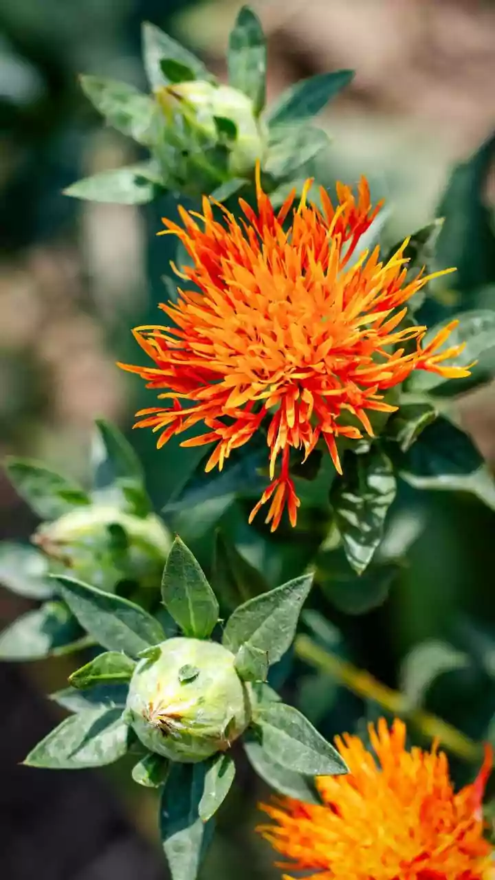


Uncover the secrets of how colors shape your emotions and daily experiences. Dive into the impact of colors on mood!
Ever stopped to think why you feel a certain way in a particular room? Or why some days
you're drawn to wearing a specific color? Well, chances are, the colors around you are playing a bigger role than you realize.
Color psychology, the study of how colors influence our emotions and behaviors, is a fascinating field. This isn't just some fancy art theory; it's a real science with practical applications in everything from interior design to marketing.
So, let's dive into some lesser-known facts about how colors impact your mood and daily life!
Blue colors can calm or depress, based on shade and context
We often hear that blue is calming and associated with feelings of peace and tranquility. Think of the ocean, the sky – vast and serene. And it's true, certain shades of blue, particularly lighter, softer tones, can indeed promote relaxation and reduce anxiety.
That's why you often see them in bedrooms or spas. But here's the catch: darker, more somber blues can actually evoke feelings of sadness, loneliness, or even depression. Ever heard the expression "feeling blue?" It highlights this very point!
Think of a gloomy, overcast sky – that's the kind of blue that can bring your spirits down. Also cultural context matter too. In some cultures blue is considered a color of mourning. So, the specific shade and the context matter a lot, guys.
Yellow: symbol of happiness, but use sparingly to avoid overwhelm
Yellow is often associated with happiness, optimism, and sunshine. It's an energizing color that can stimulate creativity and improve focus. Studies have shown that yellow can trigger the release of serotonin, a neurotransmitter linked to feelings of well-being.
That's why some offices or study spaces incorporate yellow accents. However, too much yellow can be overwhelming and even irritating.
Think of a room painted entirely bright yellow – it might feel exciting at first, but it could quickly become tiring on the eyes and even lead to feelings of restlessness. It is important to use it thoughtfully. Like a dash of haldi in your daal – just enough to make it perfect!
It is better used as an accent color rather than the primary color in a room.
Green color promotes relaxation and productivity in workspaces
Besides its obvious connection to nature and feelings of freshness, green has some surprising psychological benefits. Green is considered one of the easiest colors on the eyes, reducing eye strain and promoting relaxation.
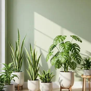
This makes it an excellent choice for office spaces or environments where prolonged concentration is required. Studies have shown that employees working in green-toned offices report lower levels of stress and increased productivity.
It is even believed that green can also boost creativity and innovation. If you're looking to create a more productive and calming workspace, consider adding some green plants or painting a wall a soft, natural green color. It's like bringing the calmness of a garden into your work area.
Red color's power and effects on emotions and marketing strategies
Red is a powerful color – associated with passion, energy, excitement, and even danger. It can increase heart rate and blood pressure, making you feel more alert and energized. That's why it's often used in marketing to grab attention and create a sense of urgency.
However, red can also be associated with aggression and anger. Too much red can be overstimulating and lead to feelings of anxiety or frustration. Consider using red sparingly as an accent color, rather than painting an entire room red.
A red cushion on a sofa or a red piece of artwork can add a touch of energy without being overwhelming. Like adding just the right amount of mirchi to your dish - enough to give it a kick, but not so much that it burns!
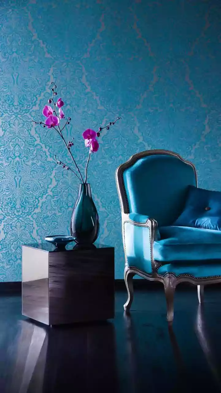
Pink's calming effect on all, but shade matters for mood
Forget the stereotypes! Pink can have a surprisingly calming effect on both men and women. Certain shades of pink, particularly softer, pastel tones, have been shown to reduce aggression and anxiety.
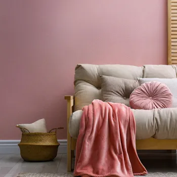
In fact, some prisons have even experimented with painting holding cells pink to calm violent inmates. However, it's important to remember that not all pinks are created equal. Brighter, more vibrant pinks can be energizing and even stimulating, while darker, more intense pinks can be overwhelming.
Soft pinks are best for creating a calming and relaxing atmosphere, while brighter pinks can be used to add a touch of fun and playfulness. Don't underestimate the power of pink!
White symbolizes purity, adds brightness; blend with color to avoid sterility
White is often associated with purity, cleanliness, and simplicity. It can create a sense of spaciousness and tranquility, making rooms feel brighter and more airy. White can also promote clarity of thought and help you feel more focused. However, too much white can be sterile and boring.
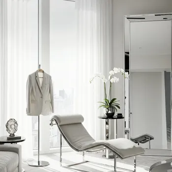
It can lack personality and make a room feel cold and uninviting. To avoid this, add pops of color with furniture, artwork, or accessories. Think of white as a blank canvas, ready to be brought to life with your own personal style.
Use colorful cushions, rugs, or plants to add warmth and personality to a white room. A dash of color can transform a stark white space into a welcoming and inspiring one.
AI Generated Content. Glance/InMobi shall have no liability for the content