Unveiling the Power of Color Psychology: How Hues Influence Your Mood. Dive into a world of vibrant emotions!
Namaste, readers! Ever felt a sudden josh just by looking at a sunny yellow wall? Or perhaps
a sense of shanti washing over you in a room painted a calming blue? Well, you're not alone! Our connection with colors goes way beyond mere aesthetics.
Color psychology, a fascinating field, explores how different hues can influence our emotions, behaviours, and even our perceptions. Today, we will unravel the amazing impact of color psychology and discover how these visual cues affect our mood.
And more importantly, understand how you can use this knowledge to create a positive environment around you and boost your daily well-being, boss!
Think about it, we face a daily bombardment of colors – from our clothes to the billboards we pass on the street.
But these colours which seem very normal actually have a subtle yet powerful effect on us. Understanding the mood and energy each colour evokes can be a game-changer, especially when it comes to designing your home, choosing your outfit, or even creating your brand identity.
So, pull up a chair, grab a chai, and let's dive into the vibrant world of color psychology and explore the hidden messages behind the colors we see every day. Learn to use them to your advantage to create an environment that is very pleasant and happy to live in.
Using it properly might make your home a better place and your office a better place to go everyday and be in.
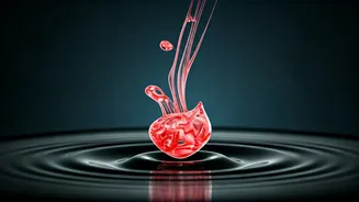
Red: The Colour of Energy and Excitement
Red, the color of fire and blood, often triggers very strong emotions. It is primarily linked to excitement, energy, and passion. Think about a bride dressed in deep red. It represents love and celebration. This vibrant colour may even increase your heart rate and make you take action!
While red is amazing when you're looking for a burst of energy, be careful in using it in excess. Too much red can lead to aggression or overstimulation. Use it to highlight certain areas, like a red door to symbolize courage, or a vibrant red accent wall to add energy to a living room.
Be mindful of the context in which you are using red colour. You may not want the children to go to sleep in red clothing. You would also might not want to paint the walls of an office room red in colour.
On a positive note, it can grab your attention but it can also grab your eye for negative reasons. This is why it works for sales or advertisements but not in a relaxing setting.
Blue: The Calm of Serenity and Trust
Blue, on the other hand, is the colour of water and sky. It generally generates feelings of peace, calm, and serenity. Think of sitting by a beach, listening to the endless waves as they come in. Studies show that blue can lower your heart rate and blood pressure.
This makes it an excellent choice for bedrooms or meditation spaces and even offices. Darker shades of blue also give a sense of authority and trustworthiness. This is why a number of banks and corporations usually use blue in their branding.
The colour can also offer a sense of security and can also be related to intellect and intelligence. While blue is generally soothing, too much of it can sometimes feel cold or depressing.
You can use blue wisely to create an atmosphere of peace and harmony in your home or office.
Just use it wisely.
Yellow: The Sunshine of Happiness and Optimism
The next colour on the list is - Yellow! It's a great colour to be seeing when you step outside. Yellow reminds us of sunshine, happiness, and optimism. It inspires feelings of joy, energy and creativity. This color helps in uplifting your mood and encouraging creativity.
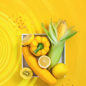
Yellow is a great choice for home offices, playrooms and art studios. Be cautious while using yellow though. Too much yellow can be overwhelming and can lead to anxiety in some people. Use it as an accent color to brighten up a room.
Incorporate yellow through art, accessories, or a bright statement wall. This can bring a sunny disposition to your space and help people stay awake even if they are tired. Being awake is also going to help improve productivity and efficiency at your work place.
This can be beneficial if you are trying to study for an exam also. But don't make it over the top either.
Green: The Harmony of Nature and Growth
Ah, green! The colour of nature and renewal. Green is strongly connected with feelings of harmony, balance, and growth. It is very effective in promoting a sense of calmness and well-being. Think of how relaxed you feel when walking through a beautiful green garden.
Green is a fantastic choice for any space where you want to create a sense of tranquility and rejuvenation. It can really brighten up the kitchen or the bathroom especially if they are dark in colour.
Some people who are doctors or vets also incorporate the colour green to show their connection with the green world. Be sure to use a lot of plants to make it even more bright!
Green can also represent fertility and optimism and this is why this colour is very pleasant.
Purple: The Royalty of Luxury and Wisdom
Purple is a color that stands for royalty, luxury, wisdom, and creativity. It often symbolizes spirituality, mystery, and imagination. In ancient times, purple was associated with royalty due to the high cost of creating purple dye. This made the colour rare and expensive.
Using purple in your space can stimulate creativity while providing a sense of elegance and refinement. It is a great idea to use purple in meditation rooms, art studios, or areas where you want to inspire deeper thought.
However, overusing purple can create a sense of artificiality or it may make you feel too introverted. Combining it with complementary colors can balance the richness and prevent the space from becoming too overwhelming.
Purple can be incorporated into fabrics when decorating or even as a mural on the walk.
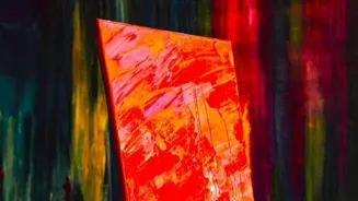
Orange: The Zest of Enthusiasm and Warmth
Orange combines the energy of red and the happiness of yellow. It radiates enthusiasm, warmth, and joy. It is known to stimulate excitement, creativity, and a sense of playfulness. Think of a beautiful sunset painting the sky in great shades of orange.

Orange can be a great choice if you wish to add a welcoming and cheerful vibe to any room. It is often used in living rooms, dining rooms, or any spaces where people gather to socialize. When using orange, understanding the need so that you use it wisely.
Too much orange can feel overwhelming or even unsophisticated. It is best used as an accent color or in small doses to add a burst of energy without overpowering the space. Remember, a little goes a long way!
A little bit of orange here and there does make the space more appealing and exciting to be at.
White: The Purity of Simplicity and New Beginnings
White, often associated with purity, cleanliness and innocence, offers a sense of simplicity and new beginnings. It is typically used to open up spaces, adding a sense of airiness and light. It is a commonly used colour in hospitals, symbolizing hygiene and sterility.
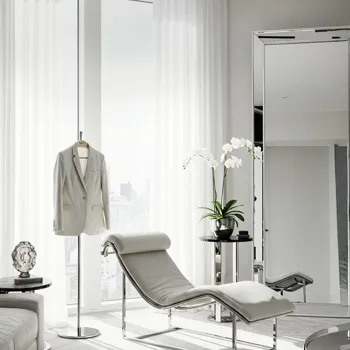
Adding white into a room can bring a sense of calmness and peace, promoting feelings of hope and freshness. However, white can also feel sterile or boring if it's the only colour used within the space. Adding touches of color can add warmth the the interior.
You can add greenery or furniture to make the space more enjoyable.
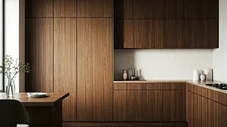
Black: The Power of Sophistication and Mystery
Last but not least, black, often associated with sophistication, power and mystery, has a strong impact on our moods and perceptions. It can symbolize elegance, authority and formality.
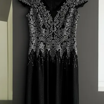
While black can bring a sense of mystery and drama to a room, using too much black can also create a sense of sadness or negativity. It is best used thoughtfully, whether combined with brighter colors to create contrast, or as an accent colour in furniture or decor.
Black can also create a sense of intimacy and coziness, making others feel safe.
Black is a powerful color when it comes to showing sophistication and a sense of class.