Unveil the Magic of Color Psychology in Home Decor! Dive into how colors influence mood and create harmony in your space
Namaste, folks! Are you feeling like your home is a little… blah? Does walking through
your door fill you with meh, instead of mazaa? Well, the secret to turning your house into a happy home might just be hiding in plain sight – in the colours on your walls!
Colour psychology, the study of how colours affect our moods and behaviour, can be a game-changer when it comes to home decor. Forget those complicated interior design books; we're breaking down how you can easily use the magic of colour to create the perfect vibe in every room of your ghar.
Get ready to paint your way to a happier, more harmonious living space!
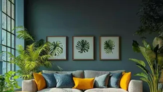
Red adds drama and warmth, use sparingly for impact
First things first, let's talk about Red. Red is a powerful colour – think energy, excitement, and a whole lot of attention! Too much red can sometimes feel a bit overwhelming, like you're stuck in a never-ending Bollywood dance number (energetic, yes, but also tiring!).
But, used wisely, red can add a fantastic pop of drama and warmth. Imagine a red accent wall in your living room, bringing a feeling of coziness and conversation to the space. Or, consider adding red cushions or artwork to inject a bit of passion into your decor.
Red is best used in areas where you want a bit of zing, like the dining room (stimulating appetite) or an entertainment area. Just remember, a little red goes a long way – unless you're going for a totally dramatic, maximalist vibe, it's best to use it as an accent rather than the main colour.
Think of it like adding that extra chilli to your dal – a pinch is perfect, but too much will make you sweat! So, use red to spice things up, but don't overdo it!
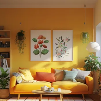
Yellow symbolizes optimism, joy, and creativity, energizing and inspiring spaces
Next up is Yellow! Yellow is the sunshine colour, and it brings all those happy, cheerful feelings right along with it. It represents optimism, joy, and creativity, making it a fantastic choice for spaces where you want to feel energized and inspired.
Consider using yellow in your kitchen to create a bright and welcoming space to start your day. A yellow entryway can make your home feel instantly more inviting, or a yellow accent wall in your office can boost your focus and creativity. However, like red, too much yellow can be a bit much.
It can sometimes be associated with anxiety or restlessness, so balance is key. Soft yellows, like pastel yellows or creamy yellows, are often a better choice than bright, saturated yellows, especially for larger areas.
Think of it like adding haldi to your cooking – a dash adds colour and flavour, but too much can be overpowering. So, bring in the sunshine with yellow, but keep it balanced for maximum happiness!
Blue color for calm, trust, and productivity in home decor
Now, let's dive into Blue! Blue is the colour of calm, peace, and tranquility. Think of the clear blue sky or the soothing ocean – blue has a naturally calming effect. It's often associated with trust, stability, and intelligence, making it a great choice for bedrooms, bathrooms, and offices.
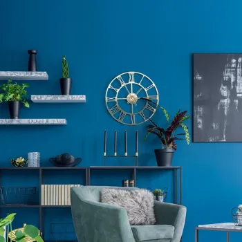
A blue bedroom can promote relaxation and better sleep, while a blue bathroom can create a spa-like atmosphere. In an office, blue can help you focus and stay productive. Different shades of blue can create different moods.
Light blues can feel airy and refreshing, while dark blues can feel sophisticated and grounding. For a small room, a lighter shade of blue can make the space feel bigger and brighter.
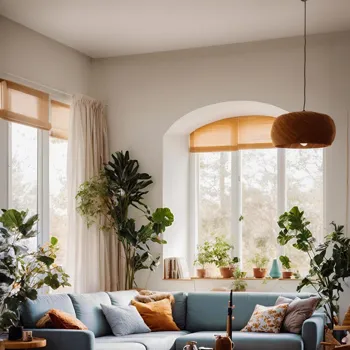
When using blue, consider pairing it with other neutral colours like white or grey to create a balanced and harmonious look. Blue is perfect for creating a serene and peaceful environment in your home – a true oasis of calm amidst the chaos of everyday life.
Green symbolizes nature, balance, and relaxation, ideal for peaceful home decor
After Blue, we have Green! Green is the colour of nature, growth, and harmony. It's associated with balance, renewal, and a sense of well-being. Bringing green into your home can create a refreshing and calming atmosphere, connecting you to the outdoors even when you're inside.
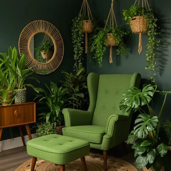
Green is an excellent choice for living rooms, bedrooms, and even bathrooms. A green living room can feel inviting and relaxing, while a green bedroom can promote restful sleep. In a bathroom, green can create a spa-like ambiance, reminiscent of lush forests and natural springs.
Different shades of green evoke different feelings. Light greens, like mint or seafoam green, can feel airy and refreshing, while darker greens, like forest green or emerald green, can feel grounding and sophisticated.
Incorporate green through paint, plants, or accessories to bring a touch of nature indoors and create a sense of peace and tranquility in your home. Green is like that comforting cup of chai – soothing and grounding.
Purple symbolizes luxury, creativity, and spirituality in decor
Let's not forget Purple! Purple is often associated with royalty, luxury, and creativity. It's a colour that can add a touch of sophistication and drama to any space.
Purple represents imagination, spirituality, and wisdom, making it a great choice for spaces where you want to feel inspired and creative. Consider using purple in a study, a meditation room, or even a bedroom to create a calming and inspiring atmosphere.
Lighter shades of purple, like lavender or lilac, can feel soft and romantic, while darker shades of purple, like eggplant or plum, can feel rich and luxurious. When using purple, it's important to balance it with other colours to avoid making the space feel too dark or overwhelming.
Pair purple with neutral colours like white, grey, or beige, or complementary colours like yellow or green, to create a balanced and harmonious look. Purple is like that silk saree you wear for special occasions – elegant and eye-catching.
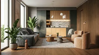
Neutrals: the unsung heroes of home decor, versatile, timeless, create calm sophistication
Finally, lets discuss Neutrals! We can not forget Whites , Greys, and Beiges they are the unsung heroes of home decor! These colours act as a blank canvas, allowing you to showcase your furniture, artwork, and accessories.
Neutrals are versatile and timeless, creating a sense of calm and sophistication in any space. White is associated with purity, cleanliness, and simplicity, making it a great choice for creating a bright and airy atmosphere.
Grey is a sophisticated and versatile neutral that can be used to create a modern and elegant look. Beige is a warm and inviting neutral that can make a space feel cozy and comfortable.
While neutrals are versatile, it's important to add pops of colour through accessories or artwork to prevent the space from feeling dull or boring. Neutrals are the foundation to building harmonious decor so embrace simplicity and create a relaxing and stylish home.
Neutrals are like that plain rice you eat with delicious food - it might seem simple, but also essential!
Transform your home with color psychology in 5 ways
So, there you have it! Five ways to use colour psychology to transform your home. Experiment with different colours, find what works best for you, and create a space that truly reflects your personality and makes you feel happy and at peace. Happy decorating!