


Butter Yellow Meets Cool Blue
This season, pale butter yellow gets a sophisticated update by partnering with crisp cool blues. While yellow can sometimes lean too sweet, the addition
of icy or powder blues provides an immediate sharpness, creating a polished and wearable aesthetic. This combination balances the desired softness of spring attire with a modern, crisp feel, perfect for airy dresses, light shirts, and relaxed layers that showcase fluid silhouettes and airy fabrics.
Pastel Pink & Rich Maroon
Pink continues its reign, but for Spring/Summer 2026, it gains a richer dimension through pairings with maroon or deep reds. This contrast elevates beyond mere sweetness, introducing structure and depth. The darker red anchors the vibrancy of bubblegum or ballet pink, resulting in a more directional and luxurious palette. This blend is particularly effective for evening wear, offering a natural balance between softness and dramatic flair, seen in collections that juxtaposed soft pinks with deep burgundy or wine tones.
Lavender and Scarlet Tension
The typically soft and romantic lavender is given an exciting edge when combined with scarlet red. This pairing creates a compelling tension where the cool delicacy of lilac meets the sharp warmth of red. Neither shade dominates; instead, they create a dynamic interplay that is visually arresting. This sophisticated contrast is ideal for event dressing, offering a fresh alternative to traditional jewel tones, as designers have showcased through elegant evening wear accented with bolder reds and vibrant purple-scarlet clashes.
Chocolate Brown with Baby Blue
Shifting chocolate brown from its autumnal roots, designers are integrating it into warmer seasons by pairing it with light baby blue. This lighter hue softens the richness of brown, resulting in a cleaner, more seasonal, and approachable palette. The contrast is especially effective in tailoring, where brown's inherent structure is complemented by the freshness of pale blue. Expect to see this pairing in sleek outerwear, minimalist separates, and relaxed suiting that feels both polished and contemporary.
Red and Sky Blue Energy
A resurgence of bold, primary colors is evident this season, with the vibrant combination of red and sky blue capturing this trend. The energetic tomato red is balanced by the openness and brightness of sky blue, creating a look that is graphic, youthful, and highly impactful. This pairing shines in playful yet sharp styling and works effectively when one color takes the lead and the other appears as accents, demonstrating a dynamic and visible statement on the runway and beyond.
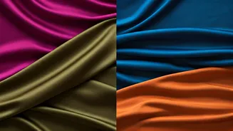
Grey and Burgundy Depth
Spring dressing isn't solely about pastels; the combination of grey and burgundy introduces depth while remaining seasonably appropriate. Grey provides an understated refinement, while burgundy adds a touch of richness without being overpowering. Styled with lighter fabrics or sharper silhouettes, this pairing creates a sophisticated look, particularly in tailoring. It offers a grounded elegance that translates well into structured separates and even into everyday wardrobes with subtle detailing.
Turquoise and Espresso Contrast
Bright turquoise, often perceived as challenging, finds its perfect complement in rich espresso brown. The deep brown anchors the vibrancy of turquoise, making it more wearable and approachable. This pairing masterfully balances intensity with depth, creating bold yet controlled looks. Designers are utilizing darker accessories and layers to ground vivid aquamarine shades, achieving a striking contrast that feels both powerful and refined.
Green and Crisp White Freshness
Simple yet impactful, the pairing of green with white offers a direct and refreshing aesthetic. Whether the green is citrusy, mossy, or grassy, the crisp white background allows it to stand out vibrantly. This combination feels incredibly versatile, enhancing the cleanliness of brighter green shades. It's a straightforward yet effective palette for dresses, shirting, and tailored pieces, making a strong, clean statement with minimal fuss.
Pistachio Green with Ivory
For those favouring softer palettes, pistachio green paired with ivory presents an elevated and tranquil option. This combination exudes a quiet luxury, where the creamy neutrality of ivory allows the muted freshness of pistachio to shine without being overshadowed. It’s particularly effective in textured fabrics like suede or washed silks, creating looks that feel effortlessly sophisticated and calm. This gentle pairing is ideal for fluid separates and accessories aiming for an expensive yet understated feel.