

The Print Mixing Evolution
Historically, blending distinct patterns such as stripes with florals or polka dots with anything else was often perceived as a fashion misstep, leading
to an appearance that felt overly busy or simply "too much." However, this perspective has undergone a significant transformation. What was once considered experimental is now an intentional design choice, moving beyond haphazard pairings to a more thoughtful approach where understanding the 'why' behind successful combinations is key. This shift has elevated print mixing from a risky endeavor to a sophisticated art form. The confidence to combine these diverse visual elements now stems from a deeper comprehension of how patterns interact and complement each other, rather than a fear of breaking traditional style rules.
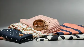
Polka Dots: A Graphic Foundation
Polka dots, traditionally perceived as soft, playful, and somewhat retro, have recently evolved into a more striking and graphic element in fashion. Their contemporary iteration often features sharper edges, a bolder presence, and can appear in oversized or unexpectedly placed arrangements, fundamentally defining the silhouette of a garment rather than merely adorning it. This reinvention makes them an exceptionally strong and versatile starting point for any print-mixing endeavor. Their ability to command attention while maintaining a degree of versatility allows them to anchor a look, providing a reliable base upon which other, potentially more complex patterns can be layered, thereby establishing a confident and visually interesting foundation for the entire ensemble.
Stripes: Bringing Structure
In contrast to the evolving nature of polka dots, stripes inherently introduce a sense of structure and order to an ensemble. Whether they are vertical, horizontal, or even unevenly spaced, stripes possess an innate ability to create direction within an outfit, which is crucial when integrating multiple distinct patterns. They act as an organizing force, preventing the overall look from appearing chaotic or scattered. This inherent linearity helps to ground the more fluid or graphic elements, ensuring that the combined effect is cohesive rather than clashing. The predictable yet dynamic nature of stripes provides a reliable framework that guides the eye and unifies disparate prints, making them an indispensable tool in the print-mixing arsenal.
Florals: The Fluid Element
Florals introduce a dynamic and often fluid element into print combinations, offering a less predictable and more organic aesthetic. Their inherent movement and softness can serve as either a balancing counterpoint to more structured patterns like stripes or a softening agent for bolder designs like graphic polka dots. The impact of a floral print depends heavily on its specific characteristics; a delicate, almost faded floral will interact differently than a vibrant, high-contrast version. Understanding these nuances is paramount. When incorporating florals, it's essential to consider their scale, color intensity, and overall mood to ensure they contribute harmoniously to the overall print dialogue rather than overwhelming or competing with other elements.
Achieving Print Harmony: Scale & Color
The art of mixing prints lies not in treating them as adversaries, but as participants in a unified visual conversation. A fundamental principle is managing scale: pair bold, large-scale polka dots with finer, more controlled stripes, allowing one print to take the lead while others provide subtle support. Similarly, a delicate floral necessitates a different approach than a robust, high-contrast one. Color serves as the crucial connective tissue. While perfect matching isn't the goal—in fact, slight disparities often enhance the look—a shared tone or a subtly repeated color across different prints provides the necessary link. This common thread ties the elements together without being overtly obvious, creating a sophisticated and intentional blend that feels less like a random assortment and more like a curated outfit.
Balance and Distribution
Achieving balance is paramount in successful print mixing, focusing on the distribution of patterns across the body and how the eye moves through the ensemble. Consider the classic combination of a striped shirt paired with a floral skirt; the shirt’s closeness to the torso contrasts with the skirt's movement, creating visual equilibrium. Similarly, layering a polka dot top beneath a striped jacket works because the dots offer a subtle peek-through rather than a direct confrontation with the stripes. This strategic placement ensures that one print doesn't overpower the other, guiding the viewer's gaze in a pleasing rhythm. The modern approach emphasizes personal expression over rigid rules, encouraging a confident interpretation of these principles to create a look that feels authentic and stylishly individual.