


The Colourful Shorthand
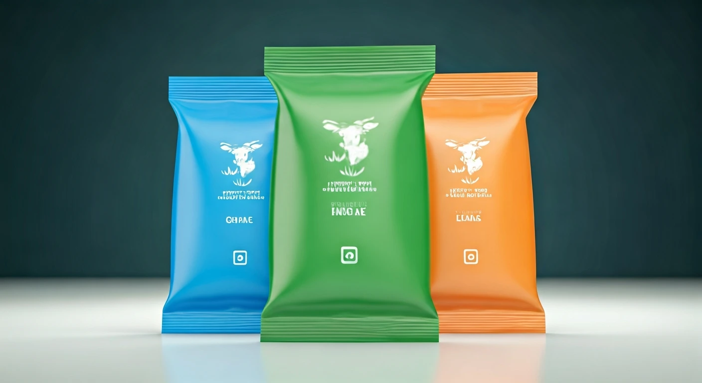
In India, milk packets aren't just plain white; they sport a vibrant spectrum of colours like blue, green, and orange. This isn't for aesthetics, but serves
as a quick visual indicator of the milk's fat content and type, simplifying choices for consumers. While regulatory bodies like FSSAI oversee general food labelling, the specific colour schemes for milk are decided by individual dairy brands. This system acts as a universal shorthand, allowing shoppers to identify their preferred milk at a glance without needing to decipher technical labels. The colours are strategically chosen to represent distinct dairy categories, each with a specific nutritional profile, making it easier for consumers to pick milk suitable for their daily needs, whether for tea, cooking, or making sweets.
Understanding the Colour Spectrum
The colour coding on milk packets is a standardized system designed for immediate consumer recognition. Typically, blue packaging indicates toned milk, containing approximately 3.0% fat. Green signifies standardised milk, which has a slightly higher fat content of around 4.5%. The orange packet usually denotes full cream milk, boasting the richest fat content of roughly 6.0%. Some brands also employ a magenta colour to distinguish double-toned milk, a lighter option with about 1.5% fat. This colour-based classification is not merely a branding tactic but a functional aspect of product identity, ensuring that consumers can differentiate between various milk types and select the one that aligns with their dietary preferences or culinary requirements.
Why Dairies Embrace Colour
Milk is a daily essential, often purchased on autopilot. In the fast-paced world of consumer goods, rapid decision-making is paramount. Dairy brands utilize colour-coding to streamline this process, preventing confusion, especially when multiple milk variants are displayed together. This system transforms technical specifications like fat percentage into easily digestible visual cues. It's particularly beneficial in a country with a diverse consumer base, catering to busy professionals and home cooks alike. Over time, this colour association becomes deeply ingrained, leading to consistent purchasing habits. For many households, the colour of the milk packet is as memorable as the brand name, facilitating quick product selection and preventing accidental purchases of the wrong milk type.
Colour vs. Quality Misconception
A common misconception is that darker or brighter colours on milk packets imply superior quality. However, this is inaccurate. The colours are functional indicators of fat content and milk type, not a measure of overall quality. Double-toned milk, for instance, is the lightest, followed by toned, then standardised, and finally, full cream milk, which is the richest. The 'best' milk is subjective and depends entirely on individual needs and preferences. Some prefer lighter milk for daily consumption, while others opt for richer milk for its taste and texture, or for use in cooking and traditional recipes. The colour coding effectively simplifies this choice, eliminating the need to scrutinize nutritional information on every purchase.
An Integral Part of Life
The adoption of colour-coding on milk packets in India has transcended mere packaging design to become an ingrained part of domestic vocabulary. People often recall 'the blue packet' or 'the orange one' more readily than exact fat percentages. This colour shorthand is passed down through generations, making it a familiar and intuitive way to communicate milk preferences within households. Milk packets, in this sense, carry a unique sense of familiarity and even nostalgia, often linking back to the colours consumers grew up with. This deeply embedded association, driven by a simple design choice, has profoundly shaped purchasing habits and made these everyday items feel surprisingly personal.
Simple Design, Great Convenience
The vibrant array of colours on milk packets might initially seem like a whimsical branding choice, but they function as a concise language designed for consumer ease. Hues like blue, green, and orange empower shoppers to make swift decisions, enabling them to easily distinguish between different milk types and select products that precisely meet their requirements. Far from being arbitrary, these colours are deliberately linked to specific fat percentages and clearly defined milk categories in official dairy classifications. This fundamental practicality is the reason the colour-coding system has endured. Its inherent simplicity, memorability, and sheer utility make it exceptionally effective, embodying the essence of excellent design by simplifying the complex demands of everyday life.