


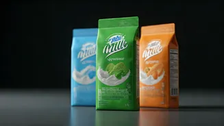
Colors as a Shorthand
In India, milk packets aren't just plain white containers; they burst with color. This isn't for decoration, but rather a clever visual language. Brands
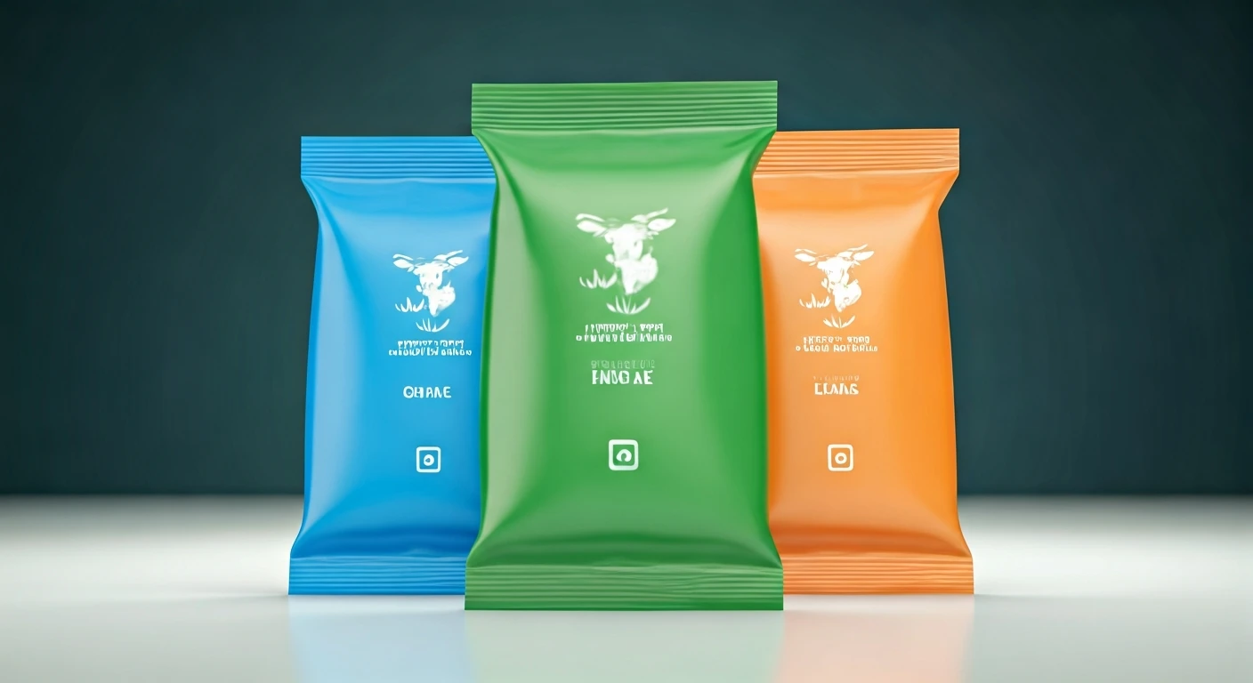
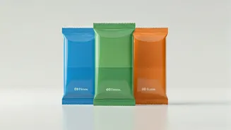
use distinct colors like blue, green, and orange as a quick identifier for the milk's fat percentage and type. This system acts as an everyday shorthand, allowing consumers to make rapid choices based on their needs, whether for daily tea or cooking. For example, standardized government guidelines often associate blue with toned milk (around 3.0% fat), green with standardized milk (approximately 4.5% fat), and orange with full cream milk (roughly 6.0% fat). Some might also use magenta for double-toned milk, which has a lower fat content of about 1.5%. This means the packet's hue is integral to its product identity, enabling shoppers to instantly select their preferred milk variant without deciphering technical nutritional information.
Why Dairies Use Colors
Milk is a common household staple, often purchased automatically. In the fast-paced world of grocery shopping, especially for frequently bought items, decision-making speed is paramount. Implementing a color-coded packaging strategy significantly reduces potential confusion, particularly when multiple milk variations are lined up on shelves. This system effectively translates technical details, like fat percentages, into easily understandable visual cues. This is especially beneficial in a diverse market where consumers range from busy professionals to home cooks. Furthermore, many families opt for consistent milk purchases over long periods. These distinct colors, consistently applied across various brands and linked to fat content and intended use, ensure that the selection process is swift and intuitive, serving a practical purpose beyond mere aesthetics.
Color vs. Milk Quality
A common misconception is that brighter or darker colors on milk packets signify superior quality. However, this is not how the color-coding system functions. The colors primarily indicate the milk's type and its corresponding fat content, rather than denoting one packet's absolute superiority over another. Each distinct milk category serves a different purpose: double-toned milk is the lightest, toned milk offers a balance, standardized milk is richer, and full cream milk is the densest. Therefore, determining the 'best' packet is subjective and depends entirely on individual household preferences. Some families prefer lighter milk for everyday consumption, while others choose richer milk for its enhanced taste, texture, and culinary applications. The color coding simplifies this choice, alleviating the need to scrutinize nutritional facts regularly.
Part of Daily Life
The way milk packet colors have integrated into India's everyday vocabulary is remarkable. While exact fat percentages might be forgotten, the associated colors – blue, green, and orange – are easily recalled. Over time, these colors have evolved into an efficient shorthand, easily communicated and passed down through generations. This is why you might hear someone casually ask for 'the blue packet,' and everyone in the household instantly understands the request without further explanation. This phenomenon highlights how seemingly mundane items like milk packets can carry a sense of personal history and cherished memories. The colors associated with milk choices from childhood can significantly influence purchasing preferences, even subconsciously. Ultimately, a simple design choice plays a profound role in shaping consumer habits.
Small Design, Big Convenience
The array of colors on milk packets might initially seem like a minor branding quirk. However, upon closer inspection, these vibrant hues form a concise and effective language designed to enhance consumer convenience. The different shades of blue, green, and orange are crucial in enabling shoppers to make quick, informed purchasing decisions, easily distinguishing between milk varieties to select products that align with their preferences and dietary needs. In official dairy product classifications, these colors are not random but are systematically linked to specific fat content percentages and clearly defined milk categories. This systematic approach is why the color-coding system has remained relevant and effective. Its ease of comprehension, memorability, and practicality make it an exceptionally functional design choice, achieving the goal of exemplary design in the fast-paced rhythm of daily life.