



What's Happening?
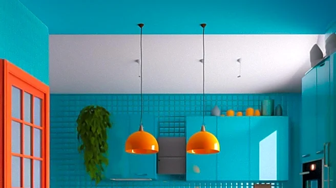
Interior design experts are cautioning against certain color combinations in kitchens, emphasizing that while experimental and colorful designs are trending, some pairings can lead to undesirable outcomes. Annie Burrows, lead designer at Blakes London,
advises limiting kitchens to one strong statement color, as combining two or more very strong colors, such as yellow and purple or green and red, can make the space feel overwhelming or corporate. She specifically notes that green and red together often evoke a 'Christmas palette,' which is generally not suitable for year-round kitchen aesthetics. Jayne Everett, creative director of Naked Kitchens, suggests avoiding the traditional high-contrast black-and-white combination, arguing that it can lack 'soul' and appear too stark or clinical. Instead, she recommends using 'whisper' tones—whites with a hint of color, cream, or beige—to achieve a softer, more inviting light-and-dark effect. Tamsin Holland, a kitchen design expert at Paula Rosa Kitchens, warns against pairing two dark shades like navy and black, as this can make a kitchen feel oppressively dark and heavy, rather than dramatically sophisticated. The consensus among these experts is that careful consideration of color balance and association is crucial for creating a functional and aesthetically pleasing kitchen space.
Why It's Important?
The advice from these design experts is important for U.S. homeowners and the interior design industry, as it highlights evolving trends and common pitfalls in kitchen aesthetics. Kitchens are often considered the heart of the home, and their design significantly impacts daily life and property value. By steering clear of combinations like green and red, which carry strong seasonal connotations, or stark black and white, which can feel unwelcoming, homeowners can create more enduring and appealing spaces. This guidance can influence consumer choices in paint, cabinetry, and decor, potentially leading to a shift away from overly bold or high-contrast schemes towards more nuanced and harmonious palettes. For businesses in the home improvement and design sectors, understanding these preferences is crucial for product development and marketing strategies. The emphasis on 'soulful' and 'inviting' spaces over merely 'modern' or 'bold' ones reflects a broader cultural shift towards comfort and personalization in home environments, impacting everything from material selection to overall design philosophy.
What's Next?
In response to these expert recommendations, consumers are likely to see a continued emphasis on balanced and thoughtful color application in kitchen design. Home improvement retailers and design firms may adjust their offerings to promote more sophisticated neutral palettes, warmer tones, and single-statement color schemes, moving away from combinations deemed problematic. Educational content from designers and home decor publications will likely reinforce these principles, guiding homeowners toward choices that enhance comfort and longevity. We might also see an increase in demand for design consultations focused on color theory and personalized palette creation, as homeowners seek to avoid common mistakes and create unique yet timeless kitchens. The industry could also explore innovative ways to incorporate color through easily changeable elements, such as accessories or lighting, allowing for seasonal updates without committing to permanent, potentially problematic color pairings.
Beyond the Headlines
The discussion around kitchen color combinations extends beyond mere aesthetics, touching upon psychological and cultural dimensions of home design. The experts' warnings against certain pairings, such as green and red evoking Christmas or black and white feeling 'soulless,' underscore how deeply colors are intertwined with human emotion and cultural associations. A kitchen's color scheme can subtly influence mood, perceived warmth, and even social interaction within the space. The push for 'soulful' and 'inviting' kitchens reflects a desire for homes to be sanctuaries that offer comfort and personal expression, rather than just functional areas. This trend also highlights the increasing value placed on timeless design over fleeting fads, suggesting a more conscious approach to consumption and investment in home aesthetics. Ultimately, the choice of kitchen colors becomes a reflection of broader societal values, emphasizing well-being, personal connection, and sustainable design principles that prioritize longevity and emotional resonance.