







What's Happening?
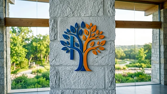
The Homewood-Flossmoor Park District has officially unveiled its new logo following a year-long process of study, design, and critique. The new multi-colored logo is designed to evoke the impression of a tree. Within the logo's design, different colors
are utilized to subtly form the letters 'H' in blue and 'F' in shades of orange, representing Homewood and Flossmoor. Bob Birgel, the marketing and public relations manager for the district, stated that the new logo aims to honor the district's rich history while simultaneously embracing the bright future of its parks.
Why It's Important?
The unveiling of a new logo for the H-F Park District is a significant branding initiative that reflects the district's identity and future aspirations. A well-designed logo can enhance public perception, foster community pride, and improve recognition of the park district's services and facilities. The tree motif symbolizes nature, growth, and community, aligning with the core mission of a park district. The subtle incorporation of 'H' and 'F' reinforces local identity and connection to the Homewood and Flossmoor communities. This rebranding effort can help the district better engage with residents, attract new visitors, and potentially secure funding or support for future projects, ultimately benefiting the local lifestyle and recreational opportunities.
What's Next?
Following the unveiling, the H-F Park District will likely begin implementing the new logo across all its official materials, including signage, websites, promotional literature, and uniforms. This transition will involve a phased rollout to ensure consistency and widespread adoption. The district may also launch a public awareness campaign to introduce the new logo to the community and explain its symbolism. Feedback from residents and stakeholders will be important in assessing the success of the rebranding effort. The new visual identity is expected to support the district's marketing and outreach efforts, potentially leading to increased participation in programs and events, and a stronger sense of community ownership over the parks.
Beyond the Headlines
The process of rebranding, even for a local park district, often reflects deeper organizational goals and community values. A new logo can signal a period of renewal, modernization, or a strategic shift in focus. In this case, the emphasis on both 'rich history' and 'bright future' suggests a desire to balance tradition with innovation. The tree imagery, a universal symbol of nature and sustainability, also subtly aligns with broader environmental consciousness and the importance of green spaces in urban and suburban environments. This rebranding could serve as a catalyst for new initiatives, partnerships, or even a re-evaluation of the district's long-term vision for community recreation and conservation, impacting the overall quality of life for residents.