






What's Happening?
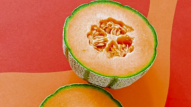
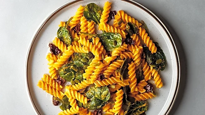
Food-inspired color palettes are being strategically utilized to enhance the visual appeal of food-related content and strengthen branding. These palettes match the visual characteristics of food with appropriate settings and branding elements. For instance,
rustic browns are often chosen for homemade meals, bright citrus tones for summer recipes, and dark chocolate shades for premium or cinematic content. Consistent branding, maintained across intros, transitions, recipe steps, channel banners, social posts, and end screens, helps viewers quickly recognize content. Testing colors on various screens and export settings is crucial, as bright colors like reds, yellows, and greens can appear more intense after compression on social media platforms. Warm tones such as reds, oranges, and yellows are employed to make cooked dishes, sauces, baked goods, and roasted ingredients appear more appetizing. Conversely, green accents are used to suggest freshness, herbs, vegetables, sustainability, or natural ingredients, with saturation controlled to avoid overpowering existing greens in footage. A robust palette typically incorporates one dominant color, one supporting color, and one accent color to establish a clear visual hierarchy. Additionally, ensuring sufficient text contrast on thumbnails, title cards, and lower thirds is vital, with dark text performing well on pale backgrounds and white text requiring a deep or dark background.
Why It's Important?
The strategic application of food-inspired color palettes holds significant importance for U.S. industries, particularly in food media, marketing, and branding. By influencing viewers' perceptions of taste, freshness, comfort, and quality, these palettes can directly impact consumer engagement and product appeal. For food brands, restaurants, and content creators, a well-chosen color scheme can make videos and images more memorable, fostering a consistent visual identity that resonates with target audiences. This consistency is crucial for brand recognition and recall in a competitive market. The use of warm, appetizing colors can drive consumer desire and potentially increase sales for food products, while fresh, natural palettes can appeal to health-conscious consumers. The ability to evoke specific moods—such as comfort, energy, health, or luxury—through color directly translates into effective marketing campaigns. Furthermore, the technical considerations of color testing across different screens and export settings highlight the need for meticulous execution to ensure brand messaging is accurately conveyed, preventing visual distortion that could undermine marketing efforts. This attention to detail is essential for maintaining a professional image and maximizing the impact of visual content in the digital age.
What's Next?
The continued evolution of digital media platforms and consumer preferences will likely drive further sophistication in the use of food-inspired color palettes. Content creators and brands are expected to increasingly leverage advanced tools, such as AI color palette features, to maintain visual consistency across diverse content formats and platforms. This will enable them to transfer specific color characteristics, like warm highlights or balanced green accents, to various clips, unifying footage from multiple cameras or different shooting environments. The integration of HSL controls, color wheels, and curves will become more prevalent for fine-tuning color intensity and achieving precise aesthetic outcomes, allowing for adjustments like enhancing orange saturation for roasted tones or softening bright yellows for a polished look. Furthermore, the adoption of video filters and 3D LUTs will simplify the stylization process, enabling creators to apply consistent looks across series, promotions, and social videos while preserving the natural textures and colors of food. As consumer demand for visually engaging and authentic content grows, the strategic development and application of these color palettes will remain a critical component of successful branding and marketing in the food industry.
Beyond the Headlines
Beyond the immediate marketing and branding benefits, the sophisticated use of food-inspired color palettes touches upon deeper psychological and cultural dimensions. Color theory, when applied to food, taps into primal human responses, influencing appetite, mood, and perception of quality. The deliberate choice of colors like warm reds and oranges to signify appetizing qualities, or greens for freshness, leverages universal associations that transcend linguistic and cultural barriers to some extent. This strategic deployment of color can subtly shape consumer behavior and preferences, fostering emotional connections with food products and brands. Ethically, this raises questions about the potential for manipulation, as colors can make less healthy foods appear more appealing or natural. Culturally, these palettes reflect and reinforce contemporary aesthetic trends, influencing not only how food is presented but also how it is consumed and perceived in society. The emphasis on consistency across various media platforms also underscores the pervasive nature of visual branding in modern life, where a brand's identity is meticulously crafted and maintained across every touchpoint, from a social media post to a product's packaging. This continuous visual reinforcement contributes to a broader cultural landscape where aesthetics play an increasingly dominant role in consumer choices and experiences.