



What's Happening?
Pantone, the global authority on color, has introduced 224 new shades to its Pantone Matching System (PMS). This expansion, the first since December 2022, brings the total library to nearly 9,000 colors. The new additions span every color family, including
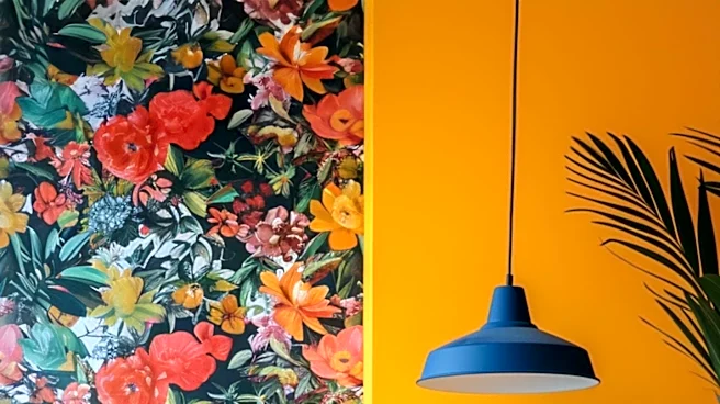
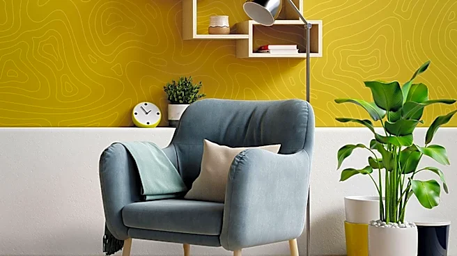
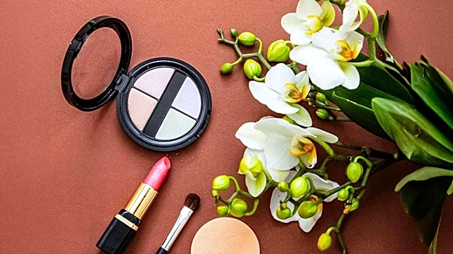
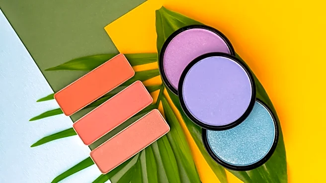
pink-infused reds, romantic roses, floral and fruity oranges, musky and citrusy yellows, restorative greens, meditative blues, and purples ranging from dusky to glamorous. According to Cindy Cooperman, general manager and vice president of Pantone, this move reflects a broader trend towards maximalism and emotional expression in design. The new colors are engineered to ensure consistent reproduction from digital concepts to physical products and are intended for graphic and product designers, brands, printers, converters, and ink manufacturers. Pantone also grouped 20 of these new shades into four trend palettes, such as 'Desire for Pleasure' with playful pinks and aquatic blue, and 'Desire for Exquisite' featuring chocolate and grape tones, to demonstrate how bolder colors can be utilized.
Why It's Important?
This significant expansion by Pantone signals a notable shift in design trends within the U.S. and global markets, moving away from minimalist aesthetics towards more vibrant and expressive maximalism. For industries such as fashion, interior design, product manufacturing, and graphic design, these new colors provide an expanded palette for creativity and differentiation. Brands can leverage these high-impact hues to evoke specific emotional responses from consumers, potentially influencing purchasing decisions and brand perception. The emphasis on technical consistency in color reproduction is crucial for businesses, ensuring that brand identity remains cohesive across various platforms and products. This development could lead to a resurgence of bold and colorful designs in consumer goods, advertising, and digital media, impacting market aesthetics and potentially driving new product development cycles. Designers and manufacturers who adopt these new shades early may gain a competitive edge in capturing consumer attention in an increasingly visually-driven market.
What's Next?
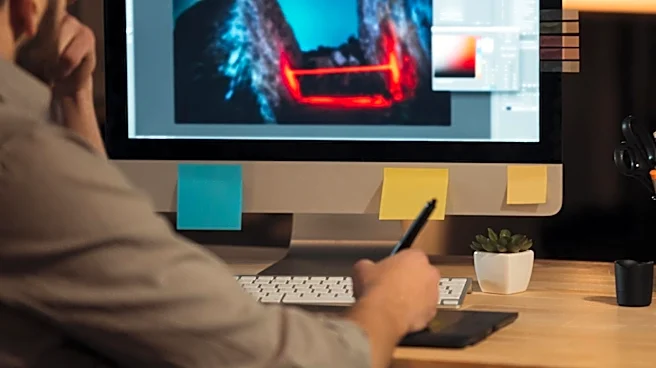
The newly introduced Pantone colors will be integrated into Pantone’s Formula Guide, Color Bridge, and Solid Chips Set, available on both coated and uncoated paper stock. Existing customers will have the option to update their collections with supplemental guides and chip pages, avoiding the need for full replacement. Digital versions of these new colors will also be accessible through Pantone Connect and its extension for Adobe Creative Cloud, facilitating their adoption in digital design workflows. The company anticipates that designers and brands will increasingly embrace these colors as a means of bold expression, focusing on the emotional impact they create for their audiences. This suggests a future where more assertive and emotionally resonant color combinations become prevalent across various design disciplines, from product packaging to digital interfaces. The continued emphasis on technical precision in color reproduction will remain a priority for Pantone, ensuring that creative freedom is balanced with consistent execution.
Beyond the Headlines
The introduction of 224 new colors by Pantone, driven by a perceived shift towards maximalism, highlights a deeper cultural and psychological trend. In an era often characterized by digital saturation and information overload, the embrace of bold, high-impact colors and expressive design may serve as a counter-narrative, offering a sense of confidence and emotional connection. This move could reflect a collective desire for more sensory richness and individuality in a world that has, for years, leaned into the understated elegance of minimalism. Ethically, the consistent reproduction of these colors across different mediums is vital for consumer trust and brand integrity, ensuring that what is advertised is what is delivered. Culturally, this trend could influence everything from fashion and home decor to digital user interfaces, potentially leading to a more visually stimulating and emotionally engaging environment. The expansion also underscores the ongoing interplay between artistic expression and scientific precision in the design world.