



What's Happening?
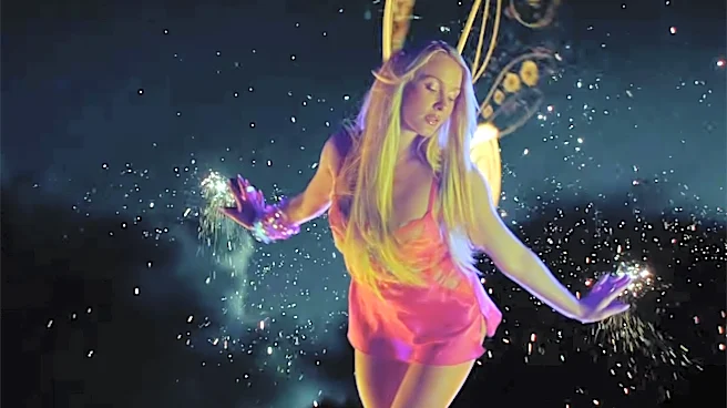
Singer Tate McRae has released a teaser for her new single, 'Housewife,' which has drawn criticism from designers due to its font choice. The single's branding prominently features an ultra-light Helvetica font, a decision that has surprised and, in some
cases, appalled creatives. While the moody superyacht setting of the teaser has generated fan theories, the typography has become a focal point of discussion within the design community. Critics on platforms like X (formerly Twitter) have expressed strong disapproval, with comments ranging from 'It's grotesque tbh' to 'Tate McRae has NO REASON to be using an ultra light Helvetica font.' Some designers have drawn parallels to early 2000s album covers, such as Britney Spears' 'I Love Rock 'N' Roll' and Madonna's 'Bedtime Stories,' suggesting that the use of ultra-light Helvetica is an outdated or poor design choice. However, a minority view suggests that this controversial font choice could be seen as a return to form for pop music design, embracing a certain aesthetic from that era.
Why It's Important?
This incident highlights the significant role of graphic design, particularly typography, in public perception and branding within the music industry. For artists, album and single covers are crucial visual elements that communicate their artistic identity and the mood of their music. A seemingly minor detail like font choice can spark widespread debate among design professionals and the public, demonstrating the impact of visual aesthetics on an artist's image and reception. The strong reactions to McRae's cover underscore the deeply ingrained principles and preferences within the design community regarding font usage, legibility, and contemporary trends. It also reflects a broader conversation about the balance between artistic expression and adherence to design best practices. While some may view the criticism as overly pedantic, it illustrates how design decisions can either elevate or detract from a creative work, influencing how it is perceived by both industry insiders and the general audience. This discussion also brings to light the cyclical nature of design trends, where elements once considered outdated can sometimes be re-evaluated or re-appropriated.
What's Next?
The immediate consequence for Tate McRae's single 'Housewife' will likely be continued discussion and debate within design and music circles, potentially generating more publicity for the release, albeit with a focus on its visual design. The controversy might prompt other artists and their design teams to be more mindful of their font choices and overall visual branding, especially when working with iconic or polarizing typefaces. For the design community, this event serves as a case study for discussing contemporary typography trends, the historical context of certain fonts, and the subjective nature of aesthetic appeal. It could also lead to more articles and analyses from design publications exploring the 'dos and don'ts' of font usage in popular culture. Ultimately, the impact on McRae's career or the commercial success of the single is uncertain, as public opinion on design can be highly subjective and often secondary to the music itself for the broader audience. However, it undeniably adds a layer of critical discourse around her artistic presentation.
Beyond the Headlines
Beyond the immediate critique of a single cover, this situation touches upon the broader cultural significance of typography and its evolution. Helvetica, in particular, holds a revered status in design history, often associated with modernism, clarity, and neutrality. Its 'ultra-light' variant, however, can present challenges in terms of legibility and impact, especially in a fast-paced, visually competitive medium like music promotion. The debate reflects a tension between classic design principles and the desire for novelty or a deliberate subversion of expectations. It also highlights the democratization of design critique in the age of social media, where professional opinions are amplified and juxtaposed with casual public reactions. This incident could contribute to a re-examination of how established design rules are applied or broken in contemporary art and commerce, and how these choices resonate with different audiences. It also subtly points to the power of visual language in shaping cultural narratives and the ongoing dialogue between creators and their interpreters.