



What's Happening?
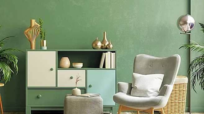
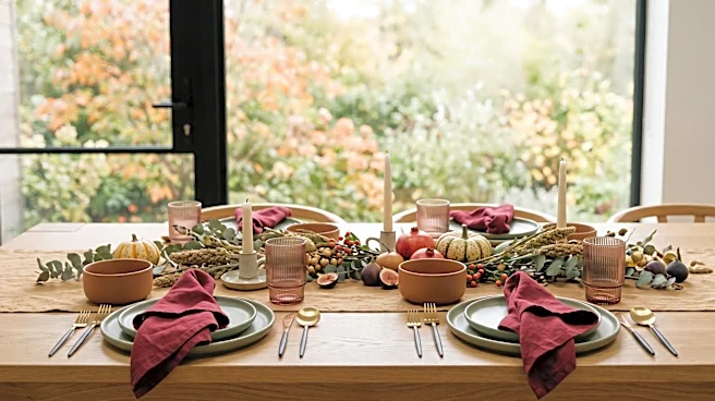
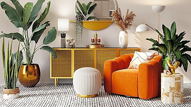
New Thanksgiving color palettes are emerging, moving away from the traditional burnt orange and mustard yellow. One suggested palette incorporates deep cranberry, muted sage, and warm neutral colors, aiming for a more sophisticated aesthetic. This approach
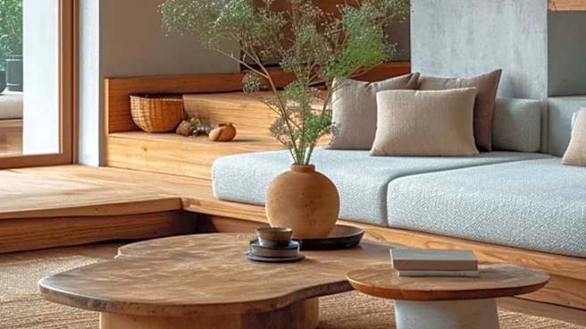
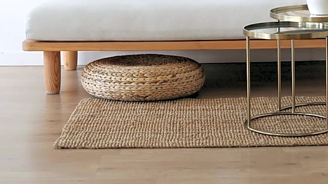
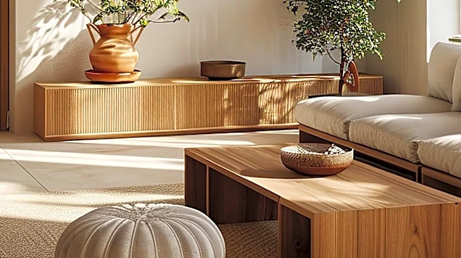
avoids pumpkin orange as the dominant color, instead utilizing it sparingly as an accent. Another modern harvest palette, described as 'Thanksgiving if it moved to Copenhagen,' completely removes pumpkin orange, replacing it with a terracotta color. This palette uses warm sand instead of cream, deep forest green as an anchor, and introduces a dusty rose for a softer feel. These palettes are designed for various applications, including menus, place cards, table linens, and brand refreshes, offering a fresh take on holiday decor and design.
Why It's Important?
The shift in Thanksgiving color palettes reflects a broader trend in design and consumer preferences towards more muted, sophisticated, and less overtly 'seasonal' aesthetics. For businesses in the home decor, event planning, and food industries, understanding and adapting to these evolving preferences is crucial. Offering alternative color schemes can attract a wider customer base seeking unique and elegant holiday experiences. The emphasis on specific color ratios, such as the 60/30/10 rule (60% dominant color, 30% secondary, 10% accent), provides practical guidance for designers and consumers, ensuring harmonious and visually appealing results. This evolution allows for greater creativity and personalization in holiday celebrations, moving beyond conventional themes.
What's Next?
As these modern color palettes gain traction, consumers and businesses can expect to see a wider array of Thanksgiving-themed products and services that incorporate these new aesthetics. Home decor retailers may feature more items in cranberry, sage, terracotta, and warm sand tones for the holiday season. Event planners might offer more customized and elegant Thanksgiving decor options. Food brands could also adopt these palettes in their packaging and marketing to align with contemporary design trends. The continued exploration of alternative color schemes for traditional holidays suggests a growing demand for fresh and personalized approaches to seasonal celebrations, potentially influencing future holiday design trends.
Beyond the Headlines
The move away from traditional, often loud, Thanksgiving color schemes highlights a cultural shift towards subtlety and refined taste in holiday aesthetics. This trend could be seen as a rejection of mass-produced, one-size-fits-all holiday decor in favor of more curated and personal expressions. It also underscores the influence of global design trends, with the 'Copenhagen-inspired' palette suggesting an appreciation for Scandinavian minimalism and earthy tones. This evolution in holiday aesthetics may encourage consumers to invest in more timeless and versatile decor pieces that can be adapted for various occasions, rather than being strictly confined to a single holiday theme, promoting a more sustainable approach to seasonal decorating.