



What's Happening?
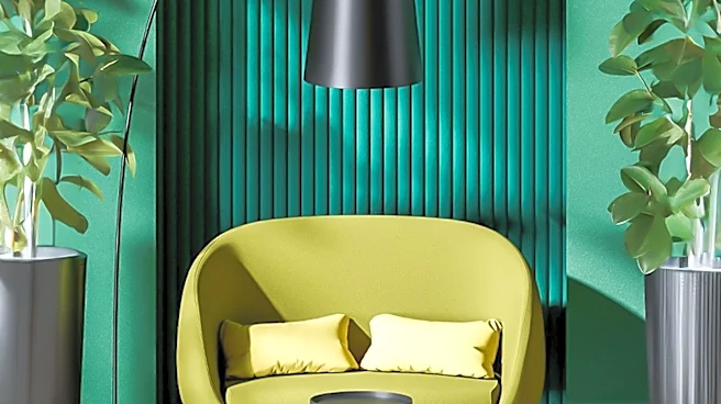
Chartreuse, a vibrant hue between electric green and bright yellow, is gaining popularity in the design world. This color, which dates back to the 18th century, is being embraced by designers for its boldness and versatility. It has been featured in high-end
furniture, fabrics, and home decor, becoming a favorite for creating dramatic and energetic spaces. The resurgence of chartreuse is part of a broader trend towards maximalist design, where homeowners and designers seek colors that make a statement. This trend is evident in various design elements, from upholstery to wall paint.
Why It's Important?
The rise of chartreuse as a popular design color reflects a shift towards more expressive and bold interior design choices. This trend signifies a move away from neutral palettes, as consumers and designers seek to create spaces that are vibrant and full of personality. The adoption of chartreuse in design can influence market trends, encouraging manufacturers to produce more products in this color. It also highlights the cyclical nature of design trends, where historical colors are reimagined for contemporary use. This could lead to a broader acceptance of bold colors in mainstream design, impacting consumer preferences and industry standards.