
What's Happening?
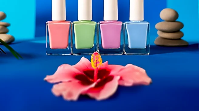
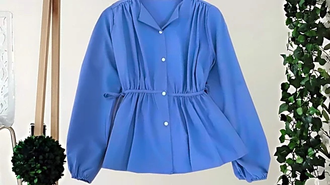
Periwinkle, a soft purple-blue color, is gaining popularity in fashion, decor, and product design. Known for its calming and creative connotations, periwinkle is used to create relaxed and approachable
identities in various industries, including wellness, skincare, and beauty. The color sits between blue and purple on the color wheel, offering a versatile palette that ranges from cornflower blue to lavender-like shades. In 2022, Pantone selected a periwinkle blue called 'Very Peri' as its Color of the Year, highlighting its relevance in contemporary design. Periwinkle is often used in branding to convey creativity and individuality, providing a softer alternative to more vivid shades of blue or purple.
Why It's Important?
The rising popularity of periwinkle reflects broader trends in consumer preferences for colors that evoke calmness and creativity. As people seek comfort and tranquility in their environments, colors like periwinkle become valuable tools for designers and marketers aiming to create soothing and inviting spaces. This trend can influence product development and marketing strategies across various sectors, encouraging brands to incorporate periwinkle into their offerings. Additionally, the color's association with creativity and individuality makes it appealing for brands looking to differentiate themselves in a competitive market. As a result, periwinkle's popularity can drive innovation in design and branding, shaping consumer experiences and preferences.