



What's Happening?
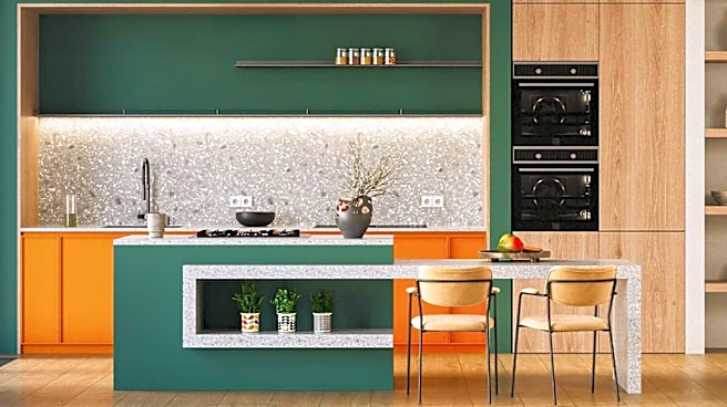
A Warsaw home, designed by Ada Wrońska of Plural by Design, has incorporated food-inspired color palettes to create a vibrant and personal living space. The kitchen, a central element, features a blend of dusty pinks, burgundy, various shades of blue,
and touches of yellow. This selection was driven by the client's desire for a specific atmosphere, drawing inspiration from Italian landscapes, particularly Liguria, known for its contrasting sea, mountains, and colorful architecture. The design aims to evoke a sense of discovery and energy, reflecting the homeowners' passion for travel, food, and Italy, where they own several renowned Italian restaurants. The overall approach avoids a perfectly coordinated look in favor of a more alive and expressive interior, utilizing unexpected color combinations that harmonize throughout the open-plan living areas.
Why It's Important?
This design approach highlights a growing trend in interior design where personal narratives and passions, such as culinary interests and travel experiences, directly influence aesthetic choices. By using food-inspired color palettes, the home achieves a unique character that moves beyond conventional design trends, offering a personalized and emotionally resonant environment. This method can inspire homeowners and designers to explore more unconventional sources for color schemes, fostering spaces that are deeply connected to the occupants' identities. The integration of diverse colors and textures also demonstrates how thoughtful design can transform potentially awkward layouts into cohesive and visually engaging areas, proving that functionality and personal expression can coexist effectively in residential architecture.
What's Next?
The success of this project may encourage more designers and homeowners to experiment with unconventional inspirations for interior aesthetics, moving away from standardized palettes. We might see an increase in demand for bespoke design solutions that deeply integrate client hobbies and cultural backgrounds. This could lead to a broader acceptance of bolder, more eclectic color schemes in residential and commercial spaces. Furthermore, the emphasis on creating 'alive' rather than 'perfectly coordinated' interiors suggests a shift towards more authentic and lived-in design philosophies, potentially influencing future trends in furniture, material selection, and overall spatial planning.
Beyond the Headlines
Beyond its aesthetic appeal, this design project touches upon the psychological impact of color and environment on daily life. The deliberate choice of colors inspired by food and travel aims to create an atmosphere of discovery and joy, suggesting that our living spaces can actively contribute to our well-being and mood. This approach challenges the notion that interiors must adhere to strict stylistic rules, instead advocating for spaces that evolve from personal stories and sensory experiences. It underscores the idea that a home can be a dynamic reflection of its inhabitants' lives, fostering a deeper connection between people and their immediate surroundings, and potentially influencing how we perceive and interact with our personal environments.