
What's Happening?
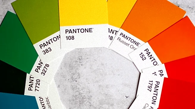
Pantone LLC, a global authority on color, has introduced 224 new colors to its Pantone Matching System (PMS), increasing the total library to nearly 9,000 shades. This expansion is a response to a growing trend in design that moves away from stark minimalism
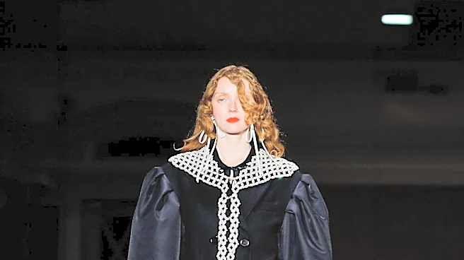
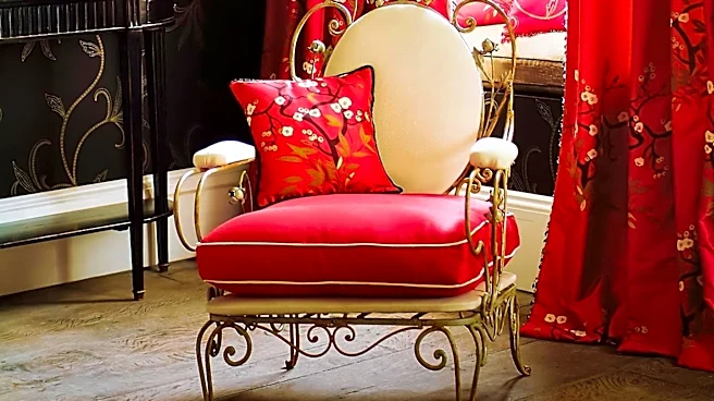
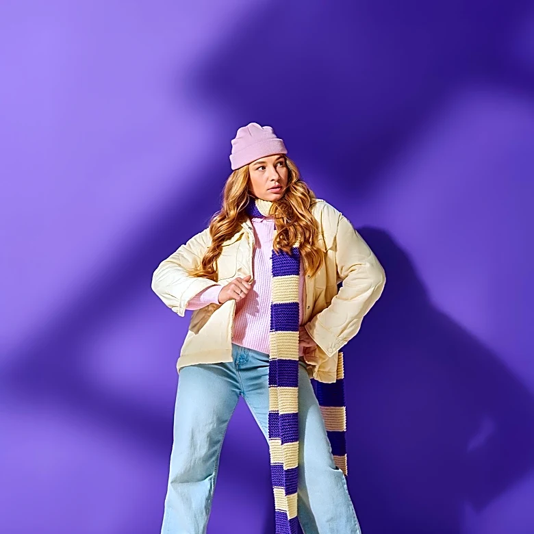
towards bold, expressive, and emotion-driven color palettes. The new additions aim to provide designers with a wider range of saturation and feeling to incorporate into their work, aligning with a surge of interest in maximalism and mood-boosting colors across various design fields, including fashion, interiors, product, and graphic design. The new colors are engineered for real-world production, available on both coated and uncoated paper stock, ensuring stability, consistency, and reproducibility from screen to physical product. The Pantone Color Institute and Pantone’s color scientists collaborated to identify and integrate these new hues, which deepen every color family within the system. For instance, reds now include pink-infused tones, pinks range from romantic to playful, oranges are vibrant and earthy, and yellows offer a culinary range. Cooler tones like greens are fresh and restorative, blues are expansive, and purples cater to a desire for glamour. The collection also includes new browns, taupes, neutrals, and versatile grays.
Why It's Important?
This significant expansion of the Pantone Matching System reflects and reinforces a major shift in U.S. design and consumer trends. The move towards bolder, more expressive color palettes indicates a broader cultural desire for individuality and emotional connection in products and environments. For industries such as fashion, interior design, product manufacturing, and graphic design, these new colors offer enhanced creative possibilities, allowing designers to better meet evolving consumer preferences. The emphasis on reproducibility and consistency across physical and digital mediums is crucial for brands, ensuring that their visual identity remains cohesive and accurate from concept to market. This development can influence product development cycles, marketing strategies, and consumer purchasing decisions, as color plays a vital role in brand recognition and emotional appeal. Businesses that adopt these new trends effectively may gain a competitive edge, while those that lag could appear outdated. The expansion also highlights the increasing importance of color science and trend forecasting in commercial success, impacting how products are designed, manufactured, and presented to the U.S. market.
What's Next?
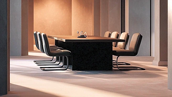
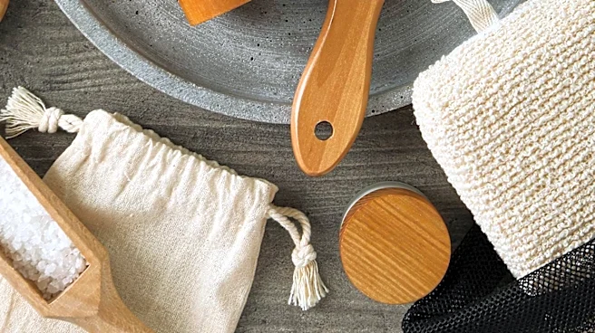
Designers and brands are expected to integrate these new Pantone colors into their upcoming collections and projects, influencing future product launches and marketing campaigns across various sectors. Pantone has already translated its trend research into four ready-made palettes—Desire for Pleasure, Desire for Exquisite, Oxygenating, and Beyond Boundaries—to inspire designers and showcase how these bold colors can be combined. These palettes will likely serve as starting points for many creative endeavors. The new colors are available across Pantone's iconic Formula Guide, Color Bridge, and Solid Chips Set, with supplements offered for existing customers. Digital access through Pantone Connect and the Pantone Connect Extension for Adobe Creative Cloud will facilitate faster exploration, sharing, and specification within designers' existing workflows. This digital integration will streamline the design process, enabling quicker adoption of the new color trends. Renowned graphic designers, such as Aaron Draplin of Draplin Design Co., are already putting these new palettes to use, demonstrating their practical application and potential impact on the design landscape. The continued adoption of these colors will likely shape consumer aesthetics and market offerings in the coming years.
Beyond the Headlines
The introduction of these new colors by Pantone extends beyond mere aesthetic choices; it signifies a deeper cultural and psychological shift in how consumers interact with their environment and products. The move from minimalism to maximalism, characterized by bold and emotion-driven colors, suggests a collective yearning for joy, self-expression, and a departure from austerity. This trend could be a reflection of broader societal sentiments, where individuals seek more vibrant and personalized experiences in their daily lives. Ethically, the emphasis on accessibility and reproducibility ensures that these design trends are not limited to high-end markets but can be adopted across various price points, potentially democratizing access to contemporary aesthetics. Legally, the precise color matching provided by Pantone helps prevent brand dilution and ensures intellectual property protection for specific color identities. Culturally, the integration of these colors into everyday products, from home decor to fashion, will subtly influence public taste and visual literacy, fostering a more colorful and expressive visual landscape across the U.S. This evolution in color preference also highlights the cyclical nature of design trends, where periods of restraint often give way to periods of exuberance, reflecting the dynamic interplay between societal mood and artistic expression.