





The visual identity of a professional sports team often becomes as iconic as its on-field performance, and the Miami Dolphins are no exception. From their inception, the team's colors, logo, and uniform designs have evolved, reflecting both tradition and changing aesthetics. For decades, the Dolphins maintained a consistent and recognizable look, deeply rooted in the vibrant character of South Florida. This journey through their visual history reveals
how the team's aesthetic choices have contributed to its enduring brand, from the original leaping dolphin to modern updates and special uniform editions.
The Original Look: 1966 to 2012
From the team's founding in 1966 through 2012, the Miami Dolphins' logo and uniforms remained largely consistent, establishing a classic and beloved image. The team's original colors were aqua and coral. The choice of coral was a deliberate tribute, honoring the Miami Seahawks, a previous professional football team in the area, and also acknowledging the numerous natural coral reefs found in Biscayne Bay. The initial logo featured a sunburst design, with a leaping dolphin positioned within it. This dolphin wore a football helmet that prominently displayed the letter "M." While the core elements remained, there were subtle variations in the logo's presentation over the years. At its debut in 1966, a lighter and brighter orange was used instead of a deep coral. The dolphin's head was initially near the center of the sunburst. In the 1967 season, the dolphin was centered on the sunburst, though it reverted to its original placement between 1968 and 1973. By 1974, the dolphin's body was centered on the sunburst, appearing in a slightly smaller version than the 1967 design.
Uniform Design and Practicality
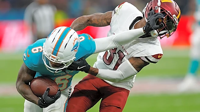
The Dolphins' uniforms during this long period were designed with both aesthetics and the South Florida climate in mind. The team consistently wore white pants adorned with aqua and orange stripes. These pants were paired with either a white or an aqua jersey. The white jersey, featuring aqua block numbers and names outlined in orange, along with aqua and orange sleeve stripes, became the primary uniform for road games and daytime home games. This choice was largely practical, as the lighter color helped mitigate the extreme heat prevalent in South Florida. Conversely, the aqua jersey, which displayed white block numbers and names with an orange outline and orange and white sleeve stripes, was predominantly used for night home games or for road games where the opposing team opted to wear white. This dual-jersey system allowed the team to adapt to different playing conditions while maintaining a distinct visual identity.
Updates and Special Editions
As the years progressed, the Dolphins' visual identity saw some updates and special variations. In 1997, the logo received a refresh; the sunburst was simplified, and the dolphin itself was darkened and given a more serious, "game-face" expression. While the uniforms largely retained their overall design, a different block number font was introduced, and navy drop shadows were added to the numbers and names. On rare occasions, an orange jersey was utilized for primetime games, offering a vibrant alternative. These orange jerseys essentially swapped the placement of orange and aqua from the regular aqua jersey. The orange jersey made its debut on a Sunday night in 2003, resulting in a Dolphins win against Washington. It reappeared in 2004 for a Monday Night Football match where the 2–11 Dolphins achieved a significant upset victory against the 12–1 defending champion New England Patriots, a game affectionately known in some Dolphin circles as "The Night That Courage Wore Orange." The orange jerseys were also worn for a 2009 Monday night win against the New York Jets, though the team experienced its first loss in orange during a 2010 Sunday night matchup with the Jets, after which the original style orange jerseys were not worn again.
Footwear and Farewell to an Era
Even the team's footwear saw changes over time, reflecting broader trends in the NFL. In 2009, the Dolphins switched to black shoes, a departure from their long-standing tradition and the first time since their "glory days" in the early 1970s. This move aligned with a recent trend among other NFL teams. However, by 2011, the team reverted to wearing white shoes. The end of the 2012 season marked a significant moment in the Dolphins' visual history. Their final game in the original style uniforms, characterized by block numbers and the iconic leaping dolphin logo, was a 28–0 shutout loss to the New England Patriots in Foxboro. The white jerseys were worn for this game. With rumors of a new look circulating, many fans watching understood that it would likely be the last time their team would don the beloved leaping dolphin logo, signaling the close of a long-standing chapter in the franchise's aesthetic evolution.