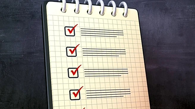






Designing an effective checklist is more than just listing tasks; it's a nuanced process that considers human psychology, operational context, and practical usability. A well-designed checklist can significantly reduce errors and improve efficiency, but its success hinges on how it is perceived and interacted with by its users. If a checklist is seen as a top-down control mechanism, it's likely to be rejected. However, if it's viewed as a helpful
tool that saves time and reduces mistakes, it stands a much better chance of acceptance and successful implementation. Involving the end-user in the development process is often key to achieving this positive perception.
Tailoring Design for Acceptance and Efficiency
One of the primary objectives in checklist design is to foster a positive attitude among operators towards its use. This means the checklist must be realistic, convenient, and not perceived as a nuisance. It should describe and facilitate a physical procedure that operators recognize as necessary, effective, efficient, and convenient. The workload and available time for completing the checklist must also be carefully considered. Each item on the list should be essential, and collectively, they should be sufficient to cover the task. Only necessary instructions should be included, and the checklist should be as brief as possible without sacrificing clarity.
Items should avoid being overly detailed or ambiguous. While a checklist doesn't typically define procedures already familiar to the checker, critical steps can be usefully listed in order when sequence is important. Numbering items often aids in place-keeping, helping users track their progress. It can also be beneficial to cross-reference the checklist with a standard procedure document, providing detailed information for training and auditing without cluttering the checklist itself. Including a version number and date ensures that the most current authorized version is always in use.
Physical Characteristics for Optimal Readability
The physical characteristics of a checklist, such as its actual size, contrast, color, and typography, are crucial for its effectiveness. The legibility of text and readability under expected usage conditions are paramount. Legibility involves selecting characters that are easily identifiable and distinguishable from others. Readability, on the other hand, refers to the quality of words or text that allows for rapid recognition of single words, word groups, abbreviations, and symbols. Research suggests that sans-serif fonts like Arial or Helvetica are generally more legible than Roman fonts due to their simpler, cleaner typeface.
Furthermore, lowercase text is often more legible because the overall pattern of the word is more familiar, and the ascenders and descenders aid recognition. While occasional uppercase words for emphasis or acronyms are acceptable, especially if common usage, they should be used sparingly. Font size is another critical factor, particularly for older operators; a size between 14 and 20 points is recommended for well-illuminated conditions, with anything less than 10 points generally not advised. For poorly lit environments, a larger font size is necessary. High contrast, such as black text on a white background, is generally preferred, though a yellow background can be acceptable in some cases. Other factors like horizontal and vertical character spacing, stroke width, character height-to-width ratio, and line length also influence readability. Italics can reduce readability for large blocks of text but are fine for emphasizing a few words. Bolding can be useful for emphasis but should be used discreetly. Multiple typefaces in body text can be confusing and should be avoided. If checklists are plastic laminated, an anti-glare finish is important to prevent disruptions from highlights, and paper opacity matters if printed on both sides or used with backlighting.
Modes of Use and Layout Strategies
Checklists can be used in different modes, each with its own merits and suitable applications. In the