




Embrace the Narrative, Not Perfection
The most compelling vintage gallery walls tell a story. Instead of seeing a collection of frames, viewers should feel a sense of history and personality. This means letting go of the need for perfect symmetry and matching sets. The goal is to create a composition
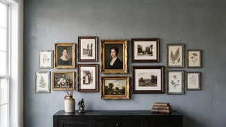
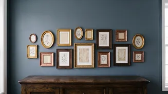
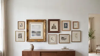
that feels curated and intentional, even in its eclecticism. Think of your wall as a conversation between different eras and styles. A rustic wooden frame can sit beautifully next to an ornate gilded one if they are connected by a shared theme or colour in the artwork they hold. The charm lies in the imperfection and the personal story each piece contributes to the whole. This approach turns a blank wall into a focal point that reflects your unique taste and experiences.
Find a Unifying Element
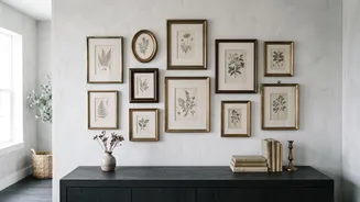
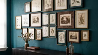
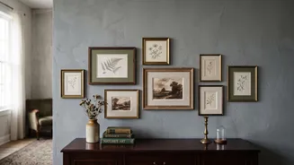
Without matching frames, your gallery wall needs a different unifying thread to prevent it from looking messy. This common element is the secret to making a diverse collection feel cohesive. It could be a consistent colour palette within the artwork, such as all black-and-white photos, sepia tones, or prints that share shades of blue or green. Another strategy is to focus on a theme, like botanical illustrations, family portraits, landscapes, or architectural drawings. You could also unify the display through the frame material, even if the styles differ—for example, a mix of various wood tones or a collection of different metallic finishes like brass and gold. This common thread guides the eye and makes the entire arrangement read as a single, deliberate statement.
Master the Art of Layout
An effortless look is rarely achieved without effort. The key to a successful non-uniform gallery wall is planning the layout before a single nail hits the wall. A trusted method is to trace each frame onto craft paper, cut out the templates, and tape them to the wall. This allows you to experiment with arrangements, step back, and see how the composition feels. Start by placing your largest or most impactful piece, known as the 'anchor', slightly off-centre at eye level. Then, build the rest of the arrangement around it, balancing larger pieces with clusters of smaller ones. Pay close attention to spacing; keeping a relatively consistent gap of two to three inches between frames helps create a sense of rhythm and prevents the wall from feeling cluttered.
Vary Size, Shape, and Texture
Visual interest in a gallery wall comes from variety. Don't be afraid to mix different frame sizes, shapes, and orientations. A blend of large, medium, and small pieces creates a dynamic rhythm that is more engaging than a wall of all same-sized frames. Incorporate both vertical (portrait) and horizontal (landscape) orientations to add movement. The frames themselves offer another opportunity for texture. Combine simple, clean-lined frames with more ornate, detailed ones. Mixing materials like wood, metal, and even painted finishes adds depth and character. You can even introduce unconventional shapes like oval or circular frames to break up the expected grid of rectangles and squares. This intentional contrast is what gives a vintage gallery wall its signature layered and collected feel.
Incorporate Objects Beyond Pictures
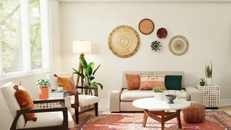
A truly memorable vintage gallery wall often includes more than just framed prints. Introducing three-dimensional objects adds texture, depth, and a surprising element that can elevate the entire display. Consider hanging a small, antique mirror with a unique shape, a decorative plate, a small floating shelf holding a keepsake, or even a piece of framed textile or embroidery. These objects break up the flatness of a wall filled only with pictures and enhance the feeling that the collection was gathered over time. The key is moderation; one or two well-placed objects are enough to add interest without overwhelming the artwork. They should complement the narrative of your wall, contributing another layer to its story.