





Mastering the Power of Scale
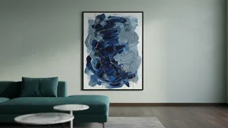
The most common mistake when choosing art is selecting a piece that is too small for the wall. A lone, undersized canvas above a large sofa can look lost and unfinished, making the room feel unbalanced. When it comes to statement art, the goal is to create
a focal point, not an afterthought. A good rule of thumb is to choose artwork that spans roughly two-thirds to three-quarters of the width of the furniture it hangs above, such as a bed or console table. For a standalone piece on an empty wall, the same logic applies to the width of the wall itself. If you have high ceilings, think vertically with taller canvases to draw the eye upward and create a sense of grandeur. Don't be afraid to go big; a larger piece creates a more luxurious and professionally designed appearance. If one oversized piece feels too daunting, a curated set of two or three frames can work together as a single, large-scale unit to achieve the same effect.
Finding the Perfect Eye Level
Hanging art too high is another frequent error that can make a piece feel disconnected from the room and its furniture. The professional standard, used by galleries and designers, is to hang artwork so that its centre point is at eye level. For most homes, this means the dead centre of the artwork should be between 57 and 60 inches from the floor. This measurement provides a comfortable viewing height for most adults and ensures the art feels integrated into the space. However, this rule needs adapting based on the context. In a dining room or living room, where people are mostly seated, you might hang the art slightly lower so it can be enjoyed without straining. When placing art above furniture like a sofa, console, or headboard, a different rule applies. The bottom of the frame should be about 4 to 8 inches above the furniture, creating a cohesive visual link. This prevents the art from appearing to float awkwardly on the wall.
The Importance of Breathing Space
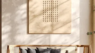
Once you've chosen a piece with the right scale and hung it at the correct height, the final principle is to give it adequate breathing space. This concept, known in design as negative space, refers to the empty area around an object. When you invest in a stunning piece of statement art, you want it to be the hero of the wall. Overcrowding the surrounding area with too many smaller decorations, shelves, or photos can create visual clutter and diminish the artwork's impact. Negative space is not wasted space; it’s an active component of good design that helps to focus attention on your main subject. It gives the eye a place to rest and allows the artwork to command the attention it deserves, making the room feel cleaner, more sophisticated, and intentionally curated. By leaving the surrounding wall relatively clear, you create a sense of balance and allow the piece to truly shine, enhancing its presence and the overall harmony of the room.
Bringing It All Together
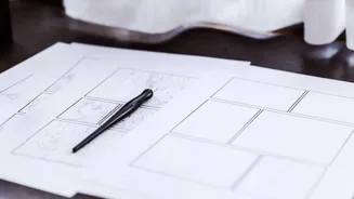
These three principles—scale, eye level, and breathing space—do not work in isolation. They are a harmonious trio that, when used together, ensure your statement art looks balanced and intentional. Think of it as a conversation: the scale of the art speaks to the architecture of the room, the eye-level placement connects it to the people in the space, and the breathing room allows its voice to be heard clearly. Lighting also plays a crucial role in animating your artwork, with natural light bringing colours to life and spotlights highlighting texture in the evening. But getting the placement right is the foundational step. Before you put any holes in the wall, consider using painter's tape or paper cutouts to map the artwork's position. This simple trick lets you visualise how these three principles will come together, helping you commit to the perfect spot with confidence.