


Why Solids Create a Polished Look
The power of pairing a botanical print with a solid color lies in its ability to create balance. A solid piece acts as a calm anchor, allowing the print to be the undisputed star of the outfit. This approach prevents the visual chaos that can sometimes
result from mixing multiple busy patterns. Think of the solid as the canvas and the print as the art. By giving the print a neutral or complementary backdrop, you ensure the overall look is intentional and harmonious, rather than accidental. This simple formula lets the intricate details of the floral or leafy design truly shine, resulting in a look that feels both sophisticated and effortlessly put together.
Choosing Your Botanical Hero Piece
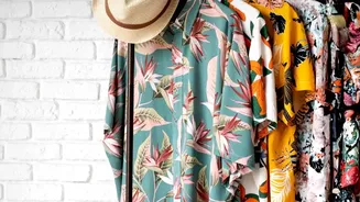
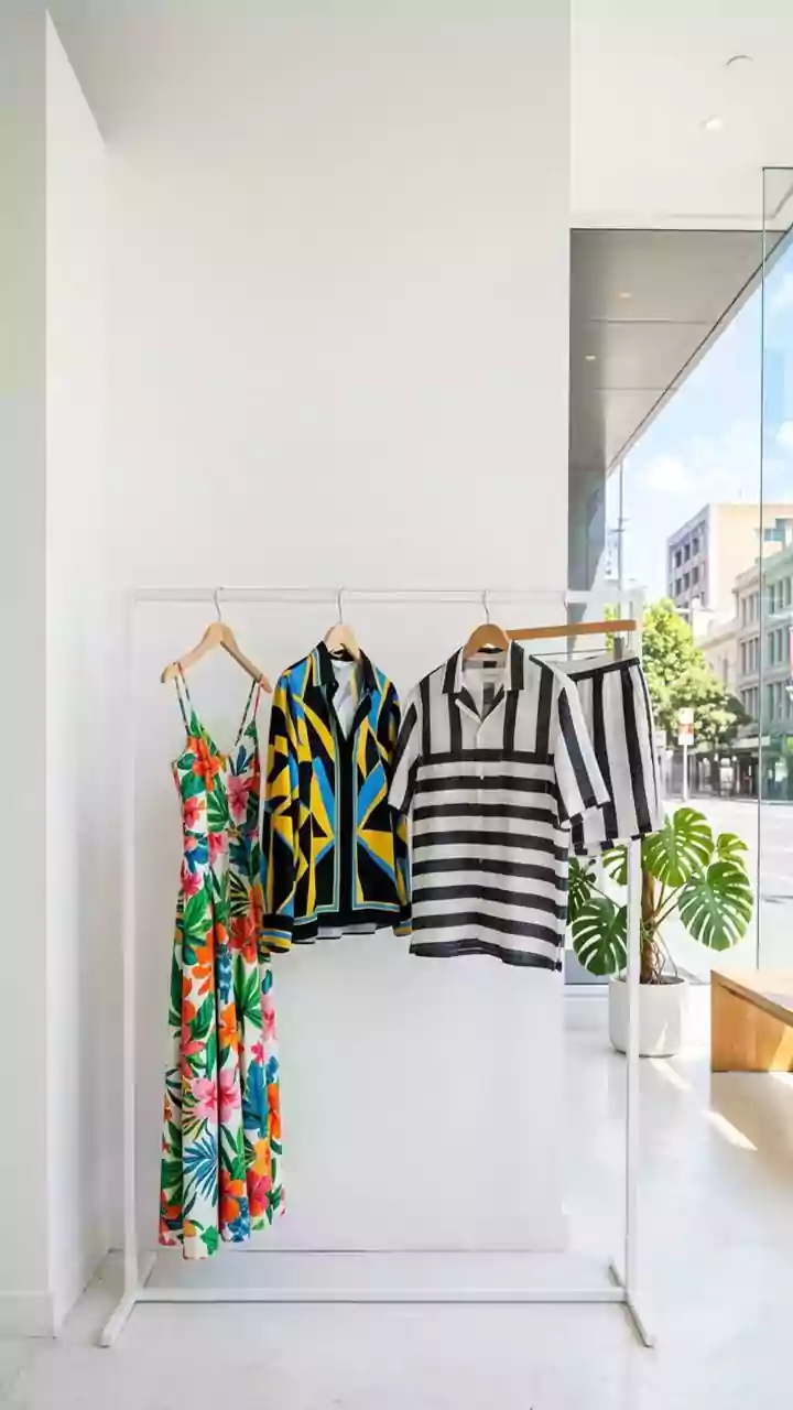
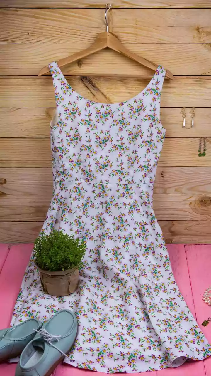
Your 'hero' is the single botanical item that will define your outfit. This could be a flowing midi skirt, a sharp blouse, a tailored blazer, or a statement dress. The scale of the print is a key consideration. Large-scale, painterly, or abstract florals are a significant trend, offering an artistic feel. These bold prints work best on simple silhouettes where the pattern itself is the main feature. On the other hand, smaller, ditsy prints behave more like a texture and can be easier to wear for those new to botanicals. Whichever you choose, ensure it's a piece you love, as it will be the focal point.
Mastering the Art of the Color Match
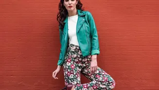
Once you have your botanical piece, selecting the right solid color is the next step. The most reliable method is to pull a color directly from the print itself. Look beyond the most dominant shade; picking up on a subtler accent color in the pattern can create a very chic, considered look. For example, if a floral blouse has small olive green leaves among pink flowers on a cream background, pairing it with olive green trousers can be more striking than simply matching it with cream. Alternatively, you can never go wrong with classic neutrals like black, white, navy, or beige. These foundation colors provide a sophisticated base that lets any print stand out.
Accessorizing Your Balanced Look
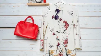
When your outfit is built around a statement print and a solid, accessories should play a supporting role. The goal is to complement, not compete. Opt for accessories in neutral tones or metallics. A classic leather bag, minimalist sandals, or simple gold or silver jewelry will enhance the outfit without adding more visual noise. If you pulled an accent color from the print for your solid piece, you can echo that color in your accessories, but be careful not to overdo it. Often, the most modern way to style a floral or botanical print is by contrasting its softness with structured, clean-lined accessories.
When Can Clashing Prints Work?
While pairing with solids is the safer bet for a 'clean' look, mixing prints isn't off the table—it just requires a different set of rules. For a successful clash, the prints should have a unifying element. This could be a shared color palette; two different patterns that both contain shades of blue, for instance, will feel connected. Another strategy is to vary the scale of the prints dramatically—a large, bold floral can work surprisingly well with a fine, subtle stripe or a micro-dot pattern. This creates a visual hierarchy and prevents the two patterns from fighting for attention. Stripes and polka dots often act as 'neutrals' in the world of print mixing, making them great starting points for experimentation.