



Defining the Earthen Palette
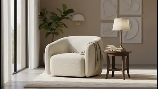
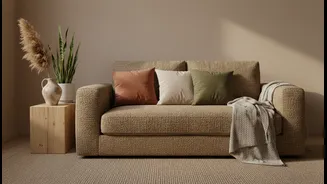
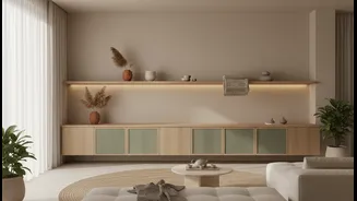
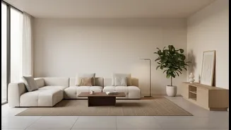
Before we dive into the why, let's establish the what. When designers talk about warm earthen tones, they're referring to a rich and inviting color family inspired by the natural world. Think of shades drawn from soil, clay, sand, and stone. The stars
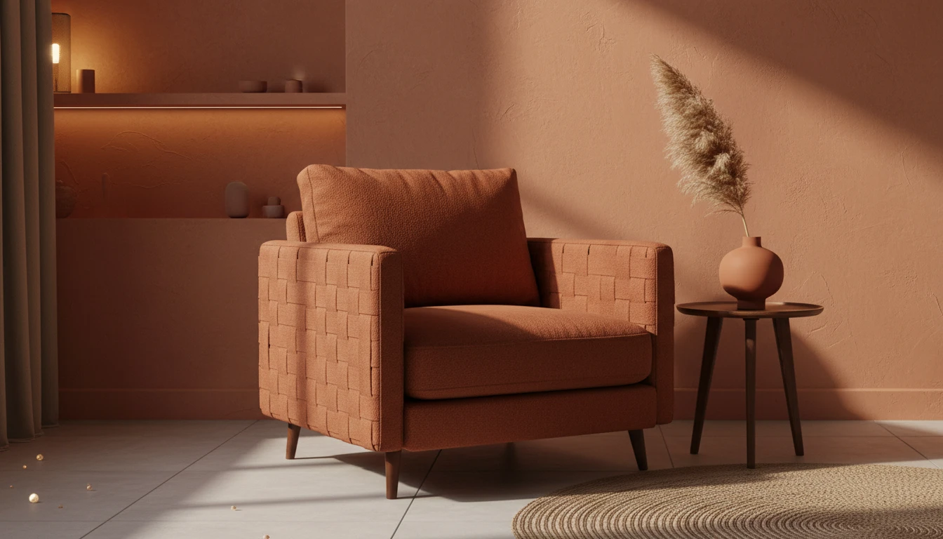
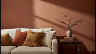
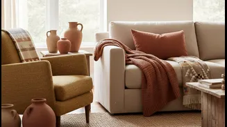
of this palette are colors like terracotta, rust, ochre, camel, and warm beiges. These aren't loud, attention-grabbing hues; they're muted, organic, and grounded. Their shared characteristic is a warm undertone, which gives them a cozy, sun-baked quality that feels both sophisticated and deeply comforting, a stark contrast to the cool grays that dominated interiors for years.
The Psychology of Comfort and Stability
The popularity of this trend goes far beyond aesthetics; it’s deeply rooted in psychology. Earth tones have a calming, grounding effect. In a world that often feels fast-paced and uncertain, these colors provide a sense of stability and security. They connect us to nature, which has a proven positive impact on well-being by reducing stress and fostering a sense of harmony. After years of global shifts that have redefined our relationship with home, people are craving spaces that feel like a sanctuary. Warm, earthy colors create a nurturing atmosphere that makes a room feel like a comforting embrace, promoting relaxation and emotional balance.
A Perfect Match for the Renter's Life
So why are these tones particularly perfect for renters? The reasons are both practical and emotional. Firstly, their versatility is unmatched. Earthen tones serve as a sophisticated neutral backdrop that complements a wide range of furniture styles and decor, from bohemian to modern minimalist. Unlike bold, niche colors, a warm beige or terracotta wall won't clash with your existing sofa or artwork. This makes it easier to create a cohesive look without buying all new things. Furthermore, these colors are often more palatable to landlords than, say, lime green or hot pink, increasing the likelihood of getting your design plans approved. And when it’s time to move out, a warm neutral is significantly easier and cheaper to paint over than a highly saturated color.
Creating Warmth Without the Landlord's OK
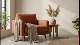
For renters who are strictly forbidden from painting, the earthen trend is still incredibly accessible. The key is to layer these colors through textiles and decor. You can introduce a rich terracotta or rust hue with a velvet armchair, a set of linen curtains, or plush throw pillows. A large jute or wool rug in a sandy beige can anchor a living room and instantly add warmth. Look for ceramic vases, wooden bowls, and other decor items in shades of clay, ochre, and warm brown. Even a simple change like swapping out cool white light bulbs for warm-toned ones (around 2700K) can dramatically enhance the cozy, earthy vibe of a room.
A Timeless Foundation for Personal Style
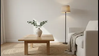
Ultimately, the staying power of this trend lies in its ability to be both timeless and personal. While cool minimalism can sometimes feel sterile, warm minimalism—built on earthy tones and natural textures—feels lived-in and soulful. These colors don't shout; they create a quiet, confident backdrop that allows your personal items to shine. Your artwork, your plants, and the souvenirs from your travels will pop against a wall painted in a soft clay or sand color. It’s a design choice that feels mature and intentional, providing the perfect foundation to build a space that tells your story, even if you’re just there for a year or two.