
1. The Collected Eclectic Mix
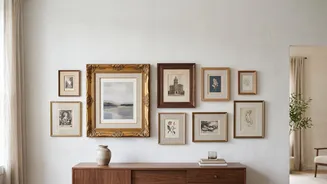
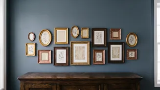
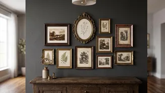
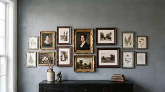
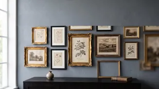
The context for this style is a wall that looks gathered over decades, even if you sourced everything last month. The key is to confidently mix, not match. Combine oil portraits, modern abstracts, sepia-toned photographs, and landscape paintings. The goal
is visual texture. Pair an ornate, gilded frame with a simple black or natural wood one. This contrast is what creates interest and makes the collection feel personal and evolved. To keep it from feeling chaotic, start with a larger 'anchor' piece and build outward. The story here is one of a life well-lived and travels well-taken, reflected in a charmingly disparate collection of art that speaks to you personally.
2. The Unifying Color Story
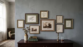
The context for this approach is creating harmony from diversity. You might have pieces from different eras and with varied subject matter, but a consistent color palette can tie them all together beautifully. This doesn't mean everything has to be the same shade. Instead, look for a common 'color thread'—a recurring ochre, a muted blue, or an earthy green—that appears in several pieces. This creates a visual chain that the eye can follow, making the entire arrangement feel cohesive. A monochromatic theme, such as all black-and-white or sepia-toned prints, is another powerful way to unify your wall, resulting in a timeless and sophisticated look that is always in style.
3. The Thematic Narrative
This style is about curating your wall like a museum exhibit dedicated to a single topic. The context is storytelling through a focused subject. Popular themes include vintage botanical illustrations, travel-related pieces like old maps and posters, or ancestral portraits. By grouping pieces with a shared subject, you create a powerful narrative. For example, a collection of vintage seascapes can evoke a sense of calm and nostalgia. A wall of antique floral prints can bring the charm of a country garden indoors. The frames can vary, but the consistent theme provides a strong, intentional point of view that gives the wall a sense of purpose and grandeur.
4. The Salon Style with 3D Objects
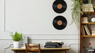
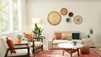
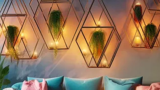
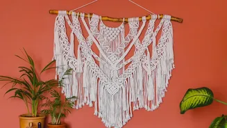
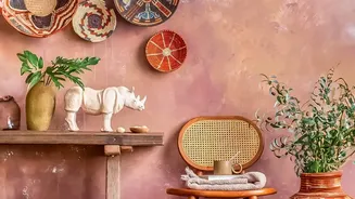
Inspired by the dense, floor-to-ceiling hangs of old Parisian salons, this context is all about maximalism and texture. It’s not just about what’s in the frames, but what you hang between them. The idea is to break up the flat plane of the wall by incorporating three-dimensional objects. Small mirrors, ceramic plates, miniature shelves with curios, or even woven textiles can be mixed in with your framed art. This adds depth, reflects light, and introduces unexpected shapes. A small, ornate mirror can add a touch of sparkle, while a plaster relief provides textural contrast, turning the gallery wall into a richer, multi-sensory experience.
5. The Asymmetrical Balance
The context here is a layout that feels organic and free-flowing, not rigidly planned. Asymmetry allows for more creativity and can make a collection feel more dynamic and charming. The trick is to achieve balance, not symmetry. A large, visually 'heavy' piece on one side can be balanced by a grouping of two or three smaller pieces on the other. Play with both horizontal and vertical orientations. The best way to plan this is by laying out all your pieces on the floor first, starting with the largest artwork and arranging the others around it until it feels right. This method results in a wall that feels less like a formula and more like an authentic expression of your personal style.