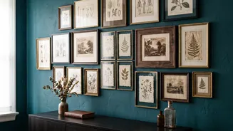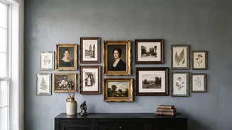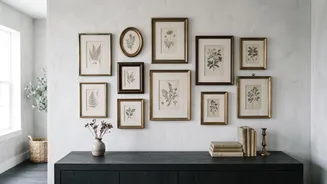



Start with a Story, Not Just Art
The most compelling gallery walls feel gathered over time, even if you assemble them in an afternoon. Before you even think about frames, decide on the mood. Are you aiming for a collection of moody landscapes and portraits, or something lighter like
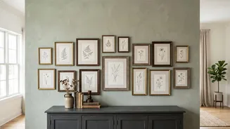
botanical prints and architectural sketches? This theme is your anchor. It’s not about matching everything perfectly, but about creating a consistent point of view. You can mix media freely—photographs, prints, paintings, and even mirrors or textiles—as long as they contribute to the same story. The goal is to choose pieces you genuinely love, not just items that fill a gap. Think of your collection as a conversation between pieces; they should relate to each other through subject, colour palette, or a general feeling.
The Art of the Imperfect Frame
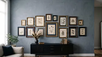
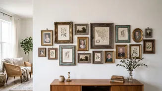
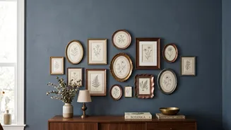
The secret to a vintage look is embracing a mix of frames. Hunt for them at thrift stores, flea markets, and antique shops. Look for a variety of shapes and sizes with interesting details, but don't worry about the colour or the art inside; both can be changed. A cohesive look comes from controlled variety, not uniformity. Stick to a limited palette of two or three frame colours or materials, like black, gold, and a warm wood tone. Repeat these finishes throughout the display to create a visual rhythm. You can mix a sleek modern frame with an ornate vintage one if they share a common element, like colour or tone. This intentional repetition is what makes the collection feel curated rather than chaotic.
Mastering the Layout
Before a single nail hits the wall, plan your arrangement on the floor. This is the easiest way to see how the pieces interact. Start with your largest or most significant piece—your 'anchor'—and place it slightly off-centre at roughly eye level (about 57-60 inches from the floor). Build outward from there, balancing a heavier frame on one side with a couple of smaller ones on the other. A mix of vertical and horizontal orientations creates energy and movement. Pay close attention to spacing. Keeping the gap between frames consistent—typically around 2 to 4 inches—is the invisible glue that holds a mismatched collection together. To be certain of your layout, trace each frame onto craft paper, cut them out, and tape the templates to the wall to visualize the final look before committing.
Beyond the Frame
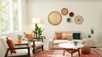
The most dynamic gallery walls often include more than just framed prints. Introducing three-dimensional objects adds texture and personality. A small convex mirror, a vintage sconce, a woven tray, or even a set of antique plates can break up the flat plane and add depth. The key is moderation; just one or two of these items is enough to create interest without overwhelming the art. These pieces should still connect to your overall theme. Think about layering your gallery wall over a piece of furniture, like a console table or sofa, and use the 'two-thirds rule' as a guide: the arrangement should span about two-thirds of the furniture's width to feel proportional. This helps ground the collection and makes it feel like an integrated part of the room's design.