




The Appeal of Understated Nature
The botanical trend has been a mainstay in interior design for years, bringing a sense of life and tranquillity into our homes. Yet, for those with minimalist tastes or rooms already rich in texture, vibrant green prints can sometimes feel too energetic.
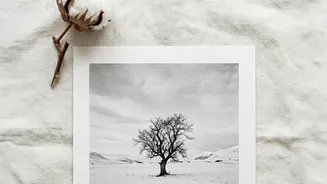
This is where monochrome botanicals truly shine. By stripping away colour, the focus shifts entirely to form and shadow—the elegant curve of a fern frond, the graphic shape of a monstera leaf, or the delicate veins of a skeleton leaf. This approach provides the calming, organic feel of nature while maintaining a serene and sophisticated palette that adds depth without creating visual noise. The result is artwork that is both a timeless statement and a gentle whisper.
Finding the Perfect Print
Choosing a monochrome leaf print is a personal journey. The style you select can dramatically alter the mood of your space. Photographic prints offer realism and soft, tonal depth, making them a great fit for relaxed living areas. In contrast, simple line drawings or illustrations provide a minimalist, hand-drawn feel that brings warmth and personality, especially in a bedroom or home office. Don't overlook the leaf itself. Bold, tropical leaves like palms or monsteras make a confident statement, while finer, more delicate botanicals like ferns or eucalyptus offer a softer touch. Consider the 'visual weight' of the print; a dark, heavy silhouette creates a dramatic focal point, while a light sketch on a pale background feels airy and subtle.
How to Style with Impact
Styling monochrome prints is refreshingly straightforward. For a classic, balanced look, hang a single, large-scale print or a matched pair above a key piece of furniture like a sofa or headboard. As a rule of thumb, aim for the artwork to be about two-thirds the width of the furniture below it, with the centre of the print at eye level, roughly 145-150cm from the floor. For a more collected and personal feel, create a gallery wall. Combine prints of various sizes, mixing leaf illustrations with abstract shapes or line art. The key to a cohesive gallery wall is a shared element—in this case, the black-and-white palette—unified further by using matching frames.
Framing and Finishing Touches
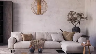
The frame is the finishing touch that completes the look. A simple black frame will add graphic contrast and make the artwork pop, while a clean white frame can create a fresh, airy feel. For a warmer, more organic aesthetic that complements the natural subject matter, consider a natural oak or light wood frame. These prints act as a neutral anchor, pairing beautifully with other materials. To prevent a monochrome scheme from feeling flat, layer in plenty of texture. Think of linen cushions, chunky knit throws, woven baskets, and natural wood furniture. The contrast between the crisp, graphic art and these soft, tactile elements creates a space that feels balanced, warm, and inviting.