




Sin City (2005): A Living Graphic Novel
Robert Rodriguez’s adaptation of Frank Miller’s neo-noir series wasn’t just inspired by the comics; it sought to be a direct translation. Shot almost entirely on green screens, the film faithfully recreated Miller’s high-contrast, black-and-white panels,
using digital technology to achieve a stark, graphic look that was unprecedented in live-action. The technique, often called digital backlot, allowed Rodriguez to control every shadow and silhouette. The most iconic choice was the use of selective color—a splash of red on a dress, the chilling yellow of a villain—which drew the audience's eye and mirrored the book's minimalist but impactful aesthetic. By treating the source material as a literal storyboard, Rodriguez proved that a film could look and feel exactly like the pages it came from, a move so faithful he famously credited Miller as co-director.
300 (2006): The Painterly Epic
Where Sin City replicated comic panels, Zack Snyder’s 300 transformed them into a moving oil painting. Based on another Frank Miller graphic novel, the film established a visual language that would influence action movies for years. Snyder utilized extensive green screen and CGI, but the magic was in the post-production process. The film employed aggressive color grading to create its signature sepia-toned, high-contrast look, desaturating most colors while making the Spartan capes a vibrant, bloody red. This was combined with speed-ramping, a technique that fluidly shifts between slow and fast motion within a single shot, lending the action a balletic, hyper-stylized quality. The result was a 'watercolour effect' with photographic elements, creating a mythological dreamscape rather than a historical reality. It wasn’t about realism; it was about capturing the epic, brutal artistry of the source material.
Scott Pilgrim vs. The World (2010): The Video Game Hybrid
Edgar Wright’s adaptation of Bryan Lee O'Malley's graphic novels didn’t just borrow from comics; it joyfully crashed them into the world of 8-bit video games. The film’s visual genius lies in its integration of graphic elements directly into the live-action scenes. When characters fight, the screen erupts with comic book onomatopoeia like “KPOW!” and opponents burst into a shower of coins, just like in a classic arcade game. Wright filled the screen with pop-up stats, level-up graphics, and split screens that mimic comic panel layouts. This wasn't just a gimmick; it was the film's entire language, perfectly capturing the slacker-hero’s journey as he navigates life and love like a video game protagonist. The visual effects team worked to ensure these graphics felt integrated into the scenes, not just pasted on top, creating a unique photographic reality that was simultaneously tangible and fantastical.
Spider-Man: Into the Spider-Verse (2018): The Future of Animation
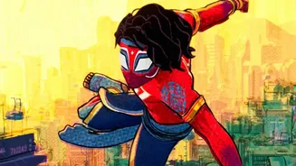
Perhaps no film has pushed the boundaries of comic book visuals further than Into the Spider-Verse. It blew the doors open for what mainstream animation could be, rejecting photorealism for a style that celebrated the artistry of its source medium. The film’s revolutionary technique involved layering 2D and 3D animation to create a living comic book. Animators mimicked printing techniques like Ben-Day dots, deliberate misalignments, and Kirby Krackle to give every frame a tactile, illustrated quality. The frame rate was intentionally manipulated to give character movements a snappier, less fluid feel, closer to flipping through comic pages. On-screen text boxes for internal thoughts and dynamic, paneled action sequences further immersed the audience in the world of the comic. Its success not only won it an Academy Award but also demonstrated that an adaptation could be wildly innovative, artistically groundbreaking, and a massive commercial hit all at once.