





The Allure of Botanical Prints
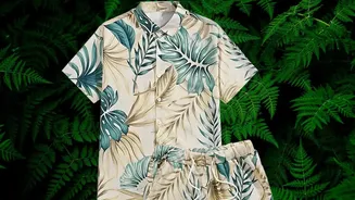
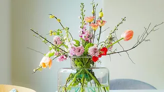
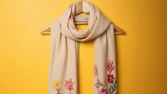
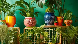
From lush, tropical leaves to delicate floral patterns, botanical prints have a timeless appeal. They bring a touch of nature's beauty and vibrant energy to our wardrobes. Yet, for every person confidently rocking a bold floral blouse, there's another
staring at a similar piece in their closet, wondering what on earth to wear with it. The richness of these prints can be intimidating; the fear of creating a chaotic, clashing outfit is real. Too often, these beautiful garments are either paired with basic black or left on the hanger, their potential untapped.
The Secret Lies in the Leaves
The solution is surprisingly simple and championed by stylists: ground your printed piece with a solid colour pulled directly from the pattern itself. The headline's advice to match a 'leaf shade' is a brilliant starting point. Instead of defaulting to the print's background colour or its most dominant flower, look for the smaller, supporting colours. Pulling a less obvious shade—like the dark green of a leaf, the warm brown of a stem, or a muted terracotta from a flower's shadow—and using that for your trousers, skirt, or shorts is a game-changer. This technique creates an intentional, harmonious, and sophisticated outfit.
Why This Styling Trick Works
This method is rooted in the principles of colour theory and balance. A solid-coloured bottom acts as an 'anchor', providing a calm foundation that prevents the busy print from overwhelming the eye. When you choose a secondary colour for that anchor, it shows a deeper level of style savvy. It demonstrates that you've paid attention to the details of the print, creating a cohesive link between the two garments. The result is an outfit that looks purposefully put together rather than randomly assembled. It feels less like you're wearing a loud print and more like you're wearing a beautifully coordinated ensemble.
How to Find Your Anchor Colour
To find your perfect anchor colour, lay your botanical-print item flat in good lighting. Look past the most prominent colours and identify the quieter tones. You'll be surprised by the range you find—from olive and sage green to deep navy, burgundy, or even shades of grey and taupe. Choose one of these colours that you feel comfortable in and that complements your skin tone. The goal is to pick a shade that is present in the print but not the main focus. This subtle repetition is the key to making the entire outfit click. If your print is on a dark background like black or navy, that can also serve as a strong and easy anchor colour.
Beyond Just Bottoms
This powerful styling rule isn't limited to trousers and skirts. You can use the same principle to choose a blazer, cardigan, or jacket. A solid-coloured jacket pulled from a shade in a floral dress can tie the look together for a cooler day or a more formal setting. The concept even extends to accessories. While it's wise to keep jewellery minimal to avoid competing with the print, you can use the anchor-colour rule for a handbag or a pair of shoes to further enhance the outfit's harmony. A pair of olive-green loafers with a floral top that has olive leaves creates a subtle, stylish echo.
Finishing the Look
Once you have your botanical print and solid anchor piece, the rest of the outfit should remain simple. Opt for neutral accessories, like a classic tan leather bag or simple metallic jewellery. Avoid adding other patterns, which can quickly make the look feel cluttered. A simple white t-shirt under a printed blazer or a classic denim jacket over a floral dress are also foolproof options that allow the botanical piece to be the star of the show. The goal is to support the print, not compete with it.