


The Old Habit of 'More Is More'
Many of us grew up in homes filled with colour, intricate patterns, and a rich collection of objects. This maximalist approach is part of our cultural DNA, a visual feast of stories and traditions. But applying the same logic to smaller, modern apartments
can lead to visual chaos. Overcrowding rooms with oversized furniture or too many decorative items is a common mistake that makes spaces feel cramped and overwhelming. When every object tries to be a showstopper, nothing truly stands out, and the result can feel more cluttered than curated. This isn't about rejecting our heritage of abundance, but adapting it to our current living spaces.
The Swing to Sterile Minimalism
In reaction to clutter, some have swung to the opposite extreme: stark minimalism. Influenced by global trends, this style focuses on clean lines, neutral palettes of white and grey, and sparse decor. While this can create a sense of calm, it often goes too far, stripping homes of their personality and warmth. A common pitfall is opting for an entirely muted or pale colour scheme, which can make a home feel boring and impersonal rather than serene. An all-white or beige room can end up looking more like a generic hotel than a home that reflects the people living in it. This approach often ignores the Indian context, where colour and vibrancy are integral to our daily lives.
What 'Boldness' Really Means
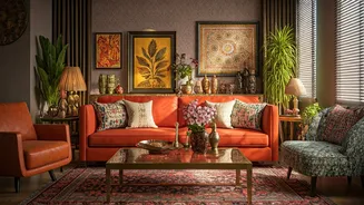
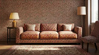
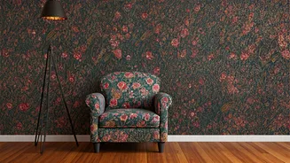
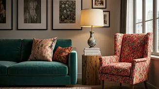
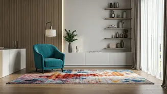
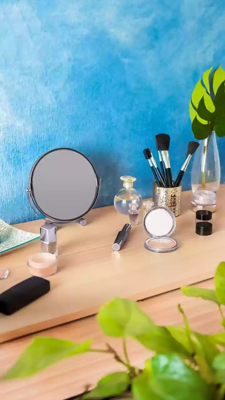
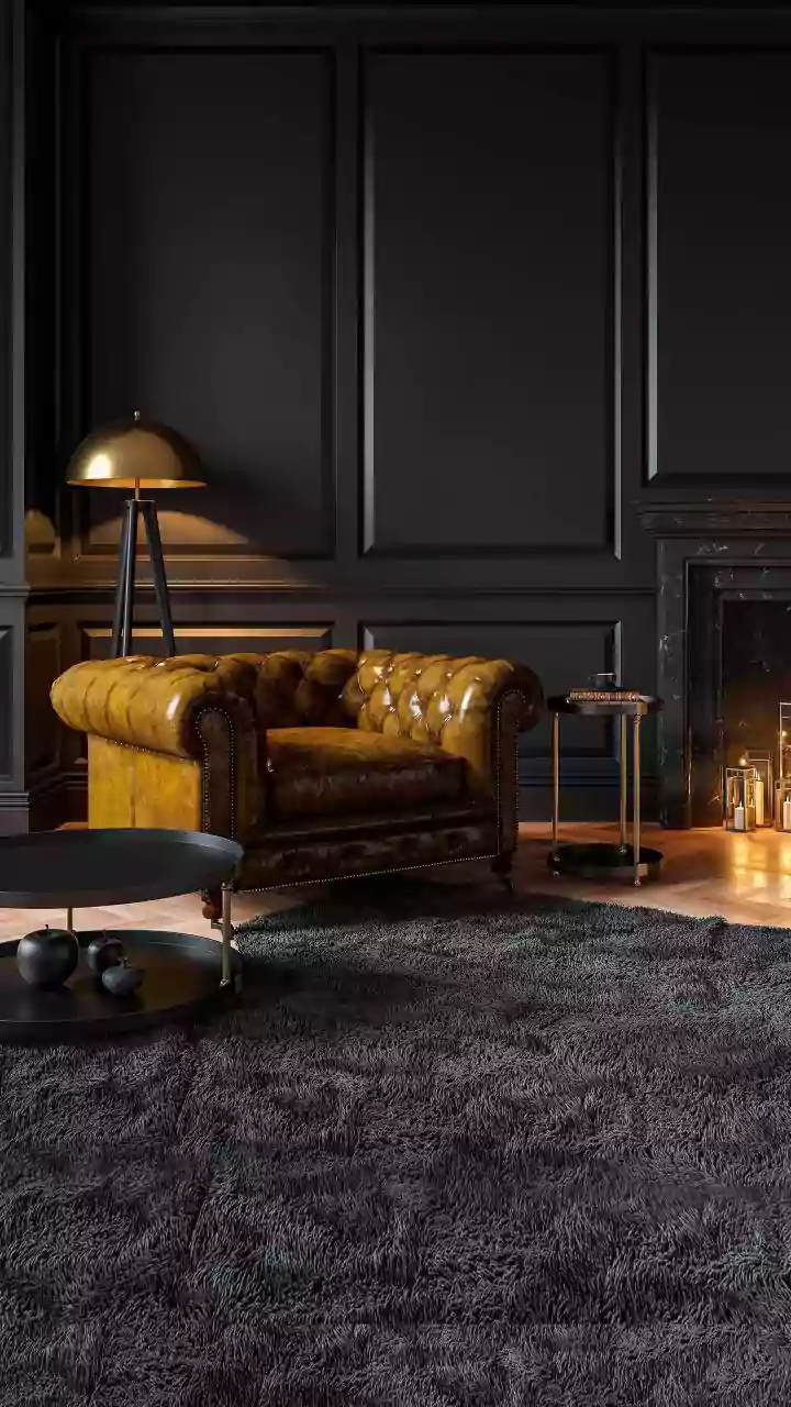
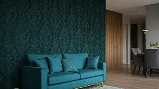
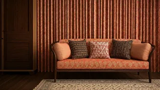
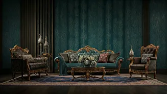
True boldness in design isn't about using exaggerated or clashing bright colours everywhere. It’s about making confident, intentional choices. This could be a single accent wall in a deep emerald green or royal blue, colours that are currently trending in modern Indian interiors. Boldness can also come from a statement piece of furniture, like a beautifully crafted swing (jhoola) or a vintage armchair. It might be found in contemporary Indian art that becomes the focal point of a room, or in the rich texture of hand-block printed cushions and woven rugs. The idea is to choose one or two elements that will carry the visual weight, allowing them to shine.
The Power of Smart Restraint
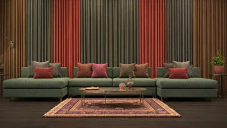
Restraint is the secret ingredient that makes boldness work. It isn't about creating empty, cold spaces; it's about making deliberate choices and knowing when to stop. Restraint means allowing for 'negative space'—areas left unadorned to give the eyes a place to rest and to make your bold choices more impactful. Instead of filling every surface, you edit with purpose. For example, if you have a vibrant, patterned sofa, keep the walls neutral. If you have an intricate piece of art, let it be the star without surrounding it with other competing decor. This balance ensures the home feels calm and cohesive, not busy.
A Practical Guide to Balance
Achieving this balance is easier than it sounds. A great starting point is the 70/30 rule, sometimes broken down further. Let about 70% of your room be a neutral base (think warm greys, beiges, or off-whites). Then, dedicate 20% to complementary textures and secondary colours, like wooden furniture, natural fabrics, or metallic accents. The final 10% is where you introduce your bold element—a pop of a rich colour like mustard yellow or deep maroon, a striking piece of art, or patterned textiles. This ensures the bold choice adds personality without overwhelming the space. Another tip is to start small: introduce one bold cushion or a single piece of art and see how it transforms the room before committing to larger changes.