

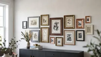
Begin with a Colour Story
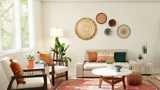
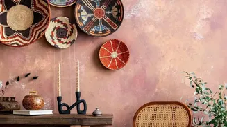
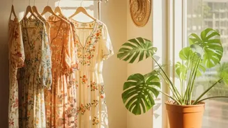
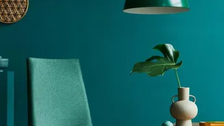
Before you start hunting for art or hammering nails, the first step is to define your colour palette. This doesn't mean every piece must be identical, but they should share a harmonious colour story. Look at the room where the gallery wall will live.
Pull two or three dominant colours from your existing decor, such as a shade from your sofa, a rug, or curtains. These will be your anchor colours. Then, choose one or two accent hues to add pops of interest. A common strategy is to select a main colour to cover about 60% of the display, a secondary colour for 30%, and a bold accent for the final 10%. Warm, muted palettes featuring ochre, sepia, and olive green often enhance a vintage feel, creating a sense of history and warmth.
The Art of the Hunt
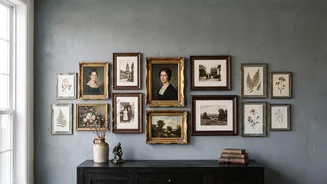
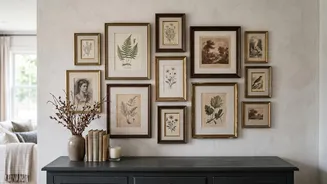
With your colour palette in mind, you can begin sourcing your art. Flea markets, antique shops, estate sales, and online marketplaces are treasure troves for vintage prints, paintings, and drawings. The goal is to find pieces that feature your chosen colours. A moody landscape, a delicate botanical print, and a modern abstract can all live happily together if they share a common thread of colour. Don't be afraid to mix subjects and styles; a portrait can hang beside a landscape, and a graphic poster can complement an oil painting. This eclectic approach is what gives a vintage gallery wall its 'collected over time' charm. In addition to framed art, consider adding other elements like small mirrors, decorative plates, or even framed textiles that fit your colour scheme to add texture and depth.
Unify with Frames and Mats
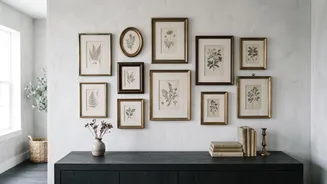
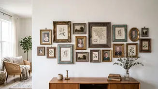
Frames are a powerful tool for creating cohesion. While using identical frames provides a clean, uniform look, a mix of styles often feels more authentic for a vintage wall. You can create unity within a mismatched collection by sticking to a limited range of frame colours or materials, like warm woods, antique gold, and classic black. For example, if you have a mix of ornate and simple frames, painting them in similar tones can tie them together. Don't overlook the matting. Using a consistent mat colour, such as a creamy off-white or a specific accent shade from your palette, can instantly make disparate pieces feel connected and polished. A bright white mat can sometimes feel too modern, so consider aged or antique-style mats to enhance the vintage aesthetic.
Planning Your Layout
Before committing to holes in the wall, always plan your layout. A foolproof method is to trace each frame onto craft paper, cut out the templates, and tape them to the wall. This allows you to experiment with arrangements and spacing without any risk. Start by placing your largest or most significant piece, known as the anchor, slightly off-centre at eye level. Then, build the rest of your collection outwards from there. Aim for a balanced composition, mixing large and small pieces, as well as horizontal and vertical orientations, to create visual rhythm. Maintain relatively consistent spacing—typically between two and four inches—between each frame to ensure the collection reads as a single, unified display rather than a jumble of individual items.