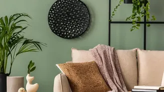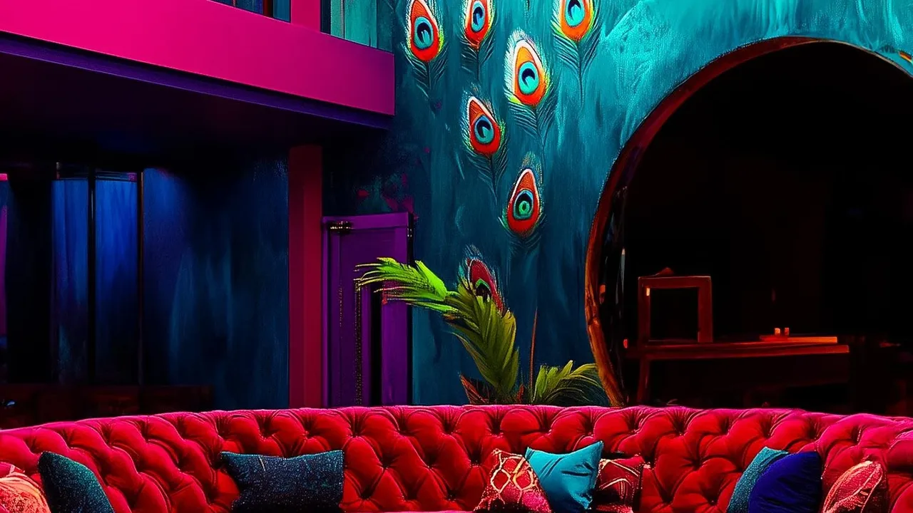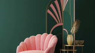


The Architectural Power of Colour-Blocking
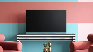
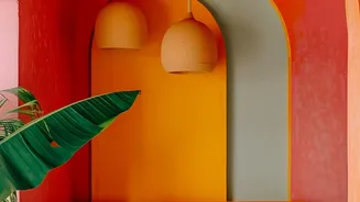
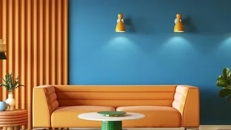
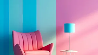
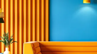
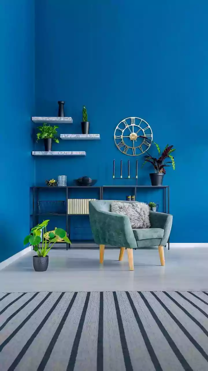
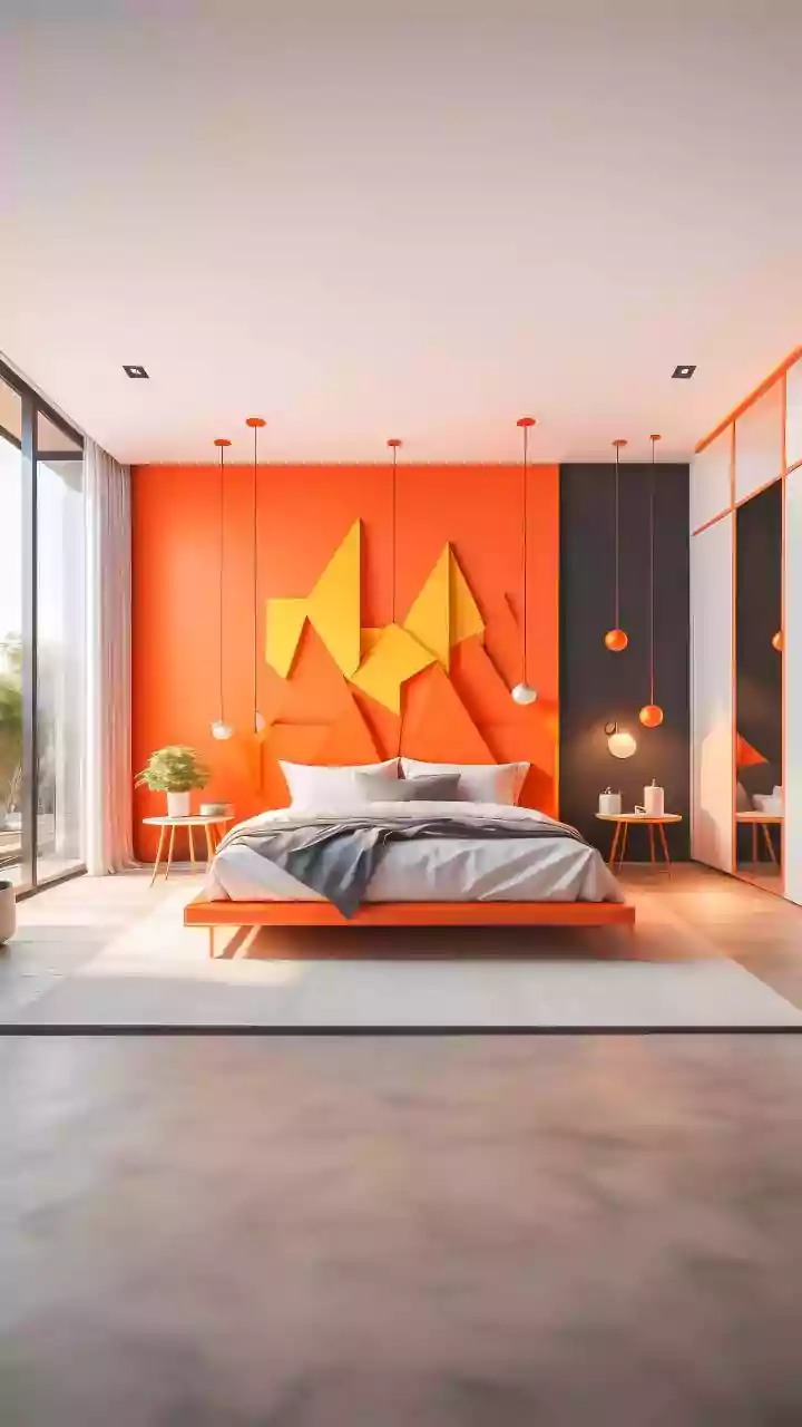
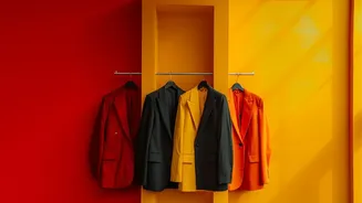
Colour-blocking is an interior design technique that uses solid, distinct blocks of colour to create structure and visual rhythm. Originating in modern art movements, like the work of Piet Mondrian, this approach treats colour as a structural element,
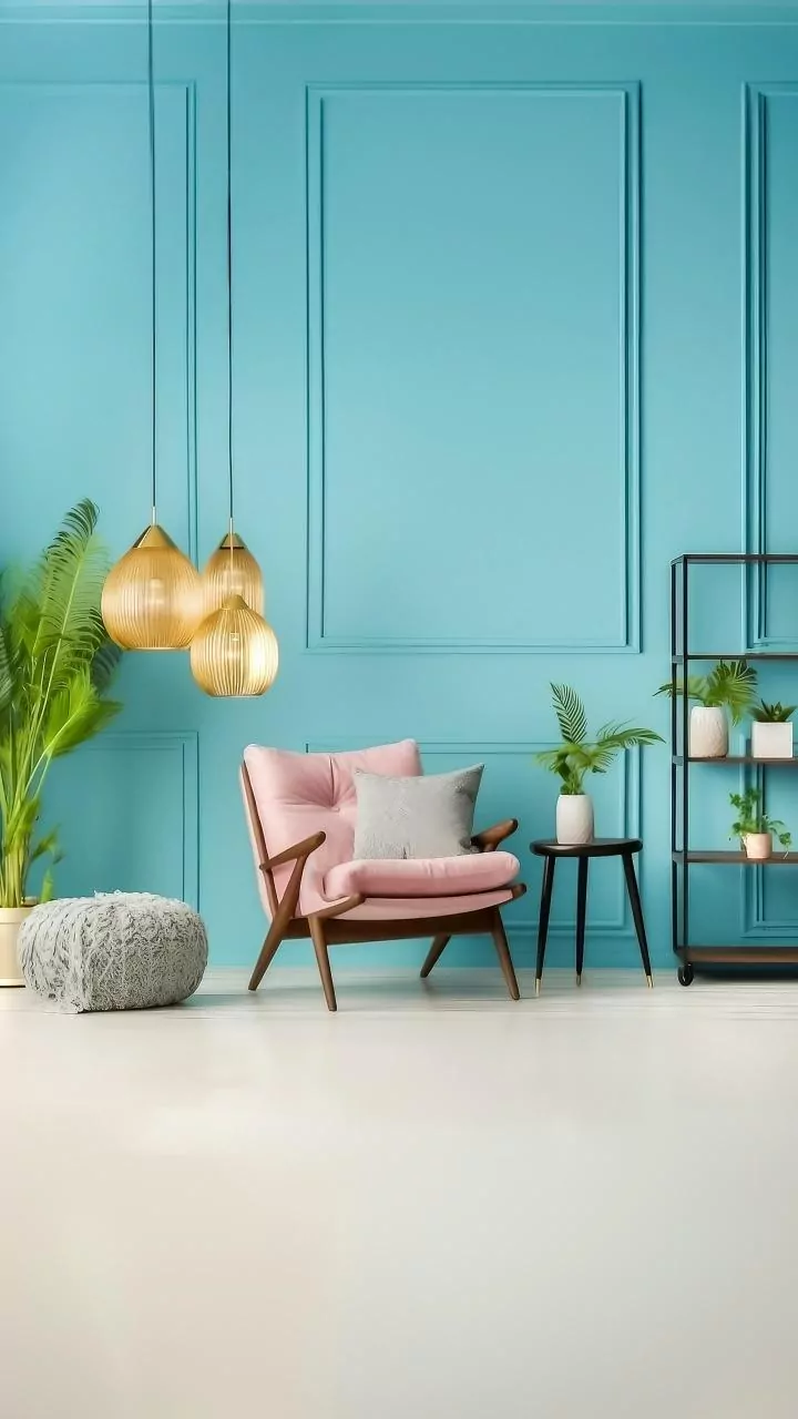
not just decoration. When applied to walls, colour-blocking or wallpapers with large geometric patterns use clean lines and defined shapes to organise a space. This can make a room feel more intentional, grounded, and architecturally considered. Unlike a pattern that scatters visual interest, colour blocks guide the eye, creating a sense of order and purpose. A single, bold rectangular feature or a wall split into two complementary tones can define a zone, add depth, or highlight a room’s best features without overwhelming it.
Why Structure Creates Calm
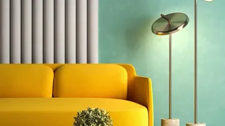
Our brains are wired to find comfort in patterns that are easy to process. Geometric and colour-blocked designs, with their predictable lines and clear shapes, require less mental effort to interpret. This 'perceptual fluency' often translates into a feeling of calm and order. Using large-scale geometric patterns or vertical stripes can even create an optical illusion, making a ceiling seem higher or a room feel more expansive. The structure provided by these designs gives the eye a place to rest, which is essential for creating a tranquil environment. By limiting the visual information, colour-blocking helps reduce the feeling of clutter, allowing furniture and other decor elements to stand out in a balanced and harmonious way.
The Enduring Allure of Floral Prints
Of course, this isn't to say floral wallpaper has no place in a modern home. For centuries, floral motifs have been used to bring the beauty and vitality of nature indoors. Studies in environmental psychology suggest that images of flowers can have a positive impact on our well-being, triggering feelings of happiness and reducing stress. A floral pattern can make a room feel softer, warmer, and more personal. Depending on the style, it can evoke romance with soft peonies, energy with bright tropicals, or drama with dark, moody botanicals on a black background. The key to using florals effectively is intention. They work best when given a specific job, such as creating a focal point behind a bed or adding character to a small powder room.
When 'Charming' Becomes 'Chaotic'
The central claim of the headline—that florals can feel 'busy'—often comes down to pattern density. A wallpaper’s visual load is determined not just by its colours, but by the number of motifs, the contrast of its lines, and the frequency of its repeat. A small-scale floral with many intricate, tightly packed flowers can feel visually demanding, even in a soft colour palette. This creates a constant hum of visual activity that can make a room feel restless or cluttered, especially when used on all four walls. To avoid this, it's crucial to balance a busy pattern with neutral furniture and ample 'breathing room' to prevent the design from taking over the space entirely.
How to Choose for Your Space
Deciding between a structured, colour-blocked design and a floral print depends entirely on the mood you want to create. If your goal is a calm, modern, and organised space, a geometric or colour-blocked wallpaper is a strong contender. It provides a confident backdrop that feels both dynamic and orderly. If you're aiming for a room that feels cozy, romantic, or infused with natural energy, a floral print may be the answer. To get the best of both worlds, consider large-scale floral murals, which offer the beauty of botanicals without the busy repetition of a traditional pattern. You can also find wallpapers that blend both concepts, placing soft floral shapes against a clean, colour-blocked background for a look that is both structured and organic.