






Transforming a simple sheet of paper into a work of art is the magic of origami. But beyond the folds, colour is your most powerful tool to create mood and breathtaking beauty. Let's explore how to make your origami wall art truly unforgettable.
Monochromatic Magic
One of
the most sophisticated approaches to colour is the monochromatic scheme, which uses different tones, tints, and shades of a single colour. Imagine a flock of origami cranes transitioning from a deep navy blue to a pale, airy sky blue. This creates a sense of depth and harmony that is both calming and visually striking. A monochromatic display feels cohesive and intentional, making it perfect for minimalist or modern interiors. To execute this, gather paper in various shades of one core colour—think forest green, mint green, and lime green. When arranged together, these variations guide the eye smoothly across the installation, creating a subtle, elegant gradient. It’s a foolproof way to make a statement without overwhelming a room.
Analogous Harmony
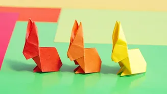
For a serene and naturally pleasing effect, look no further than an analogous colour scheme. This strategy involves using colours that sit next to each other on the colour wheel, like yellow, yellow-green, and green. Because these colours share a common base, they blend together seamlessly, creating a gentle, low-contrast design that is easy on the eyes. Think of a sunset, with its blend of red, orange, and yellow. An origami wall display using this principle, perhaps with folded flowers or leaves, can evoke the tranquillity of nature. You could create a calming wall feature with blues, blue-greens, and greens, or a warm, inviting display with reds, red-oranges, and oranges. This approach is perfect for creating a relaxed atmosphere in a bedroom or living space.
Complementary Contrast
If you want your origami art to pop, a complementary colour scheme is your best friend. This involves pairing colours that are directly opposite each other on the colour wheel, such as blue and orange, red and green, or purple and yellow. This high-contrast combination creates a vibrant, energetic tension that immediately draws attention. Imagine a display of geometric shapes alternating between a rich purple and a bright yellow, or a mural of blue butterflies accented with orange ones. While powerful, it’s a combination to use thoughtfully. In large doses, it can be intense, but it's perfect for a focal piece that you want to stand out and make a bold statement. Using one colour as the dominant shade and its complement as an accent can create a balanced yet dynamic look.
Triadic Balance
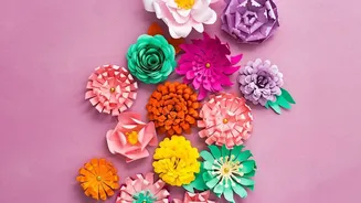
A triadic scheme uses three colours that are evenly spaced around the colour wheel, such as red, yellow, and blue. This approach offers a balanced yet vibrant look, delivering strong visual contrast while feeling more harmonious than a complementary scheme. A triadic palette is often playful and cheerful, making it an excellent choice for a child's room, a creative studio, or any space that could use a splash of dynamic energy. Even if you use paler or less saturated versions of the hues, the scheme remains lively. For example, a wall installation of origami stars or modular geometric shapes in orange, green, and purple can create a captivating and balanced visual rhythm that is both stimulating and aesthetically pleasing.
Nature-Inspired Palettes
When in doubt, turn to nature for inspiration. Mother Nature is the ultimate colourist, and her palettes are always harmonious. Consider the earthy tones of a forest: deep browns, rich greens, and muted ochres. Or think of a calming beach scene with its sandy beiges, soft blues, and whites. You could create a seasonal display with the warm, earthy tones of autumn—oranges, reds, and browns—or the cool blues and whites of winter. A display of origami flowers and butterflies in the bright colours of a spring garden can bring a sense of life and freshness into a room. These palettes feel inherently balanced and can anchor a piece of wall art than making it a natural and calming addition to your home decor.