
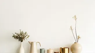
The Reign of Quiet Minimalism
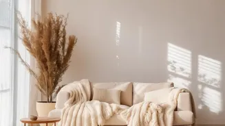
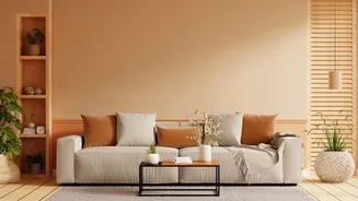
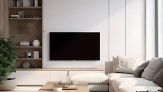
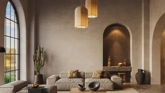
Not long ago, the all-beige interior was the pinnacle of chic. Driven by the minimalist aesthetics of Japandi and the understated elegance of “quiet luxury,” homeowners embraced monochrome palettes. The appeal was obvious: in a chaotic world, a room washed
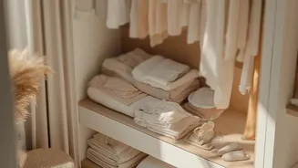
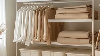
in soothing, neutral tones offered a sense of calm and order. Influencers and designers showcased spaces that were visually clean, serene, and undeniably sophisticated. This look, often associated with high-end brands and celebrity homes, suggested a kind of disciplined luxury. It was safe, non-committal, and easy on the eyes, creating a digital-friendly aesthetic that looked pristine on a phone screen. Beige, oat, and sand became the go-to colours for creating a tranquil sanctuary, a visual deep breath away from the noise of everyday life.
The 'Sad Beige' Fatigue
But a funny thing happened on the way to minimalist perfection: it started to feel a little empty. The very thing that made monochrome beige so calming also became its biggest weakness. Without variation, a room can feel one-dimensional, sterile, and lacking in personality. The internet even coined a term for it: “sad beige.” This described interiors that, while technically flawless, felt devoid of soul and individuality. When every surface is smooth and every colour is the same, a space can lack depth and warmth, creating what some designers call a visually “flat” experience. Homeowners began to realise that while their homes looked like a magazine, they didn't always feel like a home. The pendulum began to swing away from purely visual perfection toward something more sensory and emotionally resonant.
Enter Texture: The Sensory Solution
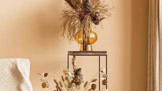
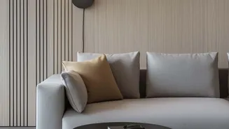
The antidote to monochrome fatigue isn’t a riot of clashing colours; it's the introduction of texture. In interior design, texture refers to the surface quality of an object—not just how it feels to the touch, but its visual feel as well. Think of the nubby weave of a bouclé chair, the cool smoothness of a marble tabletop, the rough grain of natural wood, and the soft fluff of a high-pile rug. These elements engage our sense of touch and create visual interest without shouting. Texture is the secret ingredient that prevents a neutral room from becoming boring. It adds depth, dimension, and a crucial layer of warmth that colour alone cannot provide, turning a flat space into a dynamic one.
Building a Tactile World
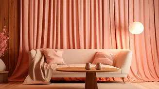
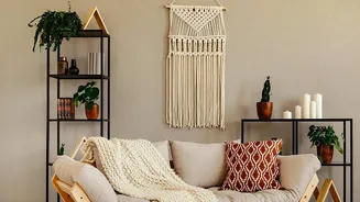
Incorporating texture is about creating a multi-sensory experience. It’s a design tool that allows you to build a narrative within a room. A leather sofa paired with a chunky knit throw tells a story of comfort and contrast. The interplay between a sleek metal lamp and a rustic linen lampshade adds a layer of curated sophistication. Designers achieve this by layering different materials. They might mix a velvet cushion on a linen sofa, place a woven basket on a polished concrete floor, or hang sheer curtains against a limewashed wall. Each element introduces a new tactile quality, inviting you to not just see the room, but to experience it. This layering creates visual weight and balance, making a space feel complete and lived-in.
An Evolution, Not an Eviction
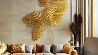
This shift doesn't mean you have to abandon your beloved beige. In fact, a neutral palette is the perfect canvas for exploring texture. The trend reversal isn’t about throwing out the beige but rather enriching it. Think of it as an evolution. You can keep the calming base colour while adding a deep-pile rug, a sculptural armchair in a rich fabric like velvet, or even just some heavily patterned cushions. The goal is to add contrast and personality. Introducing deeper tones like chocolate brown, forest green, or terracotta through textured items can ground a beige space and add dimension. It’s about moving beyond a look that feels like it was completed all at once from a single catalogue and toward a home that feels collected, personal, and rich with stories.