



The Power of a Neutral Foundation
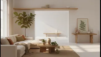
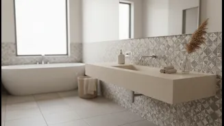
When your floor or walls already feature a busy pattern, the most effective strategy is to let that surface be the star of the show. A quiet colour palette—think soft whites, warm beiges, gentle greys, and even muted pastels—provides a neutral backdrop
that allows the pattern to stand out without overwhelming the space. These colours create a sense of cleanliness and calm, visually expanding the room by reflecting more light. The goal is to create balance; the quiet walls act as a supporting element, ensuring the bold surface feels intentional and sophisticated rather than cluttered and chaotic. Think of it as putting a simple, elegant frame around a complex piece of art.
How to Choose Your Core Colour
The key to a cohesive look is to select a neutral paint colour that complements the undertones in your busy surface. Look closely at your patterned tiles or stone. Are the underlying tones warm (with hints of yellow, beige, or pink) or cool (with hints of blue or grey)? For a harmonious design, match your wall colour to these undertones. For example, a tile with warm beige details will pair beautifully with a creamy off-white or light taupe on the walls. A cool-toned grey patterned floor will look seamless with a soft grey or crisp white paint. A foolproof method is to pull the lightest neutral shade from the pattern itself and use that for your walls, creating an instantly unified look.
Layering Texture, Not More Colour
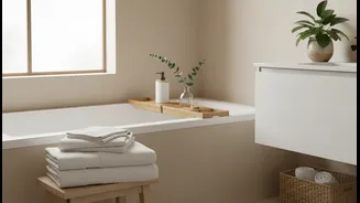
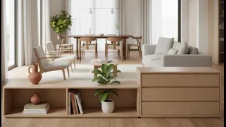
A neutral bathroom doesn't have to be boring. Once you've established your quiet colour base, you can add depth and interest by layering different textures. This is where you can bring personality into the space without adding more visual noise. Think about incorporating a variety of materials: fluffy towels, a woven laundry basket, a wooden stool, or ribbed glass accessories. Even the finishes of your tiles and fixtures contribute to this textural play. Combining matte floor tiles with glossy wall tiles, for example, can add a subtle, elegant contrast that enriches the space without competing with your main pattern. These tactile elements prevent the room from feeling flat and one-dimensional.
Selecting Cohesive Fixtures and Accents
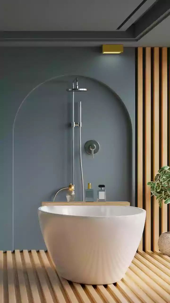
Hardware and fixtures are the finishing touches that tie the entire design together. With a busy surface and neutral walls, your taps, showerheads, and cabinet handles play a crucial role. To maintain a cohesive feel, try to stick to one finish. Matte black offers a modern, graphic contrast, while brushed gold or brass can add warmth to a neutral palette. Polished chrome is a timeless choice that works with nearly any style. The key is consistency. When it comes to accessories like soap dispensers and trays, choose simple, solid-coloured items that align with your quiet palette. This disciplined approach ensures every element in the room contributes to a feeling of calm and order, allowing your beautiful, busy surfaces to truly shine.