

Start With a Plan (On the Floor)
Before a single nail touches your wall, the most crucial step is to plan your layout on the floor. This allows you to visualize the final arrangement and make adjustments without consequence. Measure the wall space you intend to fill and mark it on the floor with painter's
tape. Then, arrange your frames within this boundary. This practice lets you see how the different sizes, shapes, and orientations interact. You can easily swap pieces, adjust spacing, and assess the overall balance until the composition feels right. Take a photo from above to reference once you’re happy with the result.
Identify Your Anchor Piece
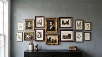
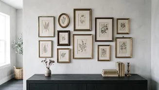
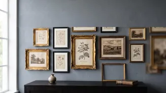
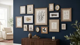
Every great gallery wall has an anchor—the piece that grounds the entire collection. This is typically your largest or most visually dominant frame. Place this piece first, often slightly off-center, to create a more dynamic, organic feel. Build the rest of your arrangement around it. This anchor provides a focal point and a structural starting point, preventing the layout from feeling random or chaotic. The other frames, both medium and small, will then work to support and balance this main piece.
Master Consistent Spacing
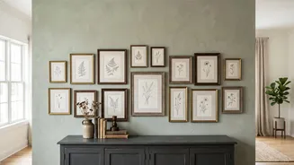
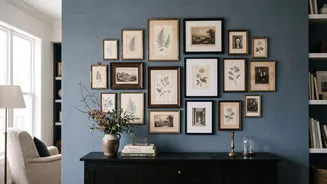
The secret to making a collection of disparate frames look like one intentional composition is consistent spacing. Aim for a uniform gap of 2 to 3 inches between each frame. This creates visual rhythm and prevents the wall from looking cluttered. While it might be tempting to give larger frames more room, sticking to one measurement for all the gaps is what creates a polished, professional look. If you have a collection of very small frames, you can tighten the gap to 1.5 inches, but consistency remains the most important rule.
Balance the Visual Weight
Balance isn't just about size; it's about 'visual weight'. A small, dark frame with a bold image can feel as 'heavy' as a larger, lighter frame. As you arrange your collection, step back frequently to ensure the weight is distributed evenly. Avoid clustering all your large, dark, or ornate frames on one side. Instead, spread them across the composition, often diagonally, to create a sense of equilibrium. For example, a heavy frame on the bottom left can be balanced by a grouping of two or three smaller frames on the top right.
Create Cohesion with Unifying Elements
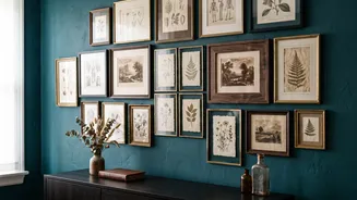
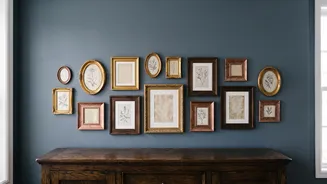
With a vintage theme, you're likely mixing various frame styles, materials, and eras. To prevent the look from becoming chaotic, create cohesion by repeating one or two elements throughout the display. A simple strategy is to limit your frame finishes to two or three, like black, wood, and gold, and ensure each finish appears at least twice. Another powerful technique is to use the same color matting—such as all-white or off-white—for all the pieces. This creates a consistent visual thread that ties everything together, allowing the variety in frames and art to shine.
Mix Orientations and Add Texture
A gallery wall composed entirely of rectangular frames in the same orientation can feel static. Create more movement and interest by mixing portrait (vertical) and landscape (horizontal) orientations. This simple trick breaks up the monotony and helps guide the eye around the arrangement. To take your vintage wall to the next level, consider adding elements beyond framed art. A small, ornate mirror, a shadow box, a woven textile, or a decorative plate can add a layer of texture and personality, making your collection feel even more curated and unique.