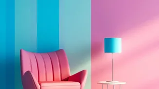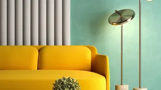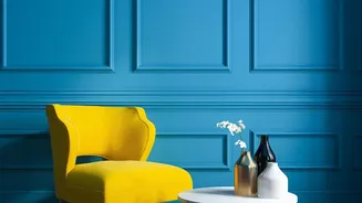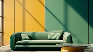


What is Colour-Blocking?
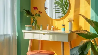
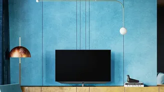
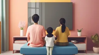
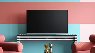
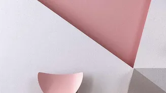
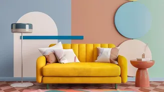
First seen in fashion, colour-blocking is an interior design technique that uses two or more distinct, solid blocks of colour to create a bold visual statement. The goal is to use colour to define or structure a space, adding drama and highlighting architectural
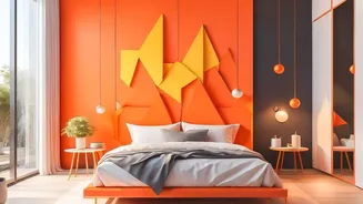
features without the need for busy patterns. Think of it as painting with shapes—using contrasting or complementary hues to create geometric forms that guide the eye and infuse a room with energy. It can be as simple as a two-tone wall or as complex as a mural of intersecting shapes.
The Wallpaper Advantage
While you can achieve a colour-blocked look with paint, it requires precision, patience, and a steady hand with masking tape. This is where wallpaper shines. Many modern wallpapers come with colour-blocked designs already printed on them, offering a simple and effective way to adopt the trend. It’s a faster and cleaner alternative, providing crisp lines and perfect geometric shapes without any DIY stress. Wallpapers also offer a vast array of textures and finishes that are difficult to replicate with paint, and they can be an excellent way to camouflage minor wall imperfections. Plus, with many peel-and-stick options available, it's a less permanent commitment, making it ideal for renters or those who love to frequently update their decor.
Choosing Your Perfect Palette
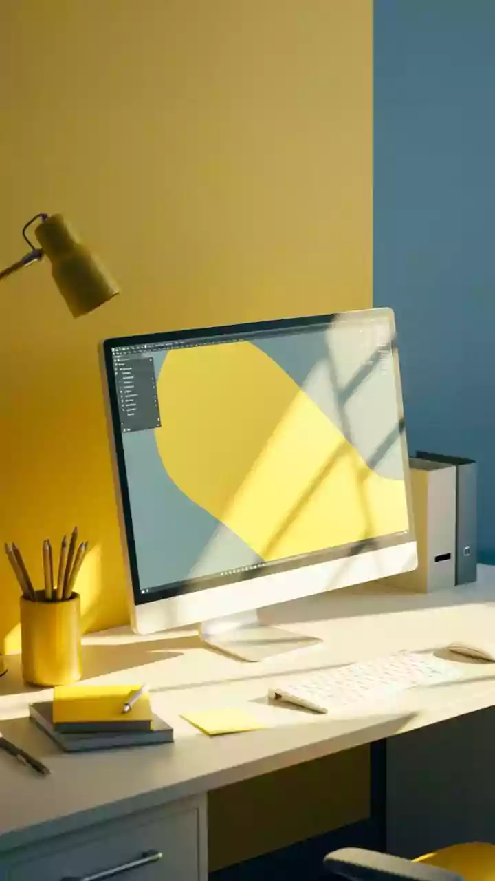
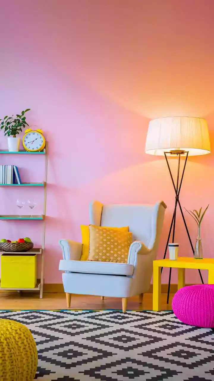
The success of colour-blocking lies in the palette. For a high-impact, energetic look, choose complementary colours that sit opposite each other on the colour wheel, like blue and orange or purple and yellow. For a more serene and harmonious feel, a tonal approach works wonders. This involves using different shades of the same colour, such as a deep navy with a soft sky blue. Another popular option is to pair a bold colour with a neutral like cream, beige, or grey to create a focal point that isn't overwhelming. When in doubt, start with a palette of two or three colours plus a neutral to keep the look intentional and uncluttered.
Strategic Placement for Maximum Impact
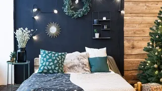
Where you place your colour-blocked wallpaper is just as important as the colours you choose. An accent wall is the most popular and straightforward approach, instantly creating a focal point without overwhelming the room. This works especially well behind a bed to act as a 'headboard' or behind a sofa in the living room. You can also use colour-blocking to define zones in an open-plan space, visually separating a dining area from a living area, for instance. A split-wall or half-wall design, with wallpaper on either the top or bottom half, can add interest while affecting the room's perceived proportions.
Making Any Room Size Work
Colour-blocking can be a powerful tool for visual trickery. In a smaller room, using vertical stripes can create the illusion of higher ceilings. Horizontal stripes or blocks can make a narrow room feel wider and more expansive. Using lighter, brighter colours on top and a darker, grounding colour on the bottom half of a wall can make the space feel both cosy and airy at the same time. In large, cavernous rooms, bold, warm colours can make the space feel more intimate and inviting. Light-coloured wallpapers, in general, are great for making smaller or darker rooms feel brighter and more open.
Think Outside the Box
Don't limit colour-blocking to just a single feature wall. You can apply this trend in more creative and subtle ways. Consider wallpapering the ceiling to draw the eye upward and add a dose of unexpected drama. Another clever idea is to apply colour-blocked wallpaper to the back of a bookshelf or inside cabinets for a surprising pop of colour when opened. This technique is also fantastic for highlighting architectural details like alcoves or wall mouldings, turning an ordinary feature into a design statement.