

Beyond a Simple Accent Wall
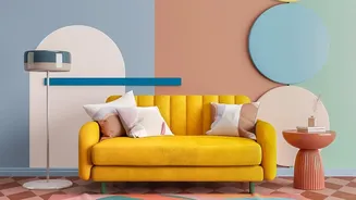
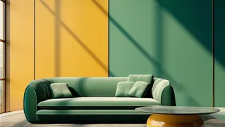
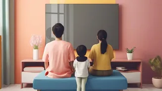
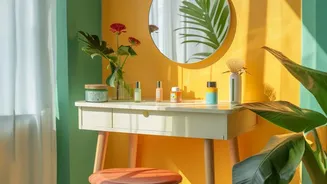
Forget the feature wall of the early 2000s, where one wall shouted while the others whispered. The modern approach is about creating a cohesive, intentional design. Two-tone wallpapering, also known as colour-blocking, uses two complementary or contrasting
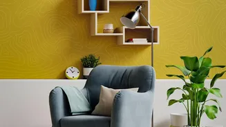
wallpapers to add architectural interest and visual rhythm to a room. This technique can involve splitting a wall horizontally, using different papers on adjoining walls, or even creating graphic shapes. The result is a space that feels curated and confident, turning flat walls into a dynamic canvas that tells a story. Unlike a single shade, which can sometimes feel monotonous, a two-tone scheme introduces immediate contrast and energy.
The Art of Spatial Illusion
One of the most powerful uses of two-tone wallpaper is its ability to manipulate the perception of space. A darker, richer pattern on the bottom third of a wall, with a lighter, airier one above, can create the illusion of higher ceilings by drawing the eye upward. This mimics the effect of classic wainscoting without the cost or commitment of installing woodwork. In smaller rooms or long hallways, this technique can make the space feel larger and more open. Conversely, in a large, cavernous room, using warmer or deeper tones can make the space feel more intimate and cosy, creating a sense of grounding and comfort that a single light colour might fail to achieve.
Defining Zones Without Building Walls
Open-plan living is more popular than ever, but it comes with the challenge of defining distinct functional areas. This is where colour-blocking shines. By using a bold patterned wallpaper in the section of a living room designated as a home office, you can create a clear visual 'zone'. This technique cleverly separates spaces without physical barriers, maintaining an open feel while providing structure. You could carve out a cosy reading nook in a bedroom, delineate a dining area within a large kitchen, or give each child their own distinct territory in a shared room. It’s a smart, stylish solution for modern living that adds both function and personality.
A Canvas for Personality and Mood
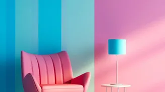
While a single-shade wall reflects one choice, a two-tone scheme offers a richer palette for self-expression. The combination of colours and patterns you choose has a profound psychological impact. You can pair a calming, cool-toned wallpaper like a soft blue or green with a neutral cream to create a serene bedroom retreat. Or, for a living room designed for socialising, you might combine an energetic, warm-toned pattern with a sophisticated neutral to spark conversation and creativity. This layering of colour allows you to craft a more nuanced atmosphere that aligns with the room's purpose, whether that's focus, relaxation, or energy. You're not just picking a colour; you're designing a feeling.
Getting the Combination Right
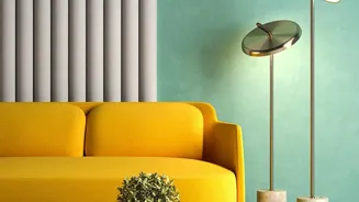
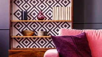
The key to successful two-tone wallpapering is a harmonious combination. You can opt for a subtle, sophisticated look by using two different shades of the same colour, a technique known as tonal variation. Another safe yet effective method is to pair a neutral wallpaper with a bolder accent pattern. If you're mixing two different patterns, a good rule of thumb is to vary the scale: combine a large-scale print with a smaller, more delicate one to avoid visual chaos. The most important part is to ensure the colours share a similar intensity or undertone to create a cohesive link, making the final look intentional and professionally styled rather than disjointed.