
The Quiet Retreat of Monochrome
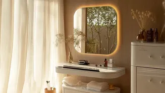
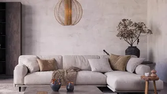
The popularity of the all-beige, or monochrome neutral, interior wasn't an accident. In a visually noisy world, it offered a sanctuary of calm. This aesthetic, often associated with Scandinavian and minimalist design, promised a clean, uncluttered, and serene
environment. It was easy to execute and provided a safe, reliable backdrop for modern life. However, after years of dominance, what once felt calming began to feel, for many, a bit sterile and impersonal. The 'sad beige' phenomenon, as it was dubbed on social media, highlighted a growing fatigue with interiors that lacked personality and expression, looking more like a catalog than a lived-in home.
The Rise of Sensory Design
The reversal of the beige trend isn't necessarily about a sudden explosion of wild color. Instead, it’s about a pivot to a more profound element: texture. In a monochrome setting, texture is what prevents a room from feeling flat. But the new approach places texture at the forefront of the design process, not as an afterthought. This shift is toward sensory design, creating spaces that are not just visually appealing but also invite touch and interaction. It's about how a space feels, not just how it looks. The coolness of a marble coffee table, the roughness of a jute rug, the softness of a boucle chair, and the grain of a wooden cabinet all contribute to a room's character in a way color alone cannot.
Texture's Power Over Sameness
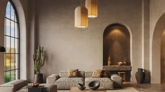
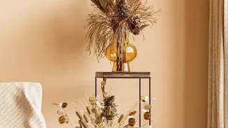
So, what does this focus on texture actually mean? It means creating depth and interest through a variety of materials and finishes. While a monochrome color palette can feel one-dimensional, a multi-texture palette feels layered and complex, even if the colors are all within the same neutral family. Texture adds visual weight and sophistication. Light plays differently on a velvet cushion than it does on a linen curtain, creating subtle shifts and shadows that make a space feel more dynamic and alive. This approach allows for personality to shine through material choices, reflecting a renewed appreciation for craftsmanship, authenticity, and quality that transcends fleeting color trends.
How to Layer Texture at Home
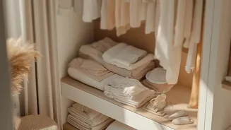
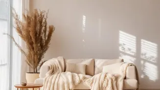
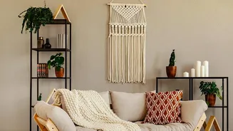
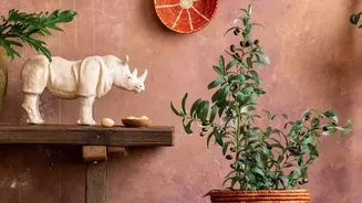
Embracing this trend doesn't mean you have to abandon your love for neutrals. In fact, a neutral palette is the perfect canvas for showcasing a variety of textures. Start by thinking in layers. Begin with foundational textures like a wooden floor or a large woven rug. Then, add in upholstery with distinct weaves, like a chunky knit throw over a smooth leather sofa. Mix different materials: combine soft textiles with hard surfaces like stone or metal. Consider your walls, too; finishes like limewash or plaster can add subtle depth that flat paint cannot. The key is to create contrast in touch, mixing rough with smooth, plush with sleek, and matte with glossy.
A More Personal Approach
Ultimately, the move away from strict monochrome beige is part of a larger desire for our homes to feel more personal and reflective of who we are. While beige offered a safe, universal solution, the focus on texture encourages a more curated and individual approach. It’s about building a space that tells a story through the materials you choose to surround yourself with. It’s a quieter, more tactile form of expression. The goal is no longer to achieve a picture-perfect, uniform look, but to create a comfortable, inviting, and interesting home that engages all the senses.