



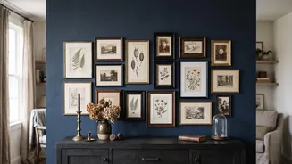
Start with an Anchor Piece
Every great gallery wall begins with a single piece that sets the tone. This is your 'anchor'—often the largest or most compelling item that captures the mood you want to create. It might be an oil painting with rich, moody tones, a vibrant vintage travel
poster, or a sepia-toned family photograph. Before you gather anything else, find this one core piece. This artwork will serve as your guide, providing the foundational colours for your entire collection. Don't worry about where it will hang just yet; instead, focus on how it makes you feel. The goal is to choose a piece that resonates with you and can serve as the visual and emotional centre of your arrangement.
Build Your Colour Story
Once you have your anchor, it's time to 'read' its colours. Look closely and identify the three to five dominant and accent hues within the piece. A reliable interior design principle is to stick to two or three core colours, complemented by neutrals like cream, black, or grey. For example, a landscape painting might offer deep olive green, dusty terracotta, and a pale, buttery yellow. This becomes your palette. This selection of colours is the visual thread that will connect every other item on your wall. As you hunt for other pieces, you'll be looking for art, photos, and objects that feature one or more of these specific shades, ensuring everything feels related, like siblings rather than strangers.
Sourcing Your Vintage Treasures
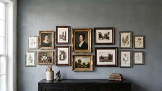
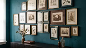
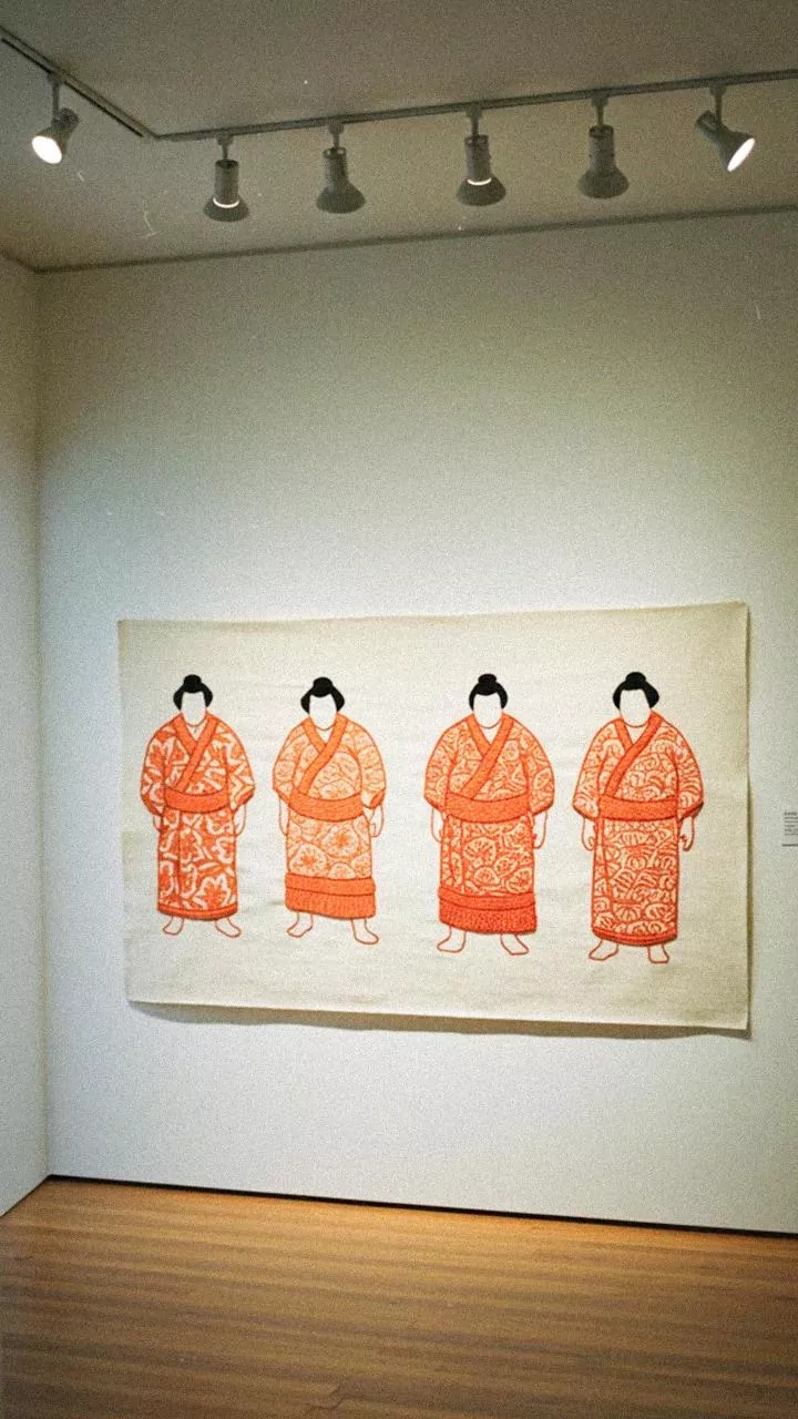
With your colour palette in hand, the treasure hunt begins. Scour flea markets, antique shops, estate sales, and online marketplaces. Look for art with visible brushstrokes, unique imperfections, or artist signatures that add character. Your guiding principle should be colour first, subject matter second. You might find a small abstract sketch with a splash of your chosen terracotta, or a botanical print featuring that same olive green. Don’t limit yourself to just framed prints. Consider incorporating small mirrors, decorative plates, or even framed textiles that fit your colour story. Mixing mediums adds texture and a 'collected-over-time' feel that makes a vintage gallery wall so charming.
Unify with Frames and Neutrals
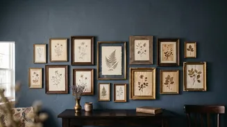
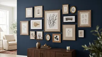
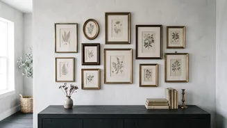
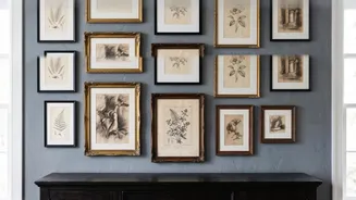
Frames are the unsung heroes of a gallery wall. While a cohesive colour palette in the artwork is key, frames help unify the collection. You don't need them all to match; in fact, a mix of styles often looks more authentic. A combination of warm wood, antique gold, and simple black frames can work beautifully together. These frames, along with any matting, act as neutral bridges between different pieces, giving the eye a place to rest and preventing the display from feeling too busy. If you find a piece you love but the frame clashes, a simple coat of spray paint in black, gold, or white can easily integrate it into your collection.
Arranging Your Collection
Before putting any nails in the wall, lay your entire collection out on the floor. This allows you to experiment with arrangements and spacing without consequence. Start by placing your anchor piece, often slightly off-centre to encourage the eye to travel around the display. Then, build outwards, balancing larger pieces with smaller ones. Maintain a consistent gap of about 2-3 inches between each frame to ensure the arrangement feels cohesive rather than cluttered. Mix horizontal and vertical orientations to create a dynamic rhythm. Once you have a layout you love, take a photo for reference before you start hanging.