



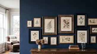
The Allure and Challenge of Vintage Frames
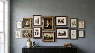
There’s a unique story in every thrifted, antique, or hand-me-down picture frame. From ornate gilt wood to simple, rustic designs, these pieces carry a history and character that new frames often lack. Yet, creating a gallery wall with a diverse collection
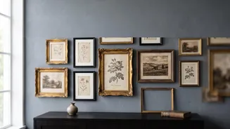
can be daunting. The very qualities that make each frame special—different materials, eras, and levels of intricacy—can also make them clash. Without a unifying element, a wall of mismatched frames can quickly look cluttered and accidental rather than intentional and stylish. The goal is to celebrate the eclectic nature of your collection while creating a display that feels harmonious and balanced. That's where a deliberate colour strategy comes in.
Define Your Colour Story
A cohesive colour palette is the 'invisible thread' that connects disparate frames. This doesn't mean every frame must be the same colour. Instead, it's about choosing a limited and related group of colours that will guide your arrangement. A strong palette creates visual harmony, making the entire display feel purposeful. Think of it as a team uniform; the players are different, but their jerseys show they belong together. You can build this story around two or three core colours, a single colour family, or even the materials themselves.
Strategy 1: Unify with Paint
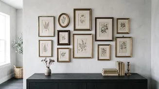
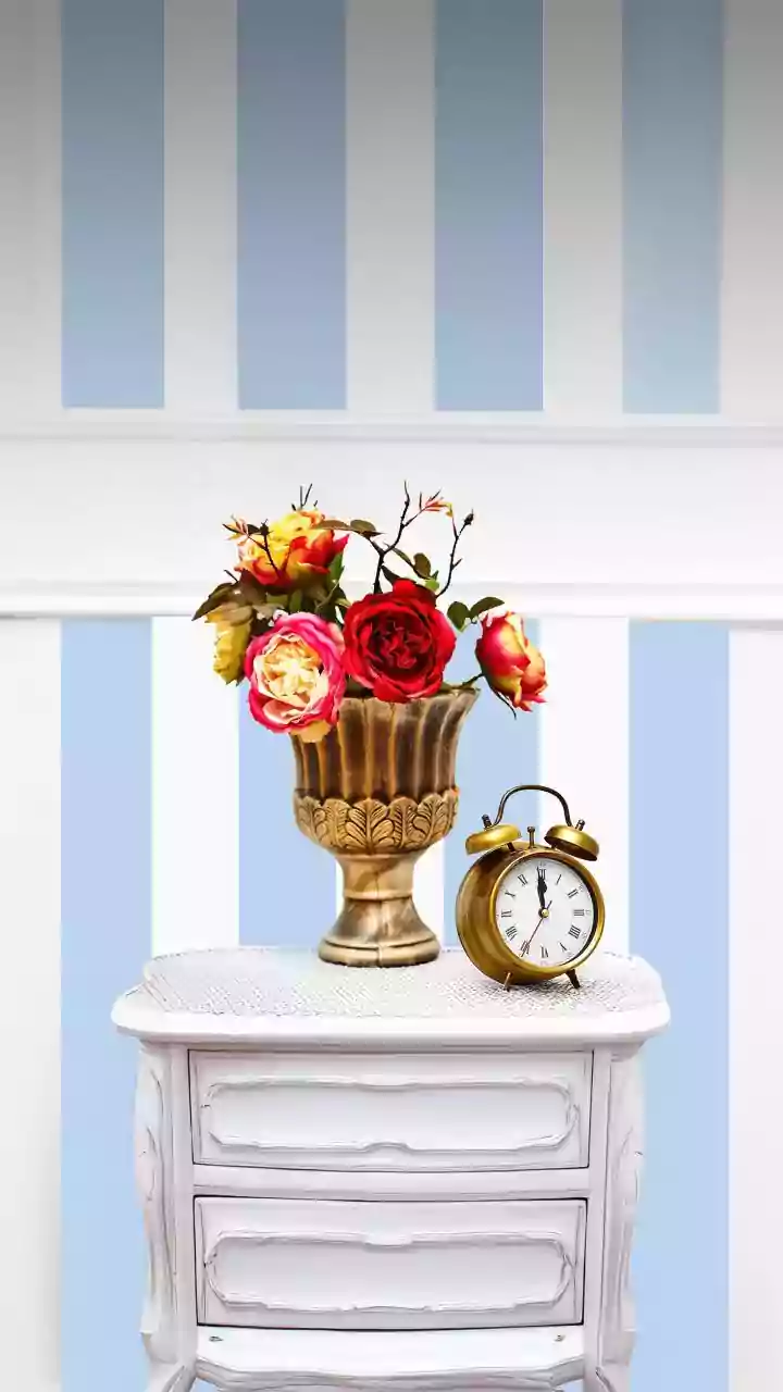
The most straightforward method for creating cohesion is paint. By painting your collection of frames in a unified palette, you preserve their unique shapes and textures while creating an immediate visual link. You don't have to stick to one shade. A monochromatic scheme, using different tones of a single colour like blues, greys, or olive greens, can add sophisticated depth. Alternatively, a classic black-and-white theme is timeless. An eggshell or matte finish often works best, allowing the frame's details to stand out without the distraction of a high-gloss shine. This approach is perfect for worn or damaged frames that can be given new life with a fresh coat of paint.
Strategy 2: The Material Palette
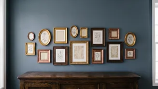
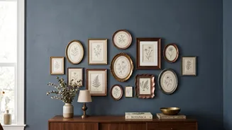
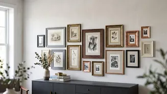
If you love the original finish of your vintage frames, let the materials guide your palette. Grouping frames by their core material is a powerful way to create a 'collected over time' feel. For example, create a warm, rustic display by mixing different wood tones—like walnut, oak, and pine. Similarly, you can create an elegant, shimmering wall by mixing metallic finishes. A palette of gold, brass, and other warm metals feels luxurious and timeless. The key is to stick to either warm tones (gold, brass) or cool tones (silver, chrome, nickel) to maintain harmony. You can also mix a dominant material, like wood, with a single metallic accent for a touch of contrast.
Strategy 3: Focus on Matting and Artwork
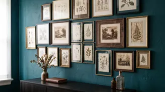
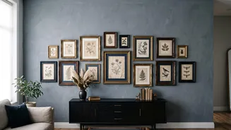
Sometimes the solution isn't the frame itself, but what's inside and around it. Using consistent matting is a designer's secret weapon. Placing a uniform mat—typically in white or off-white—inside each different frame creates a clean, visual border around the artwork and provides instant cohesion. This simple trick gives the eye a consistent element to follow, making the differences in the frames feel intentional. Furthermore, the artwork itself can provide the colour palette. Choosing photos or prints that share a similar colour story (e.g., all black-and-white photos, sepia tones, or prints with dominant blue and green hues) will tie the entire wall together, regardless of the frames used.