
The Comfort of Calm
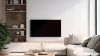
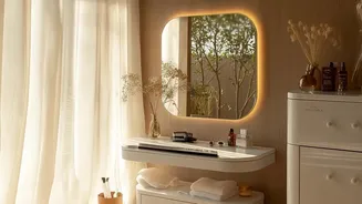
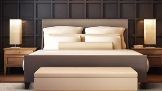
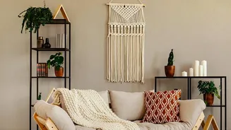
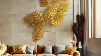
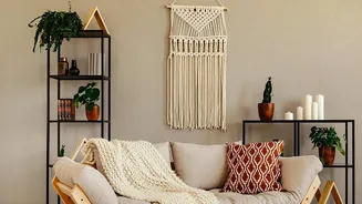
The obsession with beige wasn't accidental. It was the backdrop to the minimalist and Scandinavian design movements that prized simplicity and calm. In a world that felt increasingly loud, a home swathed in fifty shades of taupe offered a visual respite.
This aesthetic, often associated with “quiet luxury,” turned our homes into serene, hotel-like sanctuaries. However, as designers point out, when every wall, sofa, and cushion is the same muted tone, spaces can start to feel flat, one-dimensional, and even a little boring.
The Great Colour Correction
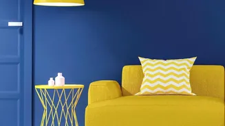
The shift away from stark neutrality is being driven by a collective desire for self-expression and happiness. Enter "dopamine decor," a trend focused on using colour, pattern, and personal items to create a space that genuinely makes you feel good. After years of playing it safe, people are ready to be bolder and make their homes a true reflection of their personality. This doesn't mean a return to chaos; rather, it’s about moving toward warmer, more layered interiors that feel welcoming and full of life.
What Is a Balanced Palette?
Moving on from beige doesn’t mean you have to paint your living room neon pink. The key is balance. A balanced colour palette is a thoughtful selection of hues that work together to create a cohesive and intentional look. The most trusted tool in a designer's kit is the 60-30-10 rule. It’s a simple but powerful guideline for creating harmony in any room. This principle ensures that colours are distributed in a way that is pleasing to the eye, preventing any single hue from overpowering the space.
The 60-30-10 Rule Explained
Think of it as a recipe for your room. 60% of the space should be your dominant color, which usually covers the largest surfaces like walls and maybe a large rug or sofa. 30% is for your secondary colour, used for things like curtains, accent chairs, or a feature wall. This colour adds contrast and interest. Finally, 10% is your accent colour—the fun part! This is where you can be bold with throw pillows, artwork, or decorative accessories, adding that final pop of personality.
Finding Your New Neutrals
The good news is you don’t have to abandon neutrals entirely. In fact, beige can still be part of a balanced palette—just not the whole thing. The concept of neutrals is expanding to include what designers call “new neutrals” or “anti-neutral neutrals.” Think of warm, earthy tones like terracotta, dusky pink, olive green, and rich browns. These shades provide a grounded, nature-inspired base that feels both sophisticated and calming, and they pair beautifully with a wide range of accent colours.
Start Small, Go Bold Later
Dipping your toes into the world of colour can be intimidating. A great way to start is by introducing colour through smaller, less permanent items. Swap out neutral cushions for ones in a vibrant jewel tone. Add a colourful rug or hang a bold piece of art. Even a single piece of painted furniture can dramatically shift the energy of a room. As you get more comfortable, you can consider bigger commitments, like an accent wall or a colourful sofa. The journey is about experimenting and discovering what brings you joy.