
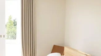
The Fading Appeal of Flat Neutrals
The reign of beige was long and understandable. It provided a calm, clean, and safe backdrop for our lives, particularly during a time when many craved simplicity and order. However, what once felt like serene luxury began to feel predictable and emotionally
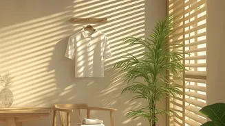
flat. Designers note that when everything—walls, furniture, and accessories—sits in the same muted shade, a room can lose its individuality and warmth. This overexposure has led to a collective desire to move beyond one-note interiors and embrace homes that tell a more personal story, reflecting who we are and how we want to feel in our own spaces.
The New Definition of Warmth
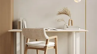
The reversal of the beige trend doesn’t mean a chaotic return to loud, jarring colors. Instead, it’s about a more sophisticated approach to warmth. The new case for contrast is built on a foundation of richer, more complex hues and materials. Think less about stark opposition and more about tonal cohesion. This evolution, sometimes called "warm minimalism" or "cozy minimalism," keeps the simplicity of modern design but replaces visual emptiness with sensory calm. It’s about creating an atmosphere that is layered, inviting, and deeply comfortable without sacrificing clean lines or a feeling of serenity.
Embracing an Earthy Palette
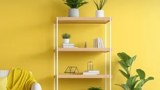
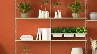
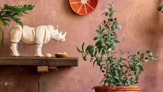
The primary replacements for beige are colors drawn directly from the natural world. Earthy tones like terracotta, olive green, cola browns, and dusky pinks are taking center stage. These shades have a grounding effect, making a home feel more connected to the outdoors and promoting a sense of well-being. Colors like terracotta and dusky, plaster-like pinks offer the same neutrality as beige but with far greater depth and character. Muted greens, from soft sage to deep moss, feel more alive and enveloping than their beige counterparts. These nature-inspired palettes can be used for an entire room or as a statement accent wall to create a cozy, immersive atmosphere.
The Crucial Role of Texture and Material
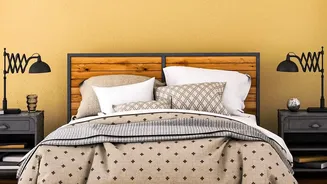
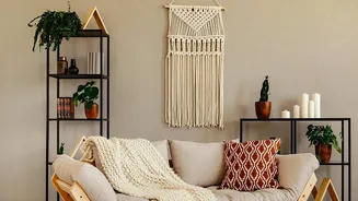
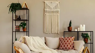
Warmth isn’t just about color; it’s about touch. The new trend emphasizes a rich interplay of textures and authentic materials. Highly engineered, polished surfaces are giving way to timber cabinetry, natural stone countertops, and handmade ceramics. Darker woods like walnut and mahogany are returning, adding structure and contrast against softer walls. In textiles, the key is layering. Combining soft textures like bouclé, velvet, and linen with harder materials like travertine or brass creates a dynamic and sophisticated look. A nubby wool rug, linen curtains, and a rattan chair can transform a simple room into a space with tactile warmth and character.
How to Introduce Warmer Contrasts at Home
You don’t need to undertake a complete renovation to move away from a beige-heavy scheme. Start small to build confidence. Introduce a new color through textiles like cushions, a patterned area rug, or a cozy throw blanket. Painting a single accent wall or even an interior door can add a pop of contrast without overwhelming the space. Consider swapping out a single piece of furniture, like a neutral sofa for one in a rich olive green or a deep blue. Even updating accessories like lamp bases, picture frames, or vases from flat neutrals to warmer woods, colored glass, or textured ceramics can make a significant impact, adding layers that feel collected and personal over time.