
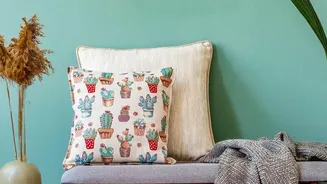
The Age of Beige
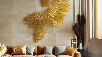
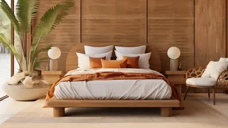
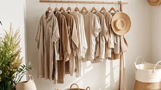
Let's be honest: there was a good reason for beige’s long reign. In a chaotic world, the minimalist, neutral aesthetic promised a serene escape. It was the colour of quiet luxury, of decluttered minds and Scandinavian simplicity. Rooms drenched in beige,
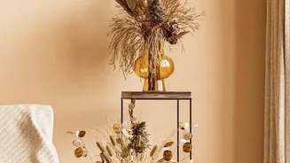
cream, and ecru felt grounding and sophisticated. For many, it was a foolproof way to create a cohesive and calming environment without the risk of clashing colours or making a design mistake. This palette became a go-to for creating spaces that felt clean, expansive, and effortlessly chic, a visual deep breath at the end of a long day.
The Backlash Against Bland
But as with any dominant trend, fatigue began to set in. The very safety of beige started to feel, well, a little boring. A phenomenon dubbed "sad beige" began circulating, describing interiors that felt so devoid of personality that they were more sterile than serene. After years of looking at the same neutral spaces on social media feeds, homeowners are craving self-expression. They want their homes to tell a story, to reflect their unique tastes and experiences. The one-size-fits-all approach of an all-beige room now feels impersonal and predictable, prompting a collective desire to reintroduce character and joy back into our living spaces.
Enter the Balanced Palette
The reversal of the beige trend doesn't mean a sudden shift to chaotic, clashing colours. Instead, the focus is on creating balanced, considered palettes. Think of it as colour with confidence. One of the most effective ways to approach this is the classic 60-30-10 rule. This design principle suggests dedicating 60% of your room to a dominant, often neutral, colour (the walls), 30% to a secondary colour (furniture, curtains), and 10% to an accent colour (cushions, art, accessories). This formula ensures that the colours are well-distributed, creating a harmonious and visually appealing space without feeling overwhelming. It’s the perfect framework for stepping away from monochrome without diving headfirst into the rainbow.
Colours Defining 2026
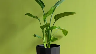
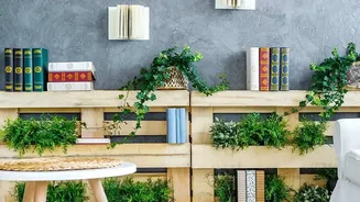
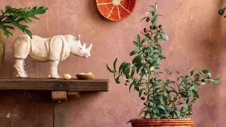
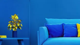
So, what shades are replacing the sea of beige? Designers are turning to rich, earthy, and complex colours that add warmth and depth. Muted greens that evoke nature are a popular choice, pairing beautifully with natural wood and brass accents. Rich, warm browns, from terracotta to cola and chocolate tones, are also gaining traction, creating cosy, enveloping spaces. For those wanting a hint of colour that still feels soft and neutral, dusky pinks and sophisticated mauves are becoming a go-to. Even shades of blue, from calming pastels to moody navy, are being used to add dimension and break the monotony of a purely warm-toned room.
How to 'Un-Beige' Your Home
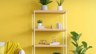
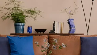
Moving away from an all-neutral scheme can feel daunting, but it doesn't require a complete overhaul. The key is to start small. Introducing a few colourful cushions or a vibrant throw blanket can instantly lift a beige sofa. A statement piece of art can serve as the inspiration for a new palette. Consider adding a 'main character' armchair in a rich velvet or a sculptural shape to disrupt the monotony. For a more significant change, try painting a single accent wall in a muted green or a warm terracotta. In India, where traditional aesthetics often celebrate colour, this can be an opportunity to blend modern layouts with heritage hues like deep reds, mustard yellows, or calming indigos in a contemporary way.