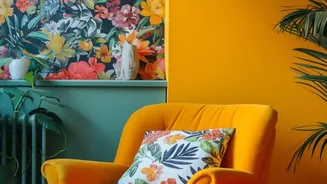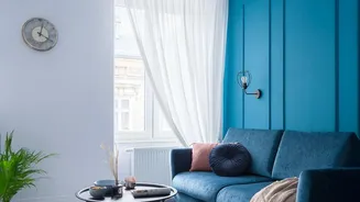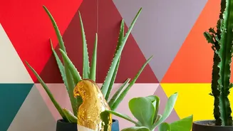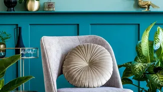


Deep Teal and Crisp White
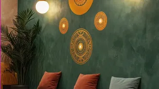
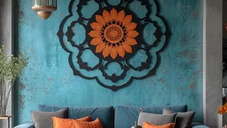
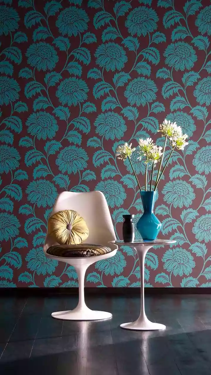
This combination is the epitome of sophisticated drama. A deep, jewel-toned teal brings a sense of calm, depth, and luxury, often associated with tranquil waters and precious gems. When set against crisp white or a very light cream on the other walls,
the teal pops without overwhelming the room. This pairing is incredibly versatile, working beautifully in living rooms behind a sofa, in a bedroom to create a serene headboard effect, or in a dining area to add a touch of formality. To complete the look, accessorise with metallic accents like brass or gold, and introduce natural textures such as light-coloured wood or woven textiles to maintain a sense of balance and warmth.
Charcoal Grey and Mustard Yellow
For a look that is both modern and welcoming, you cannot go wrong with charcoal grey and a vibrant mustard or ochre yellow. The deep, grounding nature of charcoal provides a perfect neutral canvas, allowing the optimistic punch of yellow to truly shine. This contrast feels urban, energetic, and intelligent. It is a fantastic choice for home offices, where it can inspire creativity, or living rooms that need a splash of warmth and personality. The key is to use yellow sparingly to avoid it becoming overpowering; think of it as a burst of sunshine on a cloudy day. This duo pairs exceptionally well with mid-century modern furniture, black metal fixtures, and graphic art prints.
Navy Blue and Burnt Orange
Rich, classic, and endlessly comforting, the pairing of navy blue and burnt orange or terracotta is a timeless winner. Navy offers a deep, dependable elegance that makes a space feel cosy and secure. Introducing a burnt orange accent against it evokes a feeling of warmth, like a setting sun or autumnal leaves. This earthy contrast is grounding and worldly, making it ideal for a study, library, or a snug living room. The combination works wonders in rooms with leather furniture, dark wood, and warm-toned metals like copper or bronze. It creates a space that feels both distinguished and inviting, encouraging you to settle in with a good book.
Emerald Green and Blush Pink
Once considered a daring trend, the combination of emerald green and a soft blush pink has firmly established itself as a new classic. It is a study in contrasts: the deep, lush vibrancy of emerald speaks of opulence and nature, while the gentle, dusty quality of blush pink adds a soft, romantic, and modern touch. The result is a look that feels both luxurious and surprisingly soothing. This pairing is a showstopper in bedrooms and dressing rooms, but can also bring a unique sense of glamour to a living area. To prevent the space from feeling too sweet, anchor it with neutral furniture in shades of grey or beige, and incorporate gold or brass hardware for a final touch of chic elegance.
Rich Burgundy and Soft Greige
For an atmosphere of understated, regal elegance, consider the powerful combination of a rich burgundy or plum with a soft greige. Burgundy is a complex colour, conveying warmth, sophistication, and a hint of moody luxury. Pairing it with greige—a versatile neutral that blends grey and beige—is the perfect way to balance its intensity. The greige walls provide a soft, contemporary backdrop that prevents the deep red from dominating the room, resulting in a space that feels curated and cosy. This palette is perfect for creating an intimate dining room or a sophisticated lounge area. It pairs beautifully with velvet textures, dark wood finishes, and antiqued silver or pewter accents to complete the refined aesthetic.