



The Psychology of Warmth
Colours like terracotta, rust, and ochre belong to a family of warm tones that are psychologically associated with comfort, energy, and optimism. Hues of red, orange, and yellow are known to stimulate the senses and can make a space feel more intimate
and inviting. Unlike cool colours that can make a room feel larger, warm tones create an illusion of coziness, drawing you in and making even a small nook feel like a deliberate, welcoming retreat. This connection to natural elements like sun and earth helps ground a space, making it feel more tranquil and balanced.
Finding Your Perfect Shade
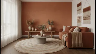
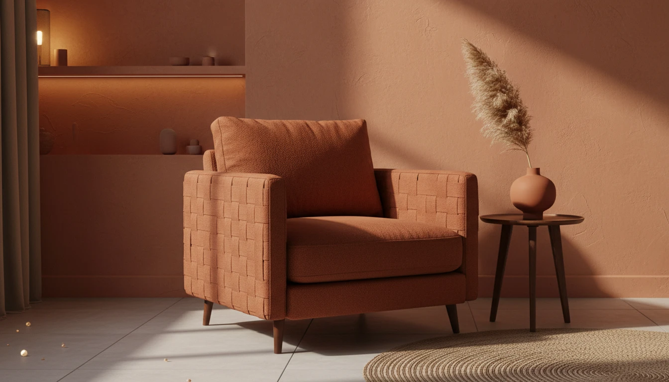
Terracotta is not a single colour but a spectrum. Softer, faded shades with sandy or peachy undertones can serve as a gentle, warm neutral for an entire room, especially in bedrooms or living areas where you want to relax. Mid-range terracottas, like a classic burnt orange or red earth, are incredibly versatile and bring a grounding energy that works well for a feature wall. For a bolder statement, deeper shades like brick red or those with rich brown undertones add a layer of sophistication and drama, perfect for creating an intimate dining area or a focused home office. When choosing, consider the natural light; a vibrant terracotta will appear richer at night under warm artificial light.
Layer with Natural Textures
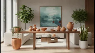
Paint is just the beginning. To truly bring a terracotta space to life, you need to introduce texture. Natural materials are a perfect partner for earthy colour palettes. Think of incorporating linen curtains, wool or cotton throw blankets, and jute or rattan rugs and baskets. These elements add visual interest and prevent the warm colours from feeling flat. Wooden furniture—especially pieces with a visible grain—complements the earthy tones perfectly. Even small additions, like clay or ceramic pots for indoor plants, reinforce the connection to nature and complete the look.
Strategic Lighting is Key
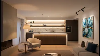
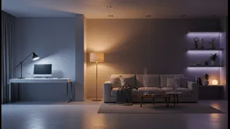
In a dark corner, colour can only do so much without the right light. The goal is to create layered lighting that works together. Avoid relying on a single harsh overhead light, which can create shadows. Instead, combine multiple sources. Start with ambient light from a main fixture, then add task and accent lighting. A floor lamp can brighten the entire corner, a table lamp on a side table provides a warm glow for reading, and wall sconces can wash the wall in soft, diffused light. Placing a mirror opposite a light source is a classic trick to bounce light around and make the space feel brighter.
Building a Cohesive Palette
Terracotta pairs beautifully with a range of other colours. For a calm and organic feel, combine it with other earthy tones like sage green, olive, or deep browns. To keep the space from feeling too heavy, balance terracotta with warm neutrals like cream, beige, or soft grey. Using a 60-30-10 rule can be helpful: 60% light neutral, 30% a medium earth tone, and 10% a deep accent like a bold terracotta. For a more dramatic and stylish contrast, vibrant blues are a surprisingly effective partner, as they sit opposite orange on the colour wheel.