


The Rise and Reign of Grey
It’s hard to remember a time before grey dominated our Pinterest boards and interior design magazines. Beginning in the late 2000s and exploding through the 2010s, grey became synonymous with chic, minimalist living. It was the perfect, unobtrusive backdrop
for the clean lines of Scandinavian design and the starkness of industrial aesthetics. It felt more modern than beige, less sterile than pure white. Real estate agents loved it, developers used it as a standard, and homeowners saw it as a foolproof choice that would increase resale value. It was the colour of sophistication—cool, calm, and collected. This 'greige' revolution promised a home that was both stylish and a blank canvas for personal touches, even if many of us stopped at the canvas.
Why the Crown Began to Slip
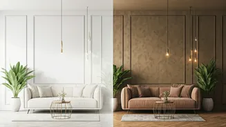
So, what went wrong? In a word: oversaturation. When a colour becomes the default for everything from luxury apartments to budget hotels and office spaces, it starts to lose its specialness. It can feel generic, even corporate. But the biggest catalyst for change was arguably the pandemic. As we spent unprecedented amounts of time within our own four walls, the perception of grey began to shift. What once felt 'calm and collected' started to feel 'cold and clinical'. The cool undertones that made grey feel so crisp and modern could also read as gloomy and impersonal, especially in rooms with limited natural light. Our homes had to become our sanctuaries, our offices, and our gyms, and many people realised they didn't want their sanctuary to feel like a boardroom.
The New Era of Warmth and Personality
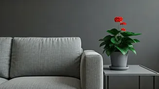
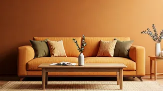
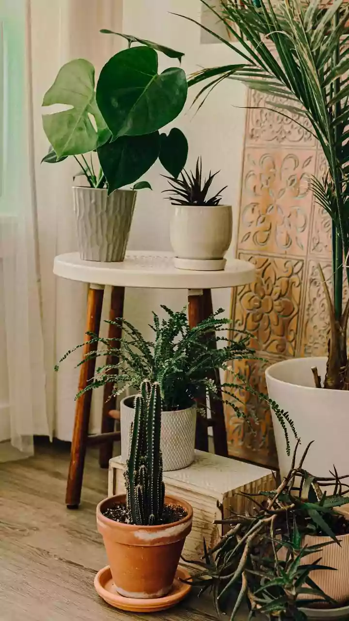
The move away from grey isn't just about disliking a colour; it's about a fundamental shift in what we want from our homes. We're craving comfort, cosiness, and spaces that feel uniquely ours. This has ushered in an era of warm neutrals and expressive colours. Think of it as 'dopamine decor'—design choices that actively make you feel good. This includes embracing colours that connect us to the natural world, a trend known as biophilic design. We're no longer afraid of painting a room in a colour that reflects our personality rather than appealing to a hypothetical future buyer. The home is now, more than ever, a space for living in, not just looking at.
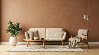
Meet the New Royal Court of Colours
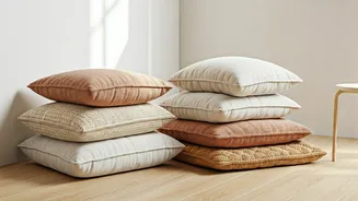
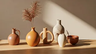
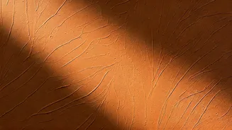
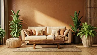
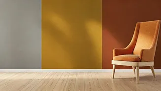
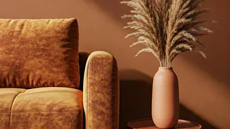
If grey is being usurped, who are the heirs to the throne? It’s not one single colour, but a whole family of warmer, more complex hues. **Warm Neutrals:** The new 'safe' choices are beiges with soft, creamy undertones, earthy taupes, and sand tones. These colours provide a neutral base without the coldness of grey, creating a soft, inviting envelope. **Earthy Tones:** Inspired by nature, colours like terracotta, sage green, olive, and muted ochre are surging in popularity. They are grounding, calming, and connect our indoor spaces with the world outside. **Moody Hues:** For those ready to be bolder, deep jewel tones are making a comeback. Rich navies, forest greens, and even shades of burgundy or dark chocolate are being used to create intimate, cocoon-like spaces, especially in bedrooms and reading nooks.
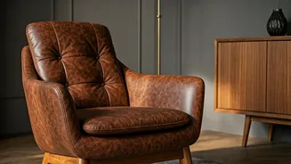
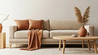
Don't Scrap Your Grey, Just Warm It Up
Reading this in your perfectly grey living room and feeling a pang of regret? Don't. The beauty of grey is its versatility, which means you don't need a complete overhaul. The goal isn't to eradicate grey, but to evolve it. Introduce warmth through texture and accent materials. Think rich wooden furniture, leather armchairs, or jute rugs. Swap out cool, silver-toned metals like chrome for warmer ones like brass, bronze, or matte black. Most importantly, add layers of textiles—plush rugs, colourful cushions in those trendy earthy tones, and cosy throws. By layering in these warmer elements, you can transform a cool grey space into one that feels balanced, current, and deeply personal without picking up a single paintbrush.